Friday, April 30, 2021

Diamonds Amongst the Rough

This article has been included in The Leadhead's Pencil Blog Volume 7, now available here.


If you don't want the book but you enjoy the article, please consider supporting the Blog project here.

Sometimes the circumstances in which a pencil is found suggests its authenticity – “junk box provenance,” I call it.  An online auction brought this one to my doorstep:


I knew what I would find imprinted near the top when it arrived: “Western Pencil Co. / Los Angeles - USA.”  It was a bit beat up, but I didn’t mind:


I haven’t seen a two-tone Western before (we won’t count that mismatched jade from the article in Volume 6, page 141).  Someone remarked that the red ends resemble Waterman’s mahogany plastic used on some Model 94 pens and pencils during the 1930s.  I think this has more red in it:


I also think it was made earlier - too early for that Waterman plastic.  The Western Pencil Company was organized by the buyers of the Dollarpoint Pencil Company, also of Los Angeles, which made metal Dollarpoint and Artpoint pencils using the same mechanism in the early 1920s.  Dollarpoint’s entire operation was sold at auction on February 12, 1925 (see Volume 4, page 267); while Western continued to exist at least in name until 1938, the ribbed front section and longer nose on this new addition indicate earlier production than the later ones with smooth, short-tipped noses:


The noses on these are removable, which begs the question whether this was built as a two-tone or whether parts have been replaced – that’s where the junk box provenance comes in.  First, you’d need to find spare Western parts, and as hard as these pencils are to find, that would be a tall order.  Then, consider the other things that accompanied the Western in that lot:


Rough?  Yes, they are . . . but finding a Western in the company of four Artpoints in any condition (let alone what’s left of the harder to find gold filled and “statuary bronze” models) strongly suggests that this bunch came from a source close to the company.   I wouldn't mind finding a Western in all red, but I think it was supposed to be like this.

But speaking of all red Westerns . . . this one slipped under the radar, in another online auction from a different sort of junk box:


Surrounded by kitsch, a “Duofold-red” Western lay amongst the weeds.  It cleaned up fairly well, although much of the plating on the clip band was gone:


Just as was the case with the later jade examples in my previous article, this one also lacks a manufacturer’s imprint near the top.  The imprint on the side appears to be an ordinary advertiser’s imprint, for Columbia Varnish Company, “Paint Makers”:


Columbia was located in southern California - a period glass paperweight indicates the company had offices in Fresno, Beverly Hills, and Los Angeles . . . hmmm, Los Angeles, just like Western.  The company was founded by Osmund Olsen, who according to his obituary, published in the North Hollywood Valley Times on August 9, 1954, was a Chicago native who moved to California and founded Columbia Varnish in 1915.  Help wanted ads from Columbia indicate the company’s plant in Los Angeles was located at 2460 E. 24th - not a match for either the old Dollarpoint location (1001 W. 16th) or where the Western Pencil Company was doing business when it was liquidated in 1938 (1821 E. Randolph).

I am so starved for more information about the Western Pencil Company that I’m tracking down an advertiser’s address just to be sure there’s no connection with the company.  No stone has been left unturned, so it’s time to file this one away . . .


. . .  until the next example turns up.


Thursday, April 29, 2021

An Autopoint Update

This article has been included in The Leadhead's Pencil Blog Volume 7, now available here.


If you don't want the book but you enjoy the article, please consider supporting the Blog project here.

Out of all the books I’ve written, A Century of Autopoint is my masterpiece.  I’ll probably spend the rest of my life trying to write something that good again.

Of course, no book is ever complete, and fortunately I never promised that what it included was all there would ever be to discover.  Two years later, I am proud to report that no glaring omissions or errors have been brought to my attention; however, a few things have come my way that are worth mentioning.

For starters, an online auction had alarm bells ringing and emails hitting my inbox from Autopoint fans near and far.  This is something I would have liked to have included in the book:


These fill an interesting gap in Autopoint’s early history, the short version of which is as follows: Charles Keeran founded the original Autopoint in 1918, but things didn’t really get rolling until 1920.  In 1921, a series of poor decisions and unavoidable circumstances resulted in a shake-up, and Keeran left Autopoint to join a new startup, the Realite Pencil Company.  Realite’s fortunes rose as the original Autopoint declined, and Realite announced that it has “merged with” Autopoint in June, 1923.  That was a kind way of putting it – Autopoint was falling apart, while Realite needed bigger and better manufacturing facilities.  The merged company was named Autopoint Products Company, and Charles Keeran was made its first (albeit short-lived) President.

All of the evidence available when the book went to press suggested that the Realite name was abandoned immediately upon the merger, and it wouldn’t be revived as a lower-budget brand name for many years.  That’s what makes this find important: the pencils themselves are Model 12 pencils (see A Century of Autopoint, page 60), but the boxes in which they are packaged are the only known examples which have both the Realite and Autopoint names on them.

The instruction sheets are also unusual.  One has an Autopoint instruction sheet and the other features a Realite; since the sheets are otherwise identical, this further establishes that both Realite and Autopoint-branded pencils were made briefly after the merger:


Also included in this lot were a few of Autopoint’s patented (by Charles Keeran) lead and eraser containers, which were marketed by Realite before the merger (see A Century of Autopoint, page 50).  Although Autopoint also marketed cartridge like this under its name through the 1936 catalog (A Century of Autopoint, page 188), the Realite name was thought to have been dropped from them, as well – this lot included a few of the Autopoint-marked cartridges:


Yet there were also several cartridges bearing both the Realite and Autopoint names:


Moving into Autopoint’s golden age, these two pencils also came my way in recent months.


The larger model 48 came by way of my friend Ibrahim Abou-Saad, who listed it in an online auction.  I’m always a sucker for an unusual color, and even though I have a Model 48 in white (see Figure 8-73 on page 121 of A Century of Autopoint), the large Autopoint imprint on the side of this one is worth the price of admission:


Autopoint fans will instantly recognize the other pencil as a Model 19X in Ivory, which I described as “the undisputed king of the Deluxe Autopoint line,” described (but not pictured) in Autopoint’s 1927 catalog and fully illustrated in the 1930 catalog.  The photo at the top of page 102 shows examples from my collection, but I didn’t have one in ivory – at the bottom of the page, I had to cheat and include a picture from Jim Stauffer which included an ivory example like this.  Call it greed . . . call it my OCD tendency to want one picture which included them all . . . I paid heavily but I got my wish:


This next group left a bad taste in my mouth:


These would have been included in A Century of Autopoint, had I bought them when they were first offered to me.  I was about halfway through writing and layout for the book in the summer of 2019, and I knew I would see hundreds of my friends at the DC Show that August, which would provide me with opportunities galore to photograph rare examples and acquire others for inclusion in the book.  I widely publicized that I would bringing the draft of the book and that I looked forward to seeing other examples.

One dealer, whom I won’t name, brought these along with many others, packaged in a leather Autopoint folder.  So many had John E. Horn’s name on them that it was clear this was a mostly intact salesman’s sample case – with the gaps filled in with common Autopoints you’d find for $2 at a flea market all day long.  This dealer offered it to me, but at an exorbitant price.  There was no breaking up the “set” (which wasn’t a set to begin with), there was no borrowing it to photograph the interesting specimens for inclusion in the book . . . and when I balked at the price, his response was that he’d just wait until after my book came out, then he’d be able to sell them for a lot more.

The good news - if an experience like that will yield any - is that when I declined at that price, he tried to play some good friends of mine against each other to get the best price he could out of the lot.  We all know each other.  All of his marks were people that were already contributing to the book.  We talk to each other.  By show’s end, nobody wanted anything to do with him or his folder full of Autopoints.  To quote John Hall, “I’d rather run them over in my f***ing driveway.”

By the time the Philadelphia Show rolled around in January, 2020, A Century of Autopoint was in print.  This dealer was in attendance, and he’d given up on the extortion plot.  These pencils were scattered around on his table, and for a price that wasn’t too far out of line, I finally brought them home.  

From the top, the Glidden Soya Plastic marked example isn’t completely foreign to me - a black example from Jim Stauffer’s collection is pictured on page 196 of A Century of Autopoint.  


I had to buy the next two down, in what Autopoint called “Water White” clear Bakelite, because I couldn’t remember whether the ones pictured in the book were mine or my Dad’s (we combined our collections as we shot these golden age examples).  Besides, both had Mr. Horn’s name on them.  


The thin model with a round upper ferrule is a Model 18BG “Streamline De Luxe,” and the one pictured on page 119 of A Century of Autopoint was my Dad’s.  “Diamond Cut” caps were added in November, 1937, and faceted upper ferrules to match were added shortly thereafter - and the Water White Model 58G shown on page 120 of A Century of Autopoint belonged to Jim Stauffer.

The next Model 58Gs, in that salmon-pinkish color, were ones I was particularly keen to add to my collection.  


Dad has a barrel in this color from Autopoint’s factory archive with an attached paper tag indicating that the company found the material “unsuitable” (see page 194).  On page 118, I show an earlier Model 58G from Jim Stauffer’s collection in this color, with a round upper ferrule and imprinted “BAKELITE” on the barrel, and I commented that while the color was uncataloged, “other examples have turned up with regular customer imprints.”  These two were the “other examples” I was referring to, so yeah . . . forgive, forget, and spend a bit of cash.

There was another reason I wanted to have them - there was a point I failed to make in the book.  When Autopoints had round ferrules at the top end, the company name was imprinted on that ferrule and the clips were unmarked.  After the unmarked faceted ferrules were added to match the new “diamond cut” caps, Autopoint struggled with where to mark its products. For a short time, Autopoint added an imprint next to the clip, and both of these have that feature:


The light translucent red example is a very interesting variation, but only if you really know your stuff.


On page 141 of A Century of Autopoint, there’s pictures of the Model 54, first cataloged in 1948 and sporting the later “Petau clips,” named after inventor Erik Petau:


This is no Model 54 - it’s at least 10 years earlier, in my estimation.  In addition to the bolted-on clip, long abandoned by 1948 (the Petau clips was introduced in 1941), note that trim ring where the nose meets the barrel.  That ring is found only very rarely – and without exception, on pencils made around 1938-1939.

Translucent red Autopoints in the 1930s were much darker than what you see here, and those higher end colors were associated with gold filled trim rather than what Autopoint called “silvonite.”  The Model 54 introduced in 1948 was based on a much earlier experiment with lighter red plastic paired with silvonite trim – this experiment, in fact.

Finally, for now, is this later, injection molded Model 48:


Injection molding allowed for a wider range of colors than the Bakelite Autopoint used earlier in Model 48 production.  Some of the wilder ones tend to command a premium, even though they are much later and were in production as late as 1970.  Here’s the picture from page 140 of A Century of Autopoint:


At first blush, this one looks to be just another dull, gray example from the twilight of Autopoint’s successes.  I saw just a little bit more in it, though:


Commemorative dates are always helpful in better defining the evolution of these pencils, and we have a date of 1954 as the “Silver Anniversary” of the Pennsylvania Transformer Company.  That isn’t the latest example of the script Autopoint clip, but it’s closed.  The latest I’ve found, before the introduction of the “Big A” clips, was from 1955.


And . . . that isn’t gray, as the imprint suggests.  Look closely and you’ll see subtle marbling . . . silver marbling, perhaps . . .


Wednesday, April 28, 2021

What I Knew Was Out There

This article has been included in The Leadhead's Pencil Blog Volume 7, now available here.


If you don't want the book but you enjoy the article, please consider supporting the Blog project here.

This was one of those that had me sit on pins and needles hoping no one else recognized what it was.  I did, and I’ve been looking for one for quite some time:


That flat ball clip and gold filled section was the last piece of a puzzle on which I’ve been working:


Sheaffer’s “Working Togs” line of utility pencils were graced with some models with higher end trim, and this one completed my collection of the cataloged variations:


The top two examples, with their flat ball clips, were cataloged in 1939.


The catalog is vague: the illustrations are accompanied by descriptions of “Gold capped” and “Gold center section” models, but the text mentions a “Working Togs Dressed Up” as model YLE and “Working Togs Full Dress” as model CLE.   I think the “full dress” version is the one with the gold-filled center section.

The remaining models are cataloged in 1940 and 1941. For 1940, Model ILE included a gold center section and cap, and model KLE included just the gold cap.  Both were described as having “ribbon” chasing on the metal, meaning groups of lines with plain sections separating them. 


For 1941, Model FLE had a gold center section and cap with ‘standard chasing,” and Model KLE was the same as described for 1940.


That means my black example with the rounded cap was offered as model KLE in 1940 and 1941:


While my two gold center and cap models are, from top, Model FLE from 1941, and Model ILE, from 1940:


That bottom example, a special pearl center model with Sheaffer’s factory pictured, came from Dan Reppert a few years back during the Michigan show and made an appearance here a few years ago (Volume 4, page 261).  Just seemed like it should be included here.

Tuesday, April 27, 2021

Rise of Tog

This article has been included in The Leadhead's Pencil Blog Volume 7, now available here.


If you don't want the book but you enjoy the article, please consider supporting the Blog project here.

The early development of Sheaffer’s Fineline utility pencils, “in working togs,” is well-documented in Sheaffer’s catalogs.  Recently, I found a better home for my crowded Sheaffer archive at an antique mall up in Amish County:


The bulk of my Sheaffer collection formerly resided in that short, gray printer’s cabinet - the move to the larger cabinet on the right gave me a long-overdue opportunity to stretch things out a little bit and reorganize things; time to show how things developed.

Sheaffer’s utility pencil program began in 1936 with the Model LL, a rear-drive pencil with a one-piece barrel.  It was cataloged only in black in 1936 and 1937, and in its final year of production, 1938, it was joined by the Model MM, in “grey pearl” (see Volume 5, page 237):


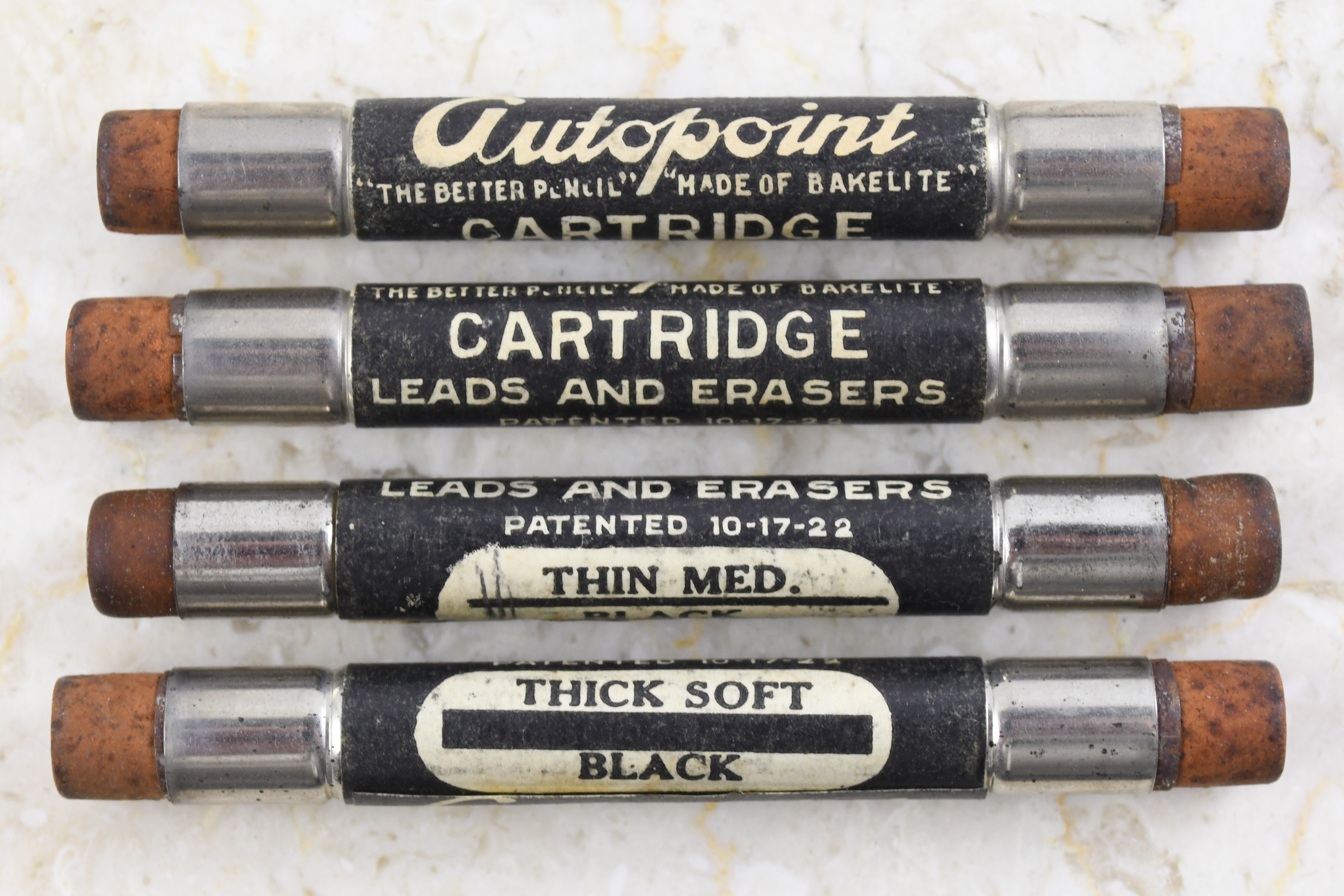
The LL and MM models appear in the 1938 catalog on a page of “Sheaffer’s Regular Pencils.”  Another page in the 1938 catalog passes the torch to Sheaffer’s new breed of utility pencils, using “Fineline” .9mm leads supplied by the Joseph Dixon Crucible Company.  The “Working Togs” model is shown at the bottom of the page, and the text indicates it was available only in black as Model LE:


Note that Sheaffer’s new model is the only one on this page fitted with a throwback clip, the flat-ball “Sheaffer’s” clip found on Sheaffer’s regular line earlier in the 1930s.  Note also a thin metal band separating the top piece from the barrel, a carryover from the earlier MM and LL pencils.  

The fact that these were offered only in black for 1938 probably explains why so many more of these are found in that color than any other:


I theorize that all four of these are from 1938, because they also have the ordinary “Sheaffer’s” imprints, another carryover from the LL and MM line:


At the time, “Fineline” was a feature offered by Sheaffer, a slick mechanism for a thinner lead.  Sheaffer would soon establish a dedicated “Fineline Division” to manufacture lower-priced and utility pencils.  For the 1939 catalog, only “Working Togs” models appear on the “Fineline” page:


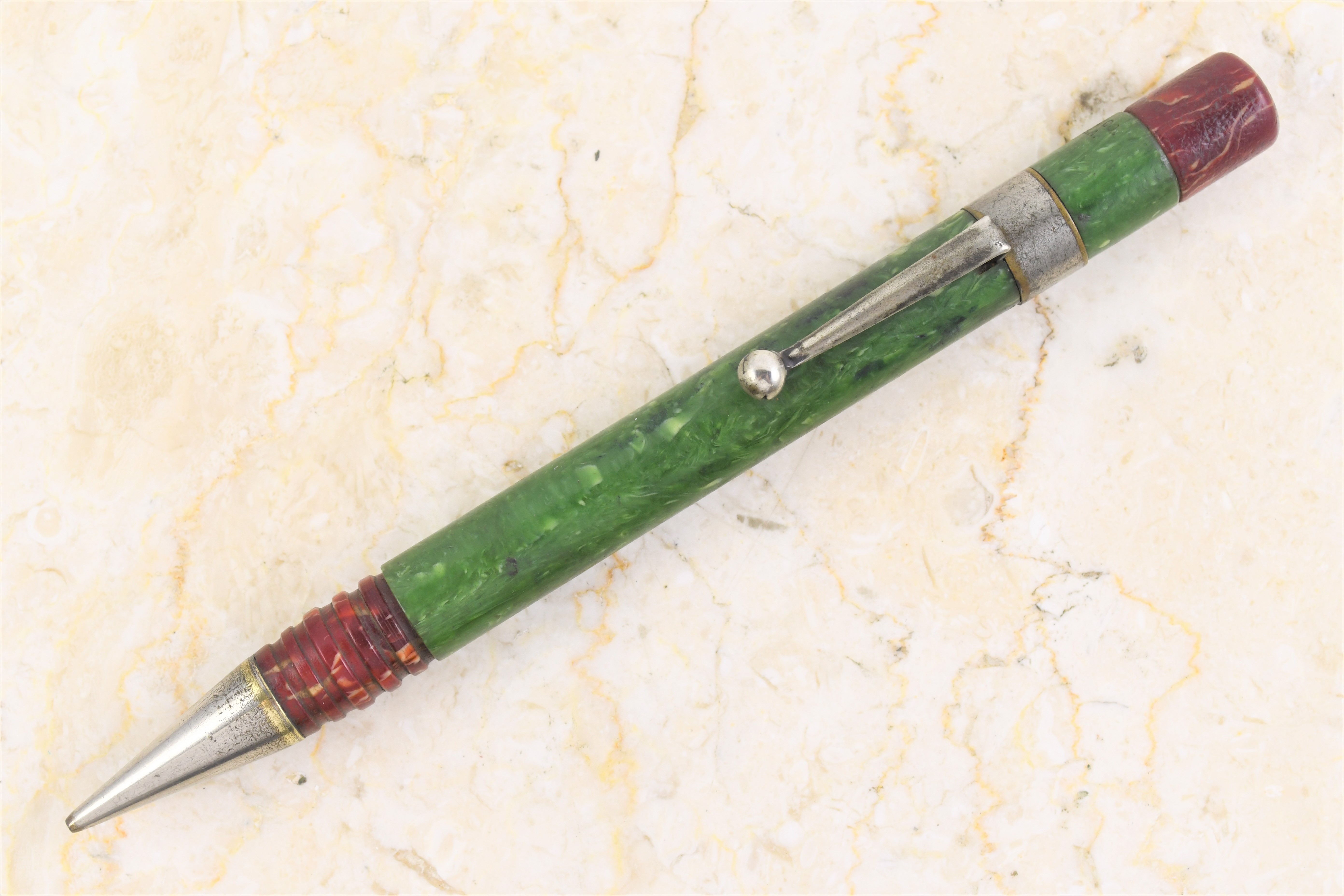
Sheaffer’s 1939 catalog indicates that these pencils were now offered in new colors – in addition to the black LE, there were also red, brown, green and blue pencils, somewhat unimaginatively designated RE, BE, GE and . . . well, since brown already took BE the blue was model TE.


No, I haven’t seen a red one yet.  A pattern emerges from this small sampling: the colored ones have a “Fineline” imprint on the side opposite from the clip, as opposed to a “Sheaffer’s” imprint below it:


That leads me to believe that black examples, identical to those pictured earlier, were made in 1939 or 1940 when they are found with this Fineline imprint:


Maybe . . . that green example is the exception to the rule, sporting what otherwise appears to be a 1938 imprint.


In 1940, Sheaffer’s catalog illustrates “pearl center” pencils for the first time; note, however, that the pencils illustrated abandon the flat ball clip in favor of a more streamlined version:


“Working Togs” pencils with clips shown in the 1940 catalog remained in production for a number of years with only minor modifications.  The black pearl center example second from top was made later, and is included here to illustrate these minor modifications.  Sheaffers in 1940-1941 had all gold-filled tips, fully ribbed lower barrels, and that metal band around the pencil at the top of the clip.  Later models had two-tone tips, barrels that were only ribbed part way up from the tip, and the metal ring was voided.


At some point Sheaffer decided green should look nicer than the mousy, pea-green in use since 1939.  As for the red, white and blue example at bottom, of course those can be “made” by mismatching parts, but “red, white and blue” was specifically cataloged by Sheaffer in 1941, as model IRTE (I for pearl center, R for red, and T – since brown already hogged the letter B – stood for blue) along with one other interesting innovation in the series:


In the lower corner of the 1941 Sheaffer catalog page, illustrating the series, customers were provided the option to have a Sheaffer working togs pencil in either twist (“Turn Type”) or button-activated repeater (“Push Type”).  Repeaters were cataloged in solid colors only, given the suffix “J” to the model name (so a black twist pencil was model LE, but a “clicker push type” was LJ).


Brown and blue “clicker push type” pencils have eluded me thus far, but the examples I have provide some good insights:


As mentioned earlier, Sheaffer replaced its ugly pea green with a more attractive, darker green.  My example with pea green top and dark green barrel suggests that old parts were being used up around the time the clickers were introduced, in late 1940 or early 1941.  The factory demonstrator at bottom is among the finest examples of a demonstrator I’ve ever seen – I believe it came from Don Jacoby’s collection.

Then, that little scuffle known as World War II came along.  Sheaffer, along with most other American industries, was called upon to help with the war effort, and product development screeched to a halt.  The next Sheaffer catalog in the Pen Collectors of America’s online library is from 1951, and by that time Sheaffer’s Fineline Division was a freestanding enterprise – none of the company’s utility models appear in the catalog.  Matt McColm did find an advertisement for a pearl center pencil in The Kiowa (Kansas) News on October 1, 1947:


If the artwork is accurate, the Sheaffer clip was still in use, but it's narrower, like the regular Sheaffer lines were from the era.  The two-tone tip had been adopted, the barrel is only partly ribbed, and the metal ring at the top is gone – exactly like the black pearl center pencil shown above.  


In February, 1948, Sheaffer’s company magazine, Sheaffer Review, illustrated the Fineline Division’s new budget fountain pens and pencils, which sported clips imprinted with a script “Fineline” rather than the Sheaffer name.  A Sheaffer Fineline brochure in the Pen Collectors of America’s online library and dated June 1951 shows that the clip had been adopted on the Working togs line, as well.


Other clip variations followed, and I illustrated many of them in The Catalogue.  Some lazy Sunday, I’ll try to better refine when these variations were introduced, but for now I’ll leave you with a couple weird variations that don’t fit the norm.

When this article was first published, I thought that the “pearl center” pencils might have been introduced in late 1939, just before the catalog artwork was prepared for 1940, because flat ball clip, pearl center pencils do turn up from time to time:


All of the ones that have surfaced have two-tone tips, barrels that are ribbed about halfway up, and a “W.A. Sheaffer Pen Co.” imprint without the “Fineline” name and with a $1.50 price.


Matt McColm weighed in quickly: the imprint, two-tone tips and partly ribbed barrels are all elements which were not introduced until 1945, Matt said, and I agree with him.  These are not an early evolutionary step, but are a much later and inexplicable use of leftover Sheaffer ball clips. 

Last (for now) is this pair: 


The black example turned up at the Baltimore Show a few years ago.  It is a “turn type” with a Fineline imprint and fully ribbed lower barrel, suggesting production in 1939 or later.  The other, with a fully ribbed lower barrel and a chrome-plated ball clip – something not seen anywhere in the working togs series – is explained by its imprint.


Made in Canada.

As for the black one, I don’t know . . . that finished cap at the top of the clip rather than an exposed eraser is all that is different about it, so I’m unsure whether it’s factory or whether someone had a bit of fun modifying one.  Until some documentation surfaces to explain it, I just enjoy it as a curiosity.