Showing posts with label Carter. Show all posts

Thursday, November 6, 2025

A Couple Whoppers

I had a couple more pencils from the Carter’s Ink Company that I did not include in “The Second, Third, and Other Shoes Drop” on October 22. I didn’t forget about them; there was just so much going on in that last article that I didn’t want these two to become lost in a sea of Carters.

This first one came from Terry Johnson’s collection, via Mike and Linda Kennedy. Janet and I made a day trip out of our visit to their Indiana home, and while ostensibly we were there to look, this is one of the items that I wasn’t leaving Indiana without.


Carter adorned some later Pearltex models with shamrocks, and this decoration has been found on all of the Pearltex colors, both pens and pencils. They seem to be more common in the shorter ladies’ models, and they are the least common in this pink. By the time these were made, around 1931, Carter was likely moving out of pen and pencil manufacturing; otherwise, it would have made sense for the company to bring out a green Pearltex for this treatment.


The other example I wanted to show you today came from Gabriel Galicia Goldsmith:


Note the top end – that rounded top with no trim is different from anything else I’ve seen on a Carter. In addition, I don’t believe this color celluloid has been found on any other pen or pencil.


That’s the other reason I did not include it in that previous article . . . all I can do is stare at it, because I don’t have any dramatic words to add.

Wednesday, October 22, 2025

The Second, Third, and Other Shoes Drop

My only complaint about the DC Supershow, held every August, is that so many of my friends are there that it is a challenge finding more than a few minutes to talk with each of them. Things only slow down to a reasonable pace on Sunday, by which time everyone is so thoroughly exhausted and “peopled” out that we are collectively ready to return to our normal, quirky lives.

I don’t even bother to set up on Thursday, so I can see everyone and share things we brought to show each other; I’ll typically have a backpack containing only a case of things I brought to show people and a bottle of Jameson’s. Both are typically empty by the time festivities end on that first day.

As I wandered about the room, my old friend R. George Adams flagged me down. R. George, you may recall, found that weird Stylofede pencil for me (see “The Pencil and the Tramp” on August 5, 2025), and he’s got a great eye for the unusual and the weird. 

This time, R. George wanted to offer me some wonderful pieces out of his collection of Carter’s pens and pencils. Two of his fountain pens enamored me; usually, I’m too cheap to spend big money on fountain pens, particularly in the first few minutes after I arrive at a show, but I was unable to resist these.


At the time, I assumed one of these was a duplicate of the DeLaCo example from yesterday’s article because I couldn’t remember what the imprint read. I didn’t mind adding a complete and intact example, even if it proved to be a duplicate, but I was pleasantly surprised when I got home:


Yesterday’s DeLaCo pen is now in the company of identical pens marked Superite (DeWitt-LaFrance’s later flagship brand) and Laughlin, of Detroit, Michigan. As for the nibs, the Superite has one of those “S” marked nibs I was telling you about yesterday, and the Laughlin has a number 5 size Snapfil nib.


That Snapfil is an unusual nib, typically found on the General Manufacturing and Houston Pen Company’s Snapfil lines of fountain pens (General Manufacturing also produced those grail “Kaligraf” pencils). By the time these were made, around 1920, Laughlin was sourcing pens rather than making them; I don’t know whether the company sourced nibs and pens separately and put them together or whether this is a random replacement.

R.George had a few pencils to show me, too. They are the four examples in the middle of this next image:


Before I get to R. George’s pencils, a word about that black hard rubber example at top. It is one of the earliest of the Carter-branded pencils, a rebadged version of the hard rubber Superite pencils. The Carter Ink Company purchased DeWitt-LaFrance in 1925, but I wouldn’t discount the possibility that Carter’s was sourcing pens and pencils from DeWitt-LaFrance before the sale.

This one came to me from an online auction that closed shortly after I got home from the DC show – it’s a duplicate that’s both an upgrade in one respect and a downgrade in another:


My other black hard rubber example has badly discolored hard rubber and corroded trim . . . but it has a price sticker. Both of my black hard rubber examples have groups of lines on the barrel. DeWitt-LaFrance made identical pencils for the Rexall Drug Stores under the “Signet” line; Signet pencils had gold filled trim, and the black hard rubber ones came either with or without those groups of lines. See “Chasing and Fixing Signets” (July 8, 2021: Volume 7, page 246).

All but one of these Carter’s pencils have nickel trim rather than gold-filled, but the existence of that red hard rubber Carter with gold filled trim suggests that there’s no reason all of these others might also come with that trim . . . and the Signet line was also offered in mottled hard rubber, too. 

The first of the four Carter’s pencils that came from R. George is that great pink and white oversized pencil; these were student or utility models, I believe, and to my knowledge there were no comparable fountain pens. With an exposed eraser, I’ve only found these in black or red hard rubber, and the crown tops found on these student models are unique to this series.


I wrote about that blue one during the first year of the blog – see “If Only All ‘Student Pencils’ Were This Nice!” (March 30, 2012: Volume 1, page 159). While larger, these are also lighter since it’s a thinner plastic barrel rather than the more hefty Coralite or hard rubber.

The second R. George Special was that Pearltex pencil in blue . . . or blueish, anyway. Pearltex shades vary from one pencil to the next and no, that’s not discoloration, which comes from exposure to rubber ink sacs, ink, or a combination of the two, something that typically doesn’t plague pencils. When I bought it, I had checked my notes, and I thought this one would fit nicely into my collection, which included what I thought was a short grey and the short and long models in blue. However, when I got them all together under the strong lights in my photo setup, it isn’t so clear.


My “gray” ringtop looks more pink, and the “blue” ringtop looks more gray. Colors on the Pearltex series are so often a matter of degree, though, and in this case I’m just content that R. George’s addition is clearly different from what was already represented in this series. 

The third R. George Memorial Carter is in lapis Coraltex – it’s very close to a model I recently wrote about in “Duly Twisted” (October 2, 2025). In that earlier article, I noted that I already had three Lapis Carter pencils, but this one is a variation I didn’t have:


Carter pencils with a single band at the top are earlier; Carter’s fountain pens are shown with a single wide cap band in newspaper advertisements from 1926 through mid-1928, while advertisements beginning in late 1928 illustrate double cap bands like these. While these advertisements do not show the matching pencils, I don’t believe it is a stretch to say that the banding on the pencils matched fountain pens made at the same time.

The two white Pearltex examples at the bottom are a story all their own: the oversized model was the fourth R. George Special from the DC Show, and Terry Mawhorter had the ringtop. I was happy and a little irritated at the same time to find these, because I had to reshoot a picture that was a real pain in the neck to stage. Here’s the original image, taken to commemorate the addition of a ringtop identical to the one I got from Terry:


This shows Carter models in white Pearltex, which evolved on a slightly different track from the same pencils in other colors. The top three examples are not a match for any other Carter’s pens or pencils of the era.


I had planned an article months ago about why  streamlined ringtops in white Pearltex have a single trim bands at the top, while all the other colors have twin bands.


Later versions in white Pearltex match the same models in other colors . . . mostly. The last of the full-length Carter pencils blended elements from the flattop series with the cheaper Carter products made in the 1930s.


Carter eventually abandoned the distinctive LaFrance clip; these later models sport very unusual colors, but I haven't found one in white Pearltex.


Later Carter ringtops are unmarked and were not made in as wide a range of colors, but the distinctive Pearltex and trim are unmistakable. Note the shorter caps on the grey models – this is too small a sampling to draw any conclusions, other than that there were two different cap lengths.


During those sad last days of Carter’s writing instrument production, not even the side clip models were marked with the Carter’s name.


In fact, it wasn’t until 2018 that I was able to confirm that these were made by the company, established by indirect means in “Settles the Issue in My Mind” (February 25, 2018: Volume 5, page 164) and from scant newspaper advertisements in  “Chapter and Verse” (October 9, 2018: Volume 5, page 263). Formal confirmation arrived after I acquired a 1931 (or so) Carter catalog from Rob Bader (see “The Inconvenient Question” on June 12, 2021: Volume 7, page 190).


As Carter’s Ink Company prepared to throw in the towel with the production of writing instruments some time in the early 1930s, there were some final modifications – or debasements, depending on how you view it – to the designs, including the addition of a standard black and pearl to the lineup and the deletion of the domed tops.


I haven’t yet found a flat top Carter pencil like this in any Pearltex color. If I do, however, I’ll be reshooting that white Pearltex spread yet again.


Thursday, October 2, 2025

Duly Twisted

At the Philadelphia Show a few years ago, Paul Erano had this Carter’s pencil on his table. He wanted a fair price (rather than the unfair price I was looking for), and when I hesitated, Paul did what Paul does best. 


“Jon,” was all he said.

“But I think I already have that one,” I replied.

 “Jaaahn, come on. In the box and with the papers?”

That was as much of a twist as my arm required. Yeah, I did have that one - a couple actually - but it looks like there were two different shades of that lapis blue “Coralite,” as Carter called it.


But the real star in this show was the papers that came with it, starting with the box – complete with a model number, but not for this pencil. Model 4117 was a fountain pen designation, specifying a red mottled (4), large diameter (1), long (1) and something sevenish, probably the nib size. “Medium” refers to a nib, not a pencil lead.


No worries about that, though. The box has ably contained and preserved the paperwork inside, and it is more than just a one-page instruction sheet. It’s an entire booklet, copyrighted 1926, titled “Be Kind to your Pen.” Sometimes my commentary is helpful, but this time I’d just be getting in the way - here it is, reproduced in its entirety.


Thursday, August 21, 2025

The Case for Cases

Ringtop pens and pencils made by the Carter Ink Company during the 1920s and 1930s are a relatively common sight. Sets housed in celluloid cases, while less common, do show up from time to time. The earlier ones were rectangular:


When these sets are reasonably priced, I’ll bite on them just for the cases, even if I might have the pencil at home. That lower one came as a nice surprise: the Coralite (Carter’s name for this sort of celluloid) was in very good condition:


And, when I checked to see if I had the pencil, I only had half of one. I’ve been looking (whether I remembered it or not) for a complete example to upgrade the one I have missing its cap:


At some point during production, the squared-off corners on the cases were streamlined. I believe this change occurred before Carter streamlined the pens and pencils themselves, since this next case looks too well put together. 


It came from the collection of Terry Johnson, who founded Private Reserve Inks, and it came to me through the Kennedys (Mike and Linda) - I had passed on it when I purchased the pencil part of the Johnson collection, but that gorgeous monogram on the case nagged at me . . . after the big purchase, I messaged Linda and arranged for her to bring it along to the Baltimore show in March.

The “streamlined” cases are sometimes found with the Carter’s name embossed inside the lid: this later set (mid-1930s) also came from Terry Johnson’s collection. The pen and pencil are worse for wear, but to me the case was what was important, anyway:


I have another streamlined case with that same treatment inside the lid. It too contains a later incarnation of the pen:


My favorite Carter’s case, however, is a little bit earlier, dating to 1929 or 1930. It lacks the Carter’s name, but has so much more going for it:


Larry Liebman also likes these – every so often, we get on the phone and have a text fest, sending pictures back and forth while we discuss different brands. When the subject of Carter’s came up a few months ago, he sent me this picture of something along these lines, in lapis celluloid with similar painting:


All of the foregoing is cool show and tell, but other than those last two cases, all of these are probably things with which most collectors are well familiar. And then comes the rest of the story . . . 

In an online discussion in one of the pen groups on Facebook, David Nishimura mentioned that these celluloid cases were supplied to Carter by some unknown third party, and that other companies were also known to have offered them.

Dang it, I thought to myself . . . from now on, I’m going to have to open every stinking one of these cases that I see, and I will not be able to assume any non-Carter contents that happen to reside in them are just later random additions. And then, just a couple of weeks after that discussion, Matt McColm pointed out something in an online auction he thought might interest me:


Opening the case reveals no name inside the lid, but that gold-filled pencil cap is no Carter:


Yes, Virginia, that’s a set made by the Moore Pen Company – the pen is a bit discolored, but what the heck – it has a price sticker.


But that isn’t the reason I clicked “buy it now” quicker than a jackrabbit on a date. It was what is inside the case, not inside the lid like on a Carter’s case but in the case body:


Non-Carter’s cases like these are so rare that most are not even aware that they exists - I took mine to the recent DC Show to share with a couple Moore fanatics I know . . . one had never seen such a thing, and the other had only heard that they exist. It does makes sense that two Boston pen companies would both source celluloid cases from the same supplier, and I supose that likely does narrow down who that supplier might have been to some manufacturer in the Northeast. LeBoeuf, in nearby Springfield, immediately comes to mind.

This is one of those articles I publish in the hopes that it will drag out more information. Actually, all of my articles are published in those hopes, but this time the questions I am trying to answer are very pointed: what other companies offered these, who made them . . .

. . . and David mentioned in that online discussion that there are also cases with three compartments rather than two . . .   

Saturday, June 12, 2021

The Inconvenient Question

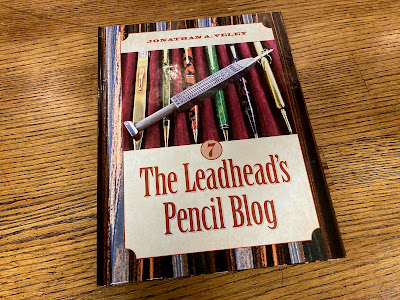
This article has been included in The Leadhead's Pencil Blog Volume 7, now available here.


If you don't want the book but you enjoy the article, please consider supporting the Blog project here.

One of the things from Don Jacoby’s collection that I liked the best was this Carter’s pencil, complete with its rounded celluloid case.  It didn’t bother me that the pen was missing:


The Carter imprint is easy to miss on these:


Later Carter pencils are unmarked, like this next one, and it took me some time to attribute these to Carter (see Volume 5, page 164):


I didn’t remember seeing a Carter that matched its carrying case so closely . . . until I arrived back at the museum and went to file it away.  I’ve posted so many articles here that I had forgotten that I wrote about a similar set (Volume 5, page 263):


The pencil from Don’s collection is, I think, a little bit earlier – a thought I come by honestly, after Rob Bader sold me a copy of Carter’s “Catalog 11" at the DC show a couple years ago:


This catalog is from 1931 or so, near the end of Carter’s run as a pen and pencil manufacturer.  I gave a copy to Ross McKinney, who used it as the backbone for his article on later Carters for The Pennant recently since it redifines what we thought we knew about Carter’s later years in its short four pages.  On page 2, we see the pencils with short noses and that later clip like the blue one from Volume 5, and the longer-tip pencils are discontinued:


Note also the pencils on the left; the venerable DeWitt-LaFrance clip has been abandoned in favor of a more streamlined version on the “Pearltex” line.  They are also shown on the following page of “Coralite” pens and pencils:  


I’ve got a few of these later Carter pencils in the collection:


I suppose the black with brown swirls might pass for “Mahogany” as described in the catalog.  There’s no gray listed, and that funky blue striated plastic?  I can’t believe they would just call that plain ol’ “Blue.”  

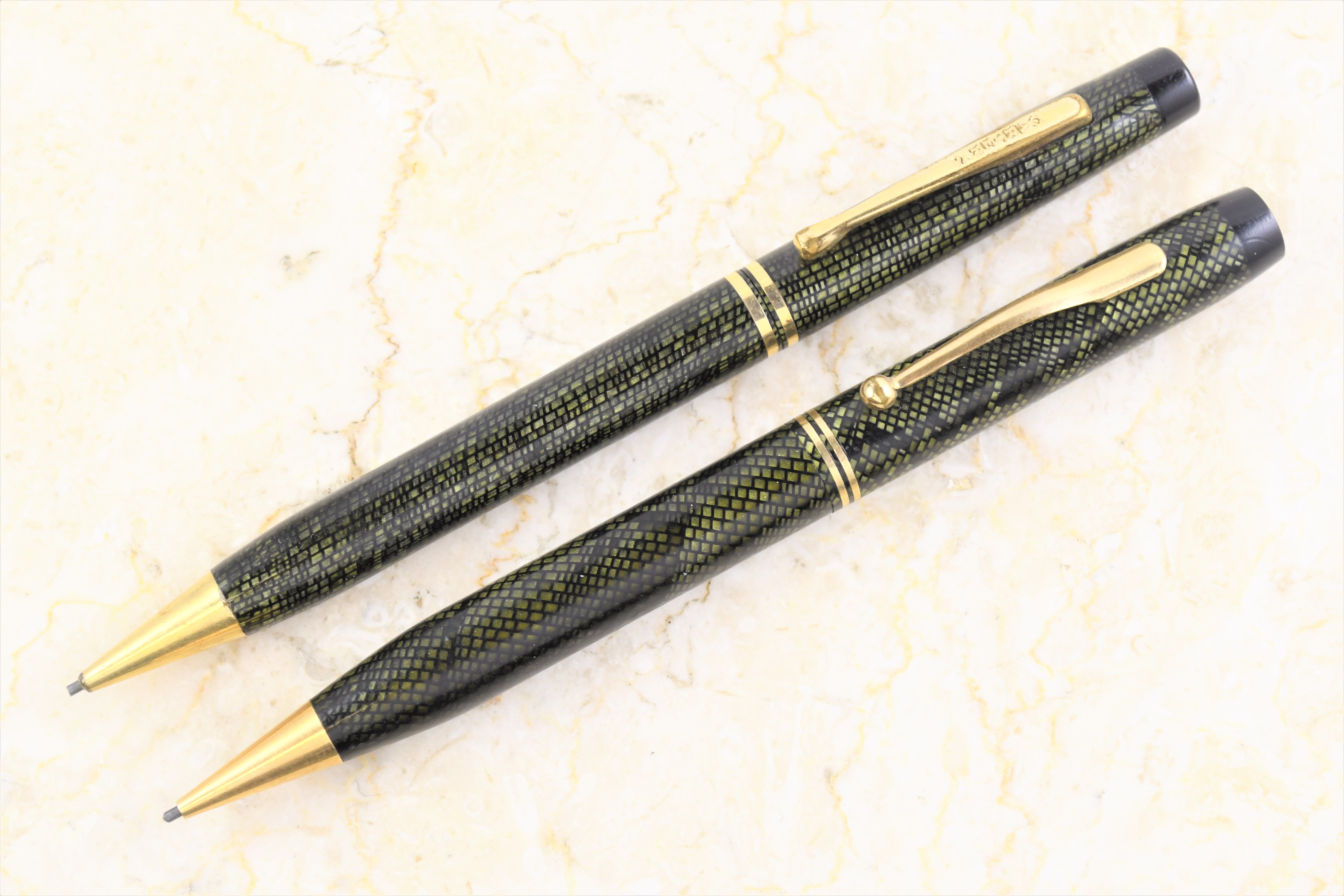
Then there’s those bottom two pencils: back in the days before Rob parted with that Carter catalog, I called that pattern “snakeskin.”  However, the last page of Catalog No. 11 refers to them as the “Mosaic Line”:


Although Catalog Number 11 shows Coralite, Pearltex and Mosaic pens and pencils all in the same trim configuration, note that the two Mosaic examples I have are a little different:


They are smaller, the nose is longer, and the top trim band is omitted in favor of a plain, black top on my Mosaic pencils.  


They aren’t like any other Carter, but they do resemble something else:


That other pencil is marked “The Geo. Innes Co.” and it was made by the Seth Crocker Pen Company (see Volume 5, page 159), which made pencils for the Innes store, as it also did for Macy’s (Volume 5, page 161).  

Let’s throw something else in the mix: the Seth Crocker pencils were protected by a design patent.  Seth Chilton Crocker applied for the patent on July 8, 1934, and the patent was granted as number Des. 94,118 on December 25, 1934:


I titled this article “The Inconvenient Question” because every time that I ask it, everybody just looks at me like I have lobsters coming out of my ears and goes back to talking among themselves.  The question is this: if the Seth Crocker pencils were protected by a design patent, and these Carter Mosaic pencils are exactly like a Seth Crocker but with the grid running straight instead of on the diagonal . . . is there any connection between the Carter and the Seth Crocker?


I’ve attributed the Carter Catalog Number 11 to 1931, but there’s no dates inside it . . . and it might be later: after all, the only newspaper advertisement I found which shows anything like what’s in Catalog Number 11 appeared in the Asbury Park (New Jersey) Press on December 22, 1933:


Perhaps these were closeouts, distributed after Carter discontinued its operations . . . after all, like so many other companies that perished during the Depression, Carter’s departure from the industry wasn’t announced.  Perhaps Carter then sold off equipment to Seth Chilton Crocker, who then took out a design patent.  

But perhaps, during Carter’s waning days as a writing instruments manufacturer, Carter made writing instruments for Seth Crocker.  

The only thing that I’m certain about is that Carter’s Mosaic line and Seth Crocker’s patented design could not coexist without some agreement.