Tuesday, March 31, 2020

The Big Tease

This article has been edited and included in The Leadhead's Pencil Blog Volume 6, now on sale at The Legendary Lead Company.  I have just a few hard copies left of the first printing, available here, and an ebook version in pdf format is available for download here.

If you don't want the book but you enjoy this article, please consider supporting the Blog project here.

A few days ago, I had to ask the question online . . . what does this read in Japanese?


Hey -- you have to give this rural Ohioan some props for knowing it was Japanese, in a part of the world where if it isn’t written in ‘Merican, it must just be from “over there somewhere.”  I wish I could say I’m more cosmopolitan than the average Midwesterner, but the truth is that I cheated.  I already knew where it was from:


When this Kanoe school set came up for auction, it was one of those things I used to say didn’t fit into my collection at all, but foreign pencils tend to nibble around the borders of the museum when one thing leads to another. 

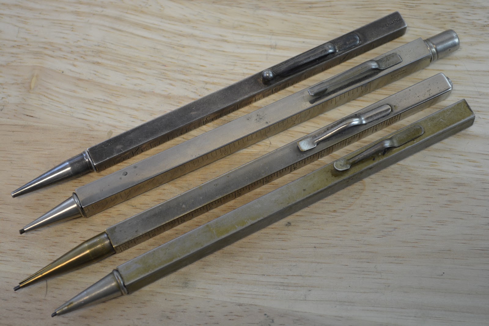
In this case, it’s been a number of years coming, beginning with a Brown & Bigelow-marked pencil in an unusual trapezoidal shape (originally posted back in March, 2013 - the article is in The Leadhead’s Pencil Blog Volume 2, page 106).  Both the internal and external elements of this Brown & Bigelow were later appropriated by both German and Japanese manufacturers, most prevalently on the “Peace” pencils made in postwar Japan.  In this next photo, from here at the Blog back in 2017, the Brown and Bigelow is at the top, immediately under which is a familiar “Peace” pencil:


Poor Joe Nemecek – he’s probably gone through three computer monitors by this point, because he says he throws a brick at the screen every time I bring these up.  Given their odd shape, it’s easy in online auctions to mistake them for other (and admittedly better) things, even though in that last article in 2017 I unveiled one along these lines marked Sarastro, the company which also made overlays for Mont Blanc (the full article is still online at https://leadheadpencils.blogspot.com/2017/08/and-now-for-some-overdue-respect.html).

Hang in there Joe – and all of you who are similarly inclined – that’s as far as I delve into that subject . . . for now (dum dum dummmmmmm.....).   My point in bringing these up again is that the “Peace” pencils were made by ... drum roll ... Kanoe.  I’ve mentioned that connection a couple times here at the blog, and at one point I nabbed a crappy online seller’s picture of a boxed example that I just . . . can’t . . . find right now to drive that particular point home.

That’s how this Kanoe set wormed its way into my collection.

Both pencils are marked “Kanoe Peace” on the clip, and they are freakishly slim given the 2.0mm leads for which they were designed.  Also in the box were two containers of leads, one with red leads and other one with black ones, with a nifty rectangle of sandpaper built into the lid so you have something to sharpen up your leads with.


There’s also an odd little pair of tweezers.  I dunno . . . maybe that’s got something to do with this, maybe that’s just some random little thing that fit conveniently in an unrelated box at some point over the last seventy years or so.  I’ve never tweezed a pencil personally, but if I ever feel the need, at least now I’m ready.

Let’s look a little closer at those lead containers.  At one end, not surprisingly, they are stamped “Kanoe”:


And at the other . . .


well, that’s the reason I had to ask the online community for a bit of help.  A quick post, and within an hour Lee Han had the answer for me . . . it reads, “Patent Pending.”

The title of this article wasn’t about having to dangle that bit of Japanese out there asking for a translation to get people to tune in today.  It’s got me wondering why just these words were stamped on the lead containers in Japanese when this Kanoe set was manufactured in post-War Japan expressly for the American market.  People stamp “Patent Pending” on their products as a warning, to put others on notice that the manufacturer is in the process of seeking patent protection.  Would-be copiers beware:  regardless of whether you copy this before or after the patent is ultimately issued, an infringer is an infringer and this legend says the patent holder will hold you accountable.

So why stamp such a warning in Japanese?  In 1950s America, few people other than those of Japanese descent would be able to read it (heck, this Ohioan in 2020 had no clue what it said).

The only explanation I can conceive is that this warning wasn’t for American companies, but for other Japanese companies.  That’s kind of interesting to me that Japanese firms were more worried about each other than they were about the Americans to whom these products were being supplied.

Monday, March 30, 2020

Victor/Victoria(n)

This article has been edited and included in The Leadhead's Pencil Blog Volume 6, now on sale at The Legendary Lead Company.  I have just a few hard copies left of the first printing, available here, and an ebook version in pdf format is available for download here.

If you don't want the book but you enjoy this article, please consider supporting the Blog project here.

I finally got to meet Steve Lehman at the Baltimore Show this year.  Well, that’s not entirely correct – I had met Steve at several shows to chat pencils and we are Facebook friends, but since he doesn’t have his picture on his Facebook profile, I didn’t associate his face with the name until the Baltimore Show this year.   Steve had his one in his pocket to show me, and whether he intended to part with it or not, he was at my table to pick up his copy of my new book, A Century of Autopoint.


Yeah, sometimes I spend books rather than selling them.

This one looks a lot more modern than the sort of stuff that usually interests me, but it’s a missing piece to a puzzle I’ve been working on for years.  The accommodation clip on this sleek, modern looking broker’s pencil is marked “Victorian”:


Sort of an odd, traditional and frilly name on a modern skyscraper of a pencil . . . and the composition – that two-tone mix of chrome-plated steel and nickel silver at the nose.  One might think at first this has been hacked together from parts, especially coupled with an accommodation clip that might have been swapped over from something else.  I don’t think so, however:


The Victorian name also appears on the nose, a very traditional place to find a maker’s mark on a broker’s pencil, even though “nickel plate” isn’t a very traditional material at all for this sort of thing.

“Victorian” is a maker that I’ve had a hard time finding decent examples to add to the museum.  On the whole, they tend to be made from thinner materials, so they dent more easily.  The plating is also thinner, so they tend to look a little cruddier.  I did find this example, a stubby (four inches or so) broker pencils – I think Paul Erano had it:


Note the long, straight ball clip with two rivets, classic design elements you’ll see on other pencils in the Hutcheon/Todd/Hicks family.  And this one also has a very traditional imprint:


. . . accompanied by a cute little crown for a hallmark:


What I’ve always wondered is if there is some connection between the Victorian and the gold filled example in this next shot:


The sterling silver example bears LT & Sons’ hallmark:


The imprint on the gold filled one reads U.S.A. “Victor”:


Both share the turned up ball clips, which LT & Sons inherited from Edward Todd and Hicks.


So does the Victorian trace its lineage honestly back to the Edward Todd/Hicks progenitors of this family?  Was it originally named the “Victor” then later modified to “Victorian” to give it a bit more traditional feel?  Even later, was it given the appearance of something modern with an outer shell made from newer (and cheaper) materials and a sleeker (and cheaper) accommodation clip?

It’s like something new, impersonating something old, impersonating something new.  Huh.  If you haven’t seen the movie “Victor/Victoria,” look it up – the title of this article wrote itself.

Sunday, March 29, 2020

One Meene Greene Keene

This article has been edited and included in The Leadhead's Pencil Blog Volume 6, now on sale at The Legendary Lead Company.  I have just a few hard copies left of the first printing, available here, and an ebook version in pdf format is available for download here.

If you don't want the book but you enjoy this article, please consider supporting the Blog project here.

Charles A. Keene is a fascinating character . . . one of the last articles I ran before I quit writing here the last time was his biography.  The article ran in October, 2018 at https://leadheadpencils.blogspot.com/2018/10/charles-keene.html.

The earlier metal Keene-marked pencils are a cult thing, known only to a few hardcore pencil guys since there were no matching pens.  Later examples, accompanied by large matching fountain pens, are somewhat better known and were obviously made by Eclipse, as you can see from the use of Eclipse’s 1923 patent clips.


Yeah, that pen with a price tag is killer -- the “Big Bill.”  I haven’t thought about it in years, and it figured into an article I posted here that has long since been the victim of Google’s image-cleansing purge.  For those who have the print or ebook version of The Leadhead’s Pencil Blog there’s more about that one in Volume 2, on page 50.

I’ve heard of all-black barrel Keene pencils, in addition to the red and mottled (kinda) hard rubber versions.  But outside of black, red and both, I never knew of anything else.  It always seemed odd to me that the flamboyant Keene, hiring a manufacturer that used a lot of brightly colored plastics, didn’t custom order some pens and pencils with a bit more flair to them.

Until a chance find online turned this one up:


I’m loving that green swirled color.   Eclipse clips are a pain in the behind to try to repair, adjust or replace, so I have no doubt that this Keene clip is what was originally installed.   If there are other interesting Eclipse pencils out there with Keene clips, I’d like to know about them.

Saturday, March 28, 2020

Well Worth a Hop Across the Pond

This article has been edited and included in The Leadhead's Pencil Blog Volume 6, now on sale at The Legendary Lead Company.  I have just a few hard copies left of the first printing, available here, and an ebook version in pdf format is available for download here.

If you don't want the book but you enjoy this article, please consider supporting the Blog project here.

Way back in 2013, I pined for a pencil I thought I would never be able to afford:


It was made by the George W. Heath Co., using the same snake pattern the company also used to fashion overlays for Parker’s fabled snake pens in the 1910s.  It was shown to me for photographing, but the seller wasn’t ready to part with it -- short of paying him the equivalent of what it would take to buy a good used car, of course.

(The article was posted on August 21, 2013; these days, it only exists in book form, in Volume 2 of The Leadhead’s Pencil Blog, pages 223-224.)

In late 2018, I received a long-distance call from England – the famed KB Collection, perhaps the finest collection ever assembled of figural Victorian pencils, was going up for auction at Wooley & Wallis Auctions in Salisbury, England, and the call was to ask if I wanted a catalog and to invite me to attend.

Sure, I said.  In the back of my mind, I thought that would be a nice book for my shelf and probably nothing more.  Joe Nemecek is the real figural collector between the two of us (he had also received an invite), and I didn’t see how it would make sense to travel across the Atlantic to look at things that probably wouldn’t interest me.

The catalog arrived, and suddenly I saw that it would make sense.  There it was, Lot 232 . . . another example of a Heath snake pencil.  It wasn’t described very well in the catalog, as merely an “unmarked American pencil.”

If ever I had a chance to own one of these, this would be it.  The pencil wasn’t identified as a Heath, and as opposed to venerated British brands, the dismissive description of it as just a meager offering from a former colony and the correspondingly low auction estimate meant there was a possibility I might actually be able to get it.

But only if I was there.  You have to be extremely careful spending large amounts of money on Victorians, since it's impossible to evaluate the condition of one of these from a picture. A thorough inspection of everything you plan to bid upon is an absolute must.

I talked to Janet, who usually says she doesn’t want to go on a vacation if there’s pencils involved.  Five days, I said.  One to get there, two for preview day and auction day (with evenings free to do as we want), a full day to enjoy the town of Salisbury, and one to get home.  If I didn’t get the pencil, at least I’d get to see the greatest collection of these pencils before it was dispersed to the four winds and we’d get a nice trip out of the deal.

Our journey was probably our best vacation ever, not even taking the auction into account.  We toured Salisbury Cathedral, saw the Magna Carta, made ourselves at home several times at The Haunches of Venison (a pub founded in 1385).  We spent some great time with Jim Marshall and his wife, including a lovely dinner.  We came, we toured, we shopped and we had a great time.

And on top of that, there was the auction experience of a lifetime.  Woolley & Wallis set me up at a table with a nice cup of tea for the preview, allowing me to view and handle pencil after pencil for about three hours.  I was even able to repair a couple pencils which had become damaged by careless buyers during the preview, which endeared me greatly to the staff.

Auction day was fascinating.  There were only about ten people present in the house, with the auctioneer placing advance bids and accepting online ones during the course of the auction.

When lot number 232 came up, my heart was beating in my throat.  No, it wouldn’t make or break our mini-vacation, but I had a budget.  My competition was bidding online, so I had the advantage – the snake was perfect and I knew it, but from afar, with just one picture and a catalog description to go on, anyone else wouldn’t know what they were risking.

I won, for what I considered an insanely reasonable price -- so reasonable that I decided to save the rest of my budget and try to get the Tiffany Metropolitan Life pencil that was later in the auction . . . alas, I was vastly outgunned on that one, so other than a couple end of auction odds and ends, the Heath was my real score for the day.

And I was absolutely elated.

News spread of my acquisition when I returned to the States, and I received a surprising message from my friend Pearce Jarvis: he had the matching dip pen, if I was interested.

He told me the price, and I gulped a little bit.  It was a lot of money for something I don’t collect.  However, by the time we got together at the DC Show, I had come to terms with the fact that I couldn’t pass the opportunity.  They had to be together, I said to myself, and besides – the total for both was less than my budget for just the pencil.

So here they are, as they rest comfortably in the Heath section of the museum:


The Heath mark - an H within brackets, appears prominently on both pieces:


The pencil, just like the Parker snake pens, has a snake with green eyes – I don’t know whether they are glass or emeralds.  For whatever reason, on the dip pen Heath dispensed with the inset eyes:


I’ve never traveled so far, and been so happy, for the purchase of a pencil!

Friday, March 27, 2020

Everybody and Their Brother - Part Two

This article has been edited and included in The Leadhead's Pencil Blog Volume 6, now on sale at The Legendary Lead Company.  I have just a few hard copies left of the first printing, available here, and an ebook version in pdf format is available for download here.

If you don't want the book but you enjoy this article, please consider supporting the Blog project here.

Note: this is the second installment in a two-part series.  Part one is at https://leadheadpencils.blogspot.com/2020/03/everybody-and-their-brother-part-one.html.

As we left things yesterday, your hapless researcher was tearing his hair out trying to find Edward Todd’s design patent for the firm’s line of ruler pencils by reading his own book, American Writing Instrument Patents 1799-1910; yet no design patents with Todd’s name on it were issued around January, 1897.  I was positive I put it in there.

I didn’t, and as it turns out, that was with good reason.

Fast forward to spring of last year, when I received a message from Aaron Svabik, the fellow behind Pentiques.com.  I’ve bought pencils over the years from my fellow former Ohioan, and he had a few laying about needing a good home to show me.  This was one of them:


Not that I’d mind having an extra Edward Todd ruler pencil on hand, but I’m a collector by design and a dealer only because I have duplicates, so I asked him what made this one different.  He showed me what was on top:


That’s a company logo for Otis elevators, and I’ve had an affinity for those ever since I first wrote about that great orange Dur-O-Lite with a perpetual calendar, topped off with that same logo (I first showed off John Coleman’s example in 2014, and then I couldn’t help but brag a little when I found my own example at https://leadheadpencils.blogspot.com/2016/11/three-more-interesting-dur-o-lites.html).

This wasn’t the only pencil Aaron was offering, and the price for the whole bunch was reasonable enough, so Otis the Second found his way to the museum.  And when it arrived, I noticed something odd:


This one says “Pat. No. 68281,” not “Pat. January 19, 1897.  Since at the time I wasn’t posting articles here, I didn’t think too much of it and filed Sir Otis away alongside his next of kin.

But wait a tick . . . after I tore my hair out a bit trying to find the January 19, 1897 patent for yesterdays article, I finally found the Watts/Smith utility patent – and it was number 575,671, not 68,281.  Either a digit is missing or . . .

That’s the design patent I was trying to remember!


Edward Todd, Jr. did get a design patent for the ruler pencil, just as I remembered.  But he didn’t apply for it until March 5, 1925, and it wasn’t issued until September 22, 1925.

I did remember it right - Edward Todd (albeit Junior) did secure a design patent for his ruler pencil, and I did include it in my patent book.  The reason it wasn’t in American Writing Instrument Patents 1799-1910 was because I put it where it belonged, in American Writing Instrument Patents Vol. 2: 1911-1945.  

But why would Todd apply for a design patent for something that had been patented more than 25 years earlier?   There’s one easy answer: Todd’s pencils were popular, and now that the utility patent had expired, he was facing competition:


On November 25, 1925, James J. Murphy of New York, New York applied for utility patent 1,607,097, for something which appears to be a pencil identical to Todd’s venerable ruler pencil.  It wasn’t assigned to Edward Todd & Co., and I’ve no idea what possessed the patent office to grant this application on November 16, 1926, given the 1897 Watts/Smith patent and Todd’s design patent.  Nor have I ever seen this number imprinted on any ruler pencil by any manufacturer – my bet is that both Todd’s design patent and this one were swiftly determined to be invalid, since both the outward appearance and the internal design had long been in the public domain.

Take, for example, Exhibit A:


This ruler pencil has Edward Todd’s distinctive upturned ball clip, but note that it has a pointy nose shown in both the Todd design patent and Murphy’s 1925 drawings.


Note also that rather than the graceful, Victorian-styled numbers, this one has spartan, sans serif numbering on the side.  There’s no Edward Todd imprint on this one and no patent number, but there is an imprint, on the innermost section right next to the nose:


Cartier.  Edward Todd, Hicks, and LT & Sons all made writing instruments for prominent jewelers such as Tiffany and Cartier.  Larry Liebman, who has a family connection to the Tamis family, has seen the remaining Edward Todd equipment, which was inherited by Tamis after Edward Todd folded in 1932, and the Tamis archive includes advertisements for ruler pencils made for Cartier.

However, there’s no known association between Edward Todd and these:


These have a long, straight clip similar to what you might find on a Hutcheon:


But the imprints are for a firm known more for kitchy novelty pencils, not high-quality writing instruments:


I’ve written about the Pen-N-Pencil Co. of New York here in 2012, in connection with the company’s “Marvel” line of lower-quality pencils with lucite magnifiers as well as in connection with another lower tier pencil with a smoker’s toolkit stowed away inside the barrel:


The floodgates were open.  After World War II, the ruler pencil was further appropriated for production in post-War Germany:


The top example is our sterling Pen-N-Pencil, but the other three are German productions.  One of these is marked Bavaia and “Rofeco,” and that’s the most prevalent variation.  Maybe as a fig leaf to discourage copycats, it bears an imprint including “Des. No. 68281,” a reference to Todd’s 1925 design patent.


One is marked only “Germany / US Zone,” a reference to allied occupied Germany, before it was formally referred to as West Germany:


And the third, marked “Pilgrim Novelty Company New York,” is also made in Germany:


And . . . horror of horrors . . . it includes a scale in the metric system!


Thursday, March 26, 2020

Everybody and Their Brother - Part One

This article has been edited and included in The Leadhead's Pencil Blog Volume 6, now on sale at The Legendary Lead Company.  I have just a few hard copies left of the first printing, available here, and an ebook version in pdf format is available for download here.

If you don't want the book but you enjoy this article, please consider supporting the Blog project here.

I’ve had the title of this article written for years, but I’ve just never gotten around to pulling together the article that goes with it.  Today’s topic is ruler pencils, such as these:


On the side of the square barrel, note that there’s a ruler.  A 4-inch ruler would be handy enough, but pull on the nose and there’s much more here than meets the eye:


This is a pretty old picture, taken maybe seven or eight years ago.  David Glass had it at the DC show in 2013, if I recall correctly, and while I couldn’t stomach the asking price, he was kind enough to allow me to photograph it.  The reason the price held me back is found on the back side of the pencil:


It’s 14k, and there’s an awful lot of it in there.  I just hate paying gold value!  Note also the patent date of January 19, 1897.  There’s no manufacturer’s hallmark on Dave’s pencil, but the clip, with that little curl up at the ball end, provides a clue as to who manufactured it:


I have other examples along these lines, although the ones in my collection are sterling, both with and without that turned-up clip:


These have that same distinctive rounded nose:


And, together with the 1897 patent date, an Edward Todd hallmark:


I have a couple ringtop examples too, one of which has a two-inch starter section and one that is three inches:


The three-inch ringtop, though, is deceptive – it has four sections rather than the normal three, so when extended it is just as long as the full length model:


One of the reasons I kept getting hung up every time I sat down to write this article was that I was getting stuck finding the patent associated with January 19, 1897.  Even after writing two patent books to make the process easier, it seemed like every time I went to lay my hands on it, I couldn’t locate that Edward Todd design patent.

Yes, the patent is in American Writing Instrument Patents 1799-1910.  There’s two reasons I couldn’t find the Edward Todd design patent I was looking for: it isn’t a design patent, and Edward Todd’s name isn’t associated with it.


George W. Watts and James B. Smith, both of Brooklyn, New York, filed an application for a utility patent, rather than a design patent, for a “telescopic measuring-rule” on May 23, 1895, and patent number 575,671 was issued on that familiar date of January 19, 1897.  There is no indication on the face of the document that it was ever assigned to Edward Todd & Co., although I’ve never seen any other manufacturer’s name on a ruler pencil bearing this date.

Still, something was nagging at me.  I was absolutely certain I had seen a design patent with Todd’s fingerprints on it, and I was absolutely positive I had included it in my patent books – but nowhere was it to be found in American Writing Instrument Patents 1799-1910 . . .

. . . there was good reason for that, too.  Tune in tomorrow –

Depending on how you landed on this article, it might be difficult to find Part Two.  The direct link is https://leadheadpencils.blogspot.com/2020/03/everybody-and-their-brother-part-two.html.