Showing posts with label Esterbrook. Show all posts

Thursday, August 5, 2021

Esterbrook Update

This article has been included in The Leadhead's Pencil Blog Volume 7, now available here.

If you don't want the book but you enjoy the article, please consider supporting the Blog project here.

It was good to see old friends at the Raleigh Show after more than a year without any pen shows in the States.  Loyal Knight R. George Adams was in attendance, and after we caught up a bit he swung by my table with some pencils that caught my interest.  Here are two of them:


The plastic is called "icicle" by collectors -- I haven't seen any documentation that this was an official designation, and I'm content in the belief that it is a collector's nickname, and a good one.  Here is an icicle, compared to a "normal" Esterbrook plastic:


These are the first icicle pencils I've run across, but they do turn up from time to time and command a significant premium over those in common colors.  In a 2015 discussion on The Fountain Pen Network, one person joked that the rarest icicles are the black ones.

Ask any Ohio driver -- yes Virginia, if the ice is black you can still slip on it.  While a "black icicle" pen might be indistinguishable from any dumb ol' Estie in black, there are subtle differences between my icicle pencils and those from the common J line.  If all icicle pencils share these characteristics, one can actually identify whether a black pencil is from the icicle series.  Note that the ribbing on the lower barrel is significantly shorter on my icicle pencils.


Also, note the imprint:  added on the back side is an R within a circle, noting trademark registration.  Esterbrook was a significant registrant of trademarks beginning in the Nineteenth century, but this designation isn't found on the regular line.  I surmise this indicates the icicles were later production. 


Another item to add to this Esterbrook update is the company's "transitional" model.  The "transition" was from the Dollar Pencil line to the more familiar PJ series (the pens were the Model J, and "PJ" was for pencil).  This example, shown between a Dollar Pencil and a PJ, is on loan from Gary Weimer:


At one end, transitional Esterbrooks share the smooth lower barrel and longer nose found on the Dollar Pencil line:


At the other end, transitional models sport the later three-ribbed clips -- but without the word "Esterbrook" imprinted on them:


There is also one subtle difference in the top jewels:  transitional models have an "outie" rather than an "innie":


Over at Esterbrook.net, Brian Anderson has noted other varieties of top jewels on transitional model pens, including one with three ribs across the center to match the clip.  Transitional pencils appear to be much more difficult to find, so I don't (yet) have an opinion as to whether these varieties also exist on the pencils.

R. George also had another Esterbrook in tow at Raleigh: an Esterbrook Dollar Pencil, rendered in hard rubber rather than plastic and shown here, at top, alongside its plastic sibling:


I believe hard rubber Dollar Pencils are earlier production, and Brian Anderson dates the hard rubber pens to 1934.  Note that the imprint is inconveniently higher on the barrel, where it wear off easily as the cap is depressed.  That was a flaw shared with earlier Esterbrook metal pencils (see Volume 5, page 213):


Like the icicles R. George sold to me, this is the first hard rubber Dollar Pencil I've seen.  Brian Anderson notes they are harder to find than the pens, but black Dollar Pencils in plastic are more scarce than their matching pens, too.  I questioned David Nishimura about whether hard rubber pencils are more rare than plastic ones, and he indicated they are not significantly harder to find.  

Maybe my luck has just been bad until now -- more likely is that I never took notice before one fell into my lap.  

Friday, April 9, 2021

During the Long Opening Act

This article has been included in The Leadhead's Pencil Blog Volume 7, now available here.


If you don't want the book but you enjoy the article, please consider supporting the Blog project here.

I understood fully why the Krinke auction began the way that it did.  The first 114 lots were mostly garden-variety lots of Esterbrook stuff, most of which were individual pieces and nearly all of which were garden variety stuff you’ll see anywhere.  Even attaching Krinke provenance to a common Esterbrook pen wasn’t going to increase its value and frankly, if these had all be placed at the end of the auction rather than the beginning, I don’t think anyone would have stuck around for them.

I wasn’t paying much attention as lot after lot of ho-hum Esties sold, chatting away with Eric Magnuson.  Advance bids and online bidders were doing all of the buying at first, at prices that were generally full retail, plus a buyers premium.  When Brian Anderson finally won something about 30 or 40 lots into the game, it wasn’t anything special but it was the first lot a live bidder was taking home – I clapped a little, and we all chuckled.

I wasn’t completely asleep at the switch, and when lot number 2096 (the 97th lot) came up a couple hours into the bidding, I held up my bidder’s number for the first time after the opening bid was reduced:


These are frequently overlooked for two reasons: first, the difference between these and a “normal” Esterbrook Dollar Pencil in the same series is a subtle one.  Here it is, next to its normal cousin:


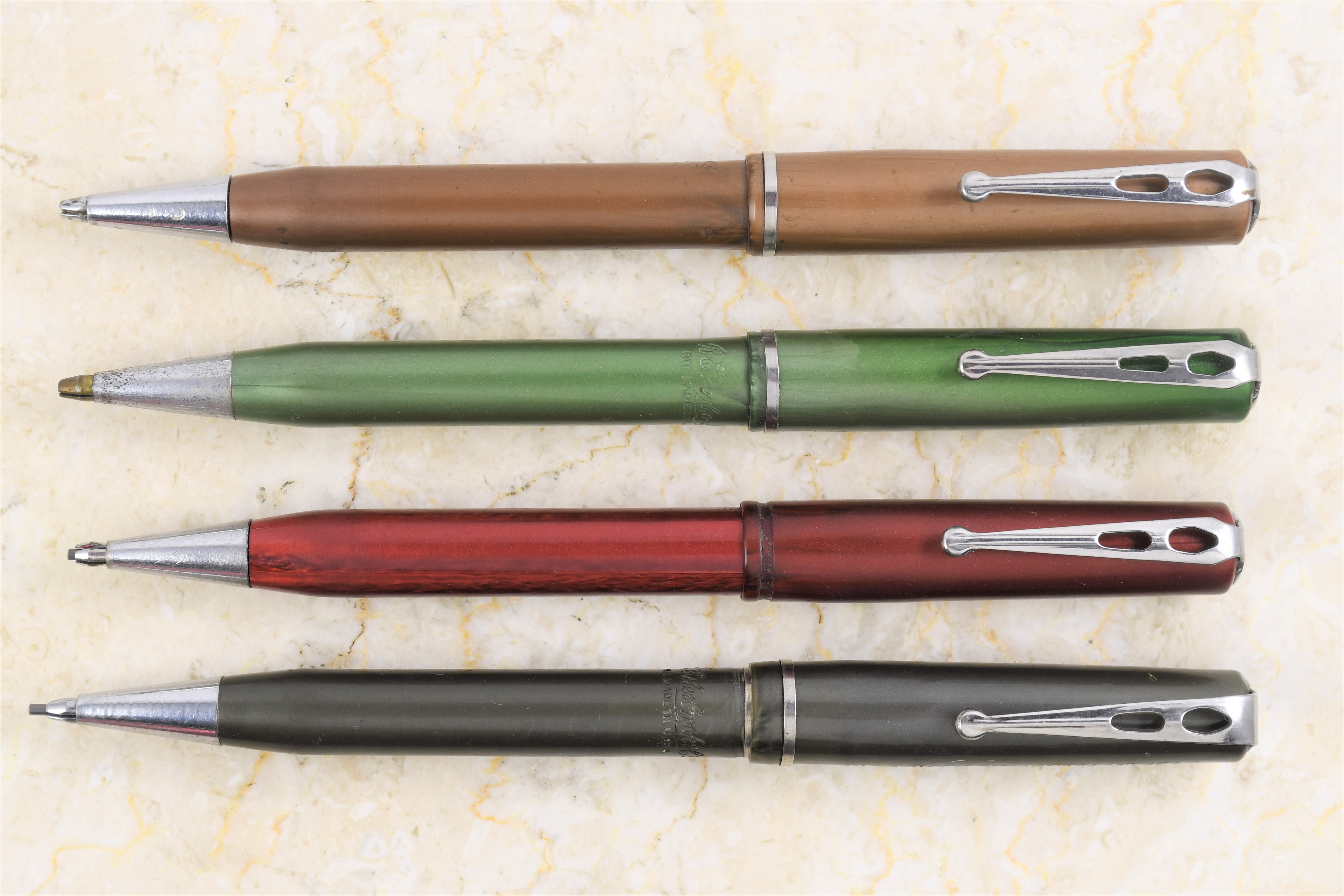
Instead of the usual marbled grey plastic, this one is flat gray, which leads me to the second reason these don’t get a lot of attention.  At some point, Esterbrook used a plain injection-molded plastic on the series, and these were plagued with shrinkage, warping and cracking.  Most of the examples look like they’ve been left in the sun too long, or were made for Salvadore Dali, and collectors pass them over due to poor condition:


These four are in reasonably good condition, although the red one has a split in the back of the barrel and none of them work very well, since the caps have shrunk to the point at which they don’t advance the lead very effectively anymore.  Still, from an archivist’s perspective, they are part of Esterbrook’s story worth telling.

But where do they fit in?  That’s the second reason my bidder’s number went up during the auction, even though I hadn’t previewed it and I was relatively sure it wouldn’t be in working condition:


The Bank of Montclair celebrated 50 years of service with this pencil in 1939.  Judging from how poorly these pencils (and the matching pens, too) have fared, I’m assuming this material was withdrawn very soon after it was introduced, so we know that Esterbrook was offering these towards the end of the plastic dollar pencil run, rather than at the beginning.

Monday, June 22, 2020

Esterbrook and the Lost Leadhead's Posts

This article has been edited and included in The Leadhead's Pencil Blog Volume 6, now on sale at The Legendary Lead Company.  I have just a few hard copies left of the first printing, available here, and an ebook version in pdf format is available for download here.

If you don't want the book but you enjoy this article, please consider supporting the Blog project here.

I am ecstatic one of these finally came my way:


It’s an Esterbrook, and for lack of a better, more correct designation, we’ll call it a “dollar pencil” – one of the earlier models with a clip sporting those two cutouts. 


I’ve got Paul Hoban’s book, Fountain Pens of Esterbrook, which was written in 1992 on an old-school typewriter.  It’s one of my favorites, harkening back to the days when everyone was writing books off the cuff.  Hoban’s work was unique, though, in that he was very careful to say when he was speculating – and in the absence of much information available at the time, he made that disclaimer a lot.  In the long run, that means (1) Hoban is reliable when he states something as fact and (2) unlike many other books of the day, time has been kind to what he wrote.

One of the things Hoban notes as fact is that by the time Esterbrook’s dollar pencils were introduced in the latter part of the 1930s, Esterbrook had mastered injection molding and incorporated it into its production methods as a means to cut costs - a brilliant strategy at a time when such measures meant survival while many others were failing.

These marbled celluloid Esterbrooks, though, were not injection molded and were made using traditional and more costly means.  Yet Hoban includes a complete copy of an Esterbrook catalog in his book, which he dates to late 1938 or 1939 - a set is pictured in the catalog, but it is identified only as a set.  No “de Luxe,” no “sooper dooper,” no nothing to set it apart from the regular line.  I know there’s a lot of guys out there who have spent more time researching Esterbrook than I have, and I’ll give credit where it is due to someone who can supply me a name for these accompanied by chapter and verse.  For now, I’ll just call them gorgeous, and I’ve been waiting to take this shot for a long time . . . waiting, in fact, for the day I’d finally cross paths with that lovely teal blue one:


Originally I planned to run this article on a lazy Sunday, since I have so little to contribute by way of original research.  But then I remembered that I have a few other Esterbrook subseries that I completed during my absence here at the blog, so there’s a bit more substance to add.  For example, I finally ran across a blue Pushmaster pencil to fill out this set:


I’ve been waiting for a brown one to come along, but as long as that may take to turn up, I’ll have to whoop and hollar about finding one another time.  

Then there’s these “doctor’s” and “nurse’s” pencils:


The little one I’ve had for awhile; the others all came from the estate of the late Jack Price, and Eric Magnuson tipped me off that this was going to be in the auction.  There are a couple other variations on this theme – I know that because Doc Liebman (or as I call him, “Larry”) and I went in on a larger grouping of these, one of which had a price band on it - Larry took that one:


And then there’s those pastels . . . those pastels . . . 

Dammit, I know I’ve shot those and I thought I posted all about them . . . 

I haven’t yet.  When I first started things back up again here in March, it was one of the first ones I wanted to circle back around to, and I just couldn’t lay my hands on those pictures.

Kudos to Joe Nemecek, who was prodding me for copies of the pages from John Loring’s old website (now long since defunct).  I knew I had pieced it together using the Wayback feature on archive.org, and like my wayward Esterbrook pictures I had no idea where I had put them.

As a last resort, I grabbed my backup storage drive and started browsing around.  Nothing, but I found a backup I had done of my entire hard drive a year or so ago.  There was a folder titled “Leadhead 6" – odd, I thought, since at the time I was sure I had concluded the blog series at five volumes.  And in that folder . . . 


The white one is the same as in the doctor’s pencils shown earlier, and I already had the middle shade of pink when all the others came my way at the 2018 Chicago show.  I also took photos to show that two of them have color-matched top “jewels”:


And three of the others had original price stickers identifying them as model TTH, for thin lead (.9mm or .036"), and listed at $2.50:


All of which I’m greatly relieved to show you . . . finally . . .as the finishing stroke to this article.  

But wait, as Billy Mays would say – there’s more.  My wayward Estie pictures weren’t the only thing in that file folder.  That Chicago Show was the one where I debuted the “Ghost Book,” now known as The Leadhead’s Pencil Blog (Volume 1).   

That book was a huge gamble – I was still stinging from the enormous cost of printing patent and trademark books that hadn’t sold very well, so I was nervous about the amount of time and money involved in printing a book containing articles people had already read – until Google wiped out all the images, of course.

I didn’t care.  I had to do it.  So I swallowed hard, printed fifty copies and divided up the printing and production cost by fifty – mine included.  If I sold out, I figured the experience would cost me a helluva lot of time and ninety five bucks.

The Chicago Show was an encouraging sign, with thirty or so copies going home with what would become Knights of the Order of the Leadheads.  Eh, it’s only money, I thought . . . a couple grand down and a great experience had in the process.  I retreated to my basement and started shooting pictures of my Chicago finds.

Then a funny thing happened.  Word got out, and the rest of them sold out within three weeks.  And many of those that bought them were demanding to know when the next volume would be available. 

I decided since  I was only down ninety five bucks, it was time to go double or nothing.  I set the blog aside for awhile, formatted a second volume of articles for print, and came back to blogging in November.

I forgot while all this was going on that I had fully researched and written eight articles in the weeks leading up to that Chicago Show, which would have started posting on May 8, 2018.  They were still a little rough, but it was all there . . . waiting for Joe to goad me into rummaging through an old backup looking for something else.

A couple of these articles ended up getting rewritten – from scratch because I couldn’t find them – and all of them are things I was positive I had written about (and did) and positive were posted at the blog (I didn’t).

So, for the next few days, I’ll be presenting the “Lost Leadhead’s” . . . 

Wednesday, April 22, 2020

Why I Think What I Do

This article has been edited and included in The Leadhead's Pencil Blog Volume 6, now on sale at The Legendary Lead Company.  I have just a few hard copies left of the first printing, available here, and an ebook version in pdf format is available for download here.

If you don't want the book but you enjoy this article, please consider supporting the Blog project here.

A couple weeks ago I divided the evolution of Parker’s pencil manufacturing into three epochs, “Ignore them,” “Oh crap” and “Screw it.”  If there’s die-hard Parker fans still reading this blog, God love you for having a good sense of humor about that!

Parker’s decision to outsource production of pencil mechanisms to Cross in the mid-1930s, I opined, signified the beginning of the “Screw it” period, after which Parker didn’t really show much interest in what went inside their pencils, as long as the outsides of them looked like their pens (the Liquid Lead pencils, I said didn’t count since they were just ballpoint pens using graphite paste rather than ink).

Over on Facebook, Mike Crawford asked a good question: so what about the Parker Vacumatic cap-actuated repeating pencils, like these?


All of these sport Made in U.S.A. imprints, all of which have date codes of 8 (the top three) or 9 (the bottom four), for 1938 and 1939:


Most cap-actuated repeating Vacumatics, if I remember correctly, were made in Canada.  My collection isn’t the best straw poll for that statement, since I steer away from Canadian models – not that I have anything against them, but since I don’t actively collect Vacumatics, it’s easier for me to keep fast to my “I only collect American pencil” excuse when someone tries to sell me one.  Not that I haven’t fallen off the wagon . . . at least once . . .


So what of my comment, that this is “what the insides of Parker Vacumatics look like after the “Screw it” era began”?


OK, you got me.  That’s what the twist-action Vacs look like.  But while the cap-actuated repeaters were totally different deal inside, they were exactly the same deal when it came to Parker’s attitude towards pencils.  I think Parker was still outsourcing mechanisms in 1938 when the Vacumatic was dressed up in cap-actuated trim . . . I just think it was coming from a different source:


Here’s that 1938 burgundy Vacumatic alongside a contemporaneous Esterbrook pencil.  Both cap actuated, and under the hood they are far too similar to be coincidental:


In both, the mechanism is secured to the barrel by a threaded bushing, which travels up and down between two protruding ribs on the mechanism’s outer tube.  The only difference between the Parker and Esterbrook is the location of the spring – on the Parker, the spring rests against that washer inside the front of the barrel, while the Esterbrook has the spring mounted behind a self-contained plug.

Now, I’ll be the first to admit that I don’t know all that much about Parker, and since Parker continued cap-actuated pencils well into the Parker 51 era, it’s possible that Parker actually did make these mechanisms themselves – maybe from the outset, or maybe after outsourcing them from someone else for a while.

Suffice to say that if it wasn't Esterbrook making these Vac mechanisms, whoever did was copying Esterbrook.

Sunday, October 14, 2018

Plaid Might Be Next

This article has been edited and included in The Leadhead's Pencil Blog Volume 5; copies are available print on demand through Amazon here, and I offer an ebook version in pdf format at the Legendary Lead Company here.

If you don't want the book but you enjoy this article, please consider supporting the Blog project here.

At the Raleigh Pen Show last June, the Saturday night auction featured a better than average selection of pencils, from the estate of the late Frank Tedesco, including these jaw-droppers:


These are early Esterbrook pencils - those with plain silver barrels were cataloged as the “PS” pencils, for “Push Sterling.”  One of these two is sterling, with a nice crisp imprint – unusual since they were stamped right where they were likely to wear off from the friction of the cap:


The other is gold filled – not cataloged and exceedingly rare.  There’s some pitting in the finish and the imprint isn’t as nice, but you won’t hear me complain:


What places these two just a bit farther to the left of “holy cow” in terms of rarity are the longitudinal lines running the lengths of the barrels and up the caps.  They nicely complement the ringed pair that I picked up from Jim Ryan’s family at the Ohio Show last November (see page 213):


All together, they make for a stunning new family portrait:


Tuesday, April 3, 2018

Must Be a PGF?

This article has been edited and included in The Leadhead's Pencil Blog Volume 5; copies are available print on demand through Amazon here, and I offer an ebook version in pdf format at the Legendary Lead Company here.

If you don't want the book but you enjoy this article, please consider supporting the Blog project here.

At the Ohio Show last November, I purchased a large collection of pencils from Chicago collector Jim Ryan, who passed away last year.  These two were among them:


I pulled them aside as something that interested me; I couldn’t put my finger on what they were at first, but I knew they were something I didn’t want to let go.  The lines on the barrel are reminiscent of something made by Hicks:


I think that’s what threw me off – if these had the plain smooth barrels I was used to seeing, I like to think it wouldn’t have taken me so long to place what they were:


These are Esterbrook PS pencils, cataloged in 1934.  I wrote about them here in October, 2016 (https://leadheadpencils.blogspot.com/2016/10/the-end-or-beginning.html) and mused about the similarities between the Esterbrook and the Selfeed, a repeating pencil that disappeared just before the PS appeared on the scene. 

I pulled the caps off to check the imprints, and there they were - as good as can be expected, since the imprints were put right where the cap rubs against the top of the barrel.  The lettering on the gold filled example fared a little better:


The sterling one would be tough to make out if you didn’t know what you were supposed to be seeing, but the “brook” part of the imprint is still legible:


A sterling example surfaced a couple of years ago on Fountain Pen Network in this ringed pattern – leading Brian Anderson to comment on the extreme rarity of the Esterbrook PS in general, compounded by the uniqueness of the ringed engine turning.  A gold filled example? I haven’t been able to find any references that they have been documented

In fact, think about it . . . the Esterbrook PS was named for the fact that it was a “Push” (repeating pencil), in sterling . . . PS.  So the only named by which we know to refer to these doesn’t fit what it is.  So what might this have been?  A PGF for Push in gold fill?

Or an SDPGF, for a super deluxe Push pencil in gold fill?

Sunday, March 4, 2018

A Pushmaster Tutorial

This article has been edited and included in The Leadhead's Pencil Blog Volume 5; copies are available print on demand through Amazon here, and I offer an ebook version in pdf format at the Legendary Lead Company here.

If you don't want the book but you enjoy this article, please consider supporting the Blog project here.

On page 54 of The Catalogue of American Mechanical Pencils, I mention the Esterbrook Pushmaster as an “Esterbrook variant to watch for.”  Recently I was able to pick up a red one from Eric Magnuson :


It joins the green example shown in the book


The model was introduced around 1941 – possibly earlier, as I found a black example commemmorating the New York Worlds’ Fair of 1939-1940 that I wrote about back in 2012.  Google wiped out the pictures, but I was able to find them on my hard drive:


What I should have done, either in the book or here at the blog, was show the Pushmaster next to its more common cousins for comparison:


The Pushmaster shares the longer nose from the earlier Dollar pencil series, and the trim band and clip of the later models . . . and the plastic from neither.  My favorite feature of the Pushmaster, though, is the top: these don’t have the name on the clip itself, but there’s a great Esterbrook logo in the place of a black plastic “jewel”: