Saturday, August 26, 2017

The Oxymorons

This article has been edited and included in The Leadhead's Pencil Blog Volume 5; copies are available print on demand through Amazon here, and I offer an ebook version in pdf format at the Legendary Lead Company here.

If you don't want the book but you enjoy this article, please consider supporting the Blog project here.

“Nice Arnold....”  two words that you don’t normally associate with each other.  Sure, the colors are nice, but Arnold brand pencils, made by Remmie Arnold in Petersburg, Virginia, are generally otherwise . . . not nice. 

These two, however, defy the norm for the brand:


The large black and pearl must be from very early on after Arnold acquired the Edison Pen Company.  The clip has a nicely detailed logo:


And the imprint is reminiscent of the elaborate Edison imprints (see http://leadheadpencils.blogspot.com/2016/12/one-heckuva-imprint.html):


With respect to the other pencil, before you dismiss it as “just an advertiser,” have a closer look at what it advertises:


“R.L. Arnold Pen Company, Inc. / Petersburg, Virginia, USA / Manufacturers of / Fountain Pens and Mechanical Pencils.:  Not bad at all . . . a pencil advertising pens!


Friday, August 25, 2017

Which Liberty?

This article has been edited and included in The Leadhead's Pencil Blog Volume 5; copies are available print on demand through Amazon here, and I offer an ebook version in pdf format at the Legendary Lead Company here.

If you don't want the book but you enjoy this article, please consider supporting the Blog project here.

This addition fell in the have-to-have-that-cool-name category:


The quality is just so-so, with a cap that isn’t even quite the same color as the barrel.  But “Liberty” is such a great name for a pencil:


When I went to track this one down, I found some conflicting sources.  There was both a “Liberty Fountain & Gold Pen Company” and a “Liberty Fountain Pen Company” in New York.  In 1917, The American Stationer published a directory in which the former was listed under gold pen points (nibs) at 380 Canal Street, New York, while the latter was listed under fountain pens at 69 Cortlandt Street:


American Writing Instrument Trademarks 1870-1953 was particularly helpful with this one.


The trademark was registered on August 10, 1926 as number 216,284.  It was filed by Edward Turnberger, President of The Liberty Fountain & Gold Pen Company at the Canal Street address.  He claimed that the company, and its predecessor, G.F. Barrett, had used the name since August, 1911.


I think the two companies were one and the same, notwithstanding the separate listings in The American Stationer.  Prior to 1916, the Liberty Fountain & Gold Pen Company was located at 69 Cortlandt, as shown in thiese advertisements:


The Bookseller, Newsdealer and Stationer reported on May 15, 1916 that the Liberty Fountain & Gold Pen Company had relocated to larger quarters at 380 Canal Street:


And then there’s this, posted by user Bordeaux146 over on The Fountain Pen Network:


The box uses the abbreviated name at the Canal Street address, while the instructions identify the longer version – at the same address.  The answer to the question “Which Liberty?” is . . . both.

Thursday, August 24, 2017

The Hicks Variation

This article has been edited and included in The Leadhead's Pencil Blog Volume 5; copies are available print on demand through Amazon here, and I offer an ebook version in pdf format at the Legendary Lead Company here.

If you don't want the book but you enjoy this article, please consider supporting the Blog project here.

Here’s another one that turned up while I was reorganizing the museum:


The pencil extends to its full length as it is drawn from the case:


I’ve written about a nearly identical pencil made by Edward Todd (see http://leadheadpencils.blogspot.com/2014/12/i-was-hoping.html and http://leadheadpencils.blogspot.com/2016/10/more-interesting-edward-todds.html).  Here they are next to each other:


The Edward Todd version was patented by James B. Smith on August 9, 1892, as number 480,479:


The Hicks, version, however, says something else:


“Hicks Pat. July 13, 97.”  In American Writing Instrument Patents 1799-1910, you’ll find this date corresponds to patent number 586,495, issued to Edward D. Hicks:


The only difference between the two is where the case grips the pencil; on the Todd version, the pencils tip is seated into the gripping area.  In the Hicks variation, it’s the second stage of the pencil which is secured inside the case, so the Hicks variation does two things at once as the pencil is drawn out: at the front end, the friction advances a magic pencil.  At the other end, it telescopes the other sections into position.

Wednesday, August 23, 2017

Johnson's Influence

This article has been edited and included in The Leadhead's Pencil Blog Volume 5; copies are available print on demand through Amazon here, and I offer an ebook version in pdf format at the Legendary Lead Company here.

If you don't want the book but you enjoy this article, please consider supporting the Blog project here.

Here are a couple nice Victorian pieces with something in common:


Both have distinctive mother of pearl slabs, and usually, these are stamped “Pearl Pat. Dec. 5 ‘71,” a reference to patent number 121,627 issued to Ephraim S. Johnson:


These two examples, though, have a twist – on figuratively, one literally.  The conventional magic pencil shown at the bottom is larger than average size, measuring a hair longer than four and a half inches extended (4 3/4" if you count the ring on top).


Instead of the Pearl patent imprint you’d expect to see, though, this one is stamped only Aikin, Lambert & Co.:


This is the only Aikin Lambert I’ve seen with the pearl slab treatment.  I don’t think it was made after Johnson’s patent expired, but it might have been.  Cross-licensing of patents appears to have been the norm amongst New York manufacturers; in fact, I found this fascinating piece in the June 16, 1892 issue of The American Stationer, in which all of the major houses, including both Aikin, Lambert & Co. and E.S. Johnson, agreed to “stop the competition” and establish a secret price-fixing schedule:


That was the figurative twist.  Now for the literal one: that other pearl-slabbed item has a much larger diameter, because there’s a lot going on inside.


At one end, the extender can be pulled out and then the top end twisted to advance a Rauch-like mechanical pencil:


Then here’s the twist: by turning the entire extension tube, a dip pen nib is advanced, in much the same way as a much later safety fountain pen:


The nib is a Mabie Todd Number 5, maybe it is original, but of course it might have been a replacement.


The patent markings are on the pencil end.  On one side is Johnson’s December 5, 1871 patent:


But on the other is a patent date I had not run across before: July 3, 1866:


It’s times like these when I’m glad I wrote American Writing Instrument Patents 1799-1910, since it certainly hasn’t been those times when I’ve waited for it to hit the best seller list in the New York Times.  There was no fumbling around trying to find the patent . . . I just opened up the book to that date, and there it was:


The date refers to James M. Clark’s patent number 56,007.  Since the presence of Johnson’s patent date on the piece suggested more of a connection between Johnson and Clark (as we saw with the Aikin Lambert, others who merely licensed a patent wouldn’t also include the patent date), I turned to another portion of my book which excels at distilling relationships between makers, and there it was:


In the section of the book in which patents are organized by inventor, there are five patents issued to James M. Clark.  This one, number 118,434, was issued on August 29, 1871, just four months before Johnson’s pearl patent – and this patent was assigned to Ephraim S. Johnson.

For the time being, I’ve placed this example on my shelf, alphabetized under Clark rather than Johnson.  There are three other Clark patents out there, and finding examples of each might better establish whether Clark was a manufacturer in his own right, whether he sold or licensed patents to several New York makers, or whether he was merely an employee of Ephraim S. Johnson.

Tuesday, August 22, 2017

The Two Yankees

This article has been edited and included in The Leadhead's Pencil Blog Volume 5; copies are available print on demand through Amazon here, and I offer an ebook version in pdf format at the Legendary Lead Company here.

If you don't want the book but you enjoy this article, please consider supporting the Blog project here.

The Yankee appears on page 174 of The Catalogue of American Mechanical Pencils:


I included it in the book, even though it is marked “Made in Germany,” since it’s got about as American a name as you can imagine, and it’s even got red, white and blue on there (even though they are mixed in with a very continental-looking combination of purple and orange).  Besides, there’s enough of them floating around over here to lead me to believe that they were regularly marketed in the United States.

Recently I came across another Yankee, of a different sort:


This Yankee has a sliding outer barrel which telescopes over the inner barrel, with the lead fixed in place so that as the outer barrel is slid down over the inner barrel, more lead protrudes from the end.  This is the same mechanism found on the Dow pencil from “The Real Housewives of Minneapolis” (see http://leadheadpencils.blogspot.com/2012/07/real-housewives-of-minneapolis.html).


I’ve known about the metal Yankee for some time – ever since Joe Nemecek allowed me to photograph his examples at the 2013 Raleigh Show, with a different camera and terrible lighting, but successfully enough that you get the idea:


These were made by the Yankee Pencil Company, 655 South Wells Street, Chicago:


Was there any connection between the Yankee Pencil Company and the German-made ones shown in The Catalogue?  Until this year, I didn’t know – which is why these photographs have been languishing in the dead letter office for so long.  But now, thanks to a terrific new book, I can answer that question definitively:


In the course of researching American Writing Instrument Trademarks 1870-1953, I found two trademarks for the Yankee name, both of which (along with more than 2,200 others) are included in the book.  The later of the two filings matches the logo on the clips of the metal Yankees:


In addition to the information on Joe’s display card, we now know from trademark number 533,578 that this version of the Yankee logo was first used on October 18, 1947, and the President of the Yankee Pencil Company was David Collins.

The earlier filed trademark matches the logo found on the Yankee listed in The Catalogue:


Adolf Grunbaum, as President of the Export Underwriters Corporation (13 East 16th Street, New York) filed for trademark number 200,568 on February 4, 1925 - claiming to have used this version of the Yankee script since December 15, 1924.

No, there was no connection between the two Yankees.

(Note: American Writing Instrument Trademarks 1870-1953 is available at http://www.legendaryleadcompany.com/store/c2/Books_by_Jonathan_Veley.html.)

Monday, August 21, 2017

Speaking of Eclipses . . .

This article has been edited and included in The Leadhead's Pencil Blog Volume 5; copies are available print on demand through Amazon here, and I offer an ebook version in pdf format at the Legendary Lead Company here.

If you don't want the book but you enjoy this article, please consider supporting the Blog project here.

The day of the Great American Eclipse seemed the perfect opportunity to share some Eclipse pencils, now that my museum reorganization project has them all neatly organized in a printer’s cabinet.  The first row starts with the earliest “Never Dull” and “Fin-Sharp” (after Marx Finstone, the founder) pencils, followed on the right by early Eclipse-marked versions:


The next row starts off with a transitional overlay pencil and two ultra-unusual Eclipse repeating pencils based on the Presto.   Then come what I believe are the finest examples of the brand, lavish and oversized flattop pencils with flared caps and Eclipse’s patented 1925 clip:


This next tray features similar Eclipses, but in lesser colors and with plain black caps.  I’ve always thought these were probably later versions of the flared cap flattops, but I don’t have any documentation of that suspicion.  As for the ones with straight gold-filled caps, I would tend to believe they are earlier than the flared top pencils in the preceding picture . . . but again, I don’t have any documentation:


This next tray features pencils very similar to the oversized flattops in the preceding two photos, but with straight, black hard rubber caps.  The pencils on the right show the influence of the Sheaffer Balance which became popular in 1929, leading me to believe they were made in the early 1930s:


Then there are the later Eclipses, which tend to be long on style and short on technical innovation.  All of these are nose drive, middle joint pencils.  Note that a couple on the left have stepped top caps like the company’s Monroe subbrand.  I suspect those with the flat black top caps mght be Canadian.  The four on the left are Eclipse “Streamline” pencils - the red lizard pattern is my newest addition.  The blue one with the wide gold center section is a “Hooded Knight”:


And here are a couple Eclipse subbrands.  Most of these are Marxtons (again, taking their name from the company’s founder, Marx Finstone); those on the right are “Vogue” pencils identical to the Eclipse Streamline, as well as a couple others with that same clip (the “Non-Stop” and the “Linton”:


What about the Monroe?  I decided they were far too pretty to confine to a drawer.  They remain proudly displayed on the wall o’ pencils.

Finally, there’s this:


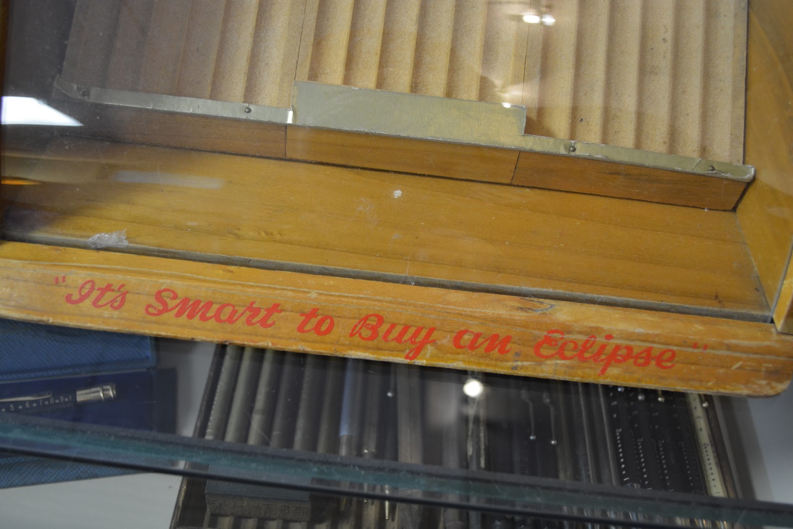
Rob Bader brought this to the Raleigh show a couple years ago, and I haven’t figured out what to do with it yet.  I’ve never seen an Eclipse display case before, but this one is incomplete and only holds 18 items . . . Rob hadn’t told me a price yet and I was hesitant to make an offer.  Those who know Rob will chuckle when I tell you I remember his exact words to me at that moment, delivered in that Memphis drawl of his: “I am telling you I’m NOT taking it home with me, so what are you willing to give me?”

Rob was right – he didn’t take it home.  Someday maybe I’ll find a top to fit it (strainger things have happened), and someday maybe I’ll figure out which 18 to display in it.  Of course, maybe I’ll buy 18 more.  After all:


“It’s Smart to Buy an Eclipse.”