Friday, July 16, 2021

Who Else . . . Part Two

This article has been included in The Leadhead's Pencil Blog Volume 7, now available here.
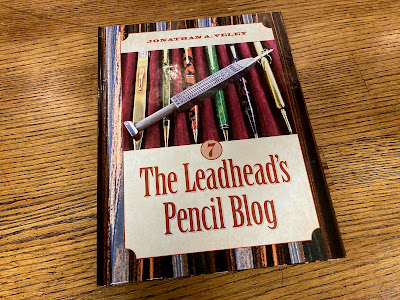

If you don't want the book but you enjoy the article, please consider supporting the Blog project here.

On May 18, I published an article musing about whether a jade golf pencil I had found might have been made by Sheaffer.  A major consideration weighing in favor of that possibility was Sheaffer’s design patent covering golf pencils in that distinctive teardrop shape (design patent 80,362), coupled with Sheaffer’s notorious reputation for stamping out any infringement, through threats and litigation.  

As mentioned earlier, William Cuthbert and Earl Sodeberg applied for the golf pencil design patent on August 30, 1929 – long after applying for the patents for the pencil, pen and combination pen and pencil, seemingly as an afterthought.  The fact that Sheaffer sued Eagle for violations of those other three patents, but apparently gave Eagle a pass on the “Jot Jr.” golf pencils, suggests that perhaps Sheaffer thought twice about trying to enforce its golf pencil design patent; maybe because it was unenforceable, and maybe because it was invalidated.

I still believe its possible Sheaffer made that unmarked pencil from my earlier article.  However, I might have leaned too much on Sheaffer’s design patent, after this one turned up:


The color is generally referred to as “Brazilian green,” because that is what it was called by the company that made the greatest use of it: Wahl-Eversharp.  Celluloids were sourced from other companies, most notably DuPont, and other examples of writing instruments made from this plastic have turned up on pencils made by other companies (offhand, Waterman and the “Ford’s Deluxe” come to mind).

However, the strong association of Brazilian green with Eversharp had me opening my drawer of Equipoised-era pencils:


The top example is clearly marked, and while collectors refer to these as “Eversharp golf pencils,” it is made up of parts from an Eversharp convertible set: the front end doubled as the pencil portion of a combination pen and pencil, and the set included both that short cap for pocket use as well as a desk taper.  In the early days, I captured a poor photograph of Cliff Harrington’s set when he displayed it at the Chicago Show in 2012 (see Volume 1, page 217):


As for those other two golf pencils . . . the tapered flattop one is unmarked, but it was sold to me as an Eversharp by a member of our community who knows his stuff - I won’t say who, because I’m not entirely sure about that now, and I’m not suggesting I was misled.   

Then there’s the Sheafferesque example, with a shape that should have triggered a patent dispute . . . IF someone other than Sheaffer made it, IF it was made after Sheaffer’s patent was filed, and IF Sheaffer’s patent was enforceable.  Attributing this one to Eversharp is equally thin:


IF this is from Eversharp’s stash of Brazilian green, IF Eversharp made both marked and unmarked golf pencils, IF Eversharp added gold bands to some of them, IF Eversharp used triangular loops on their ringtops, and IF Eversharp dared to openly defy Sheaffer’s patents.

OK, maybe a little less thin because that last IF isn’t just an if, because Eversharp DID . . . 


This model is illustrated in Eversharp’s 1929 catalog, and after Sheaffer promptly cried foul it was quickly withdrawn.  There’s a progression here: note the difference between the two ringtop examples shown:


There were two versions of the ringtop, the one with a flattened area at the top like the known Eversharp golf pencil was made after Sheaffer complained, to replace the ones that were streamlined all the way to the top, just like a Sheaffer Balance.

The parts are not interchangeable between my imprinted Eversharp golf pencil and either of the other two.  Can I say conclusively that my Sheaffer-shaped golf pencil in Brazilian Green was made by Eversharp?  No.  But I’m more likely to attribute it to Eversharp than to Sheaffer.

Thursday, July 15, 2021

Long Way Around the Barn . . . Twice

This article has been included in The Leadhead's Pencil Blog Volume 7, now available here.


If you don't want the book but you enjoy the article, please consider supporting the Blog project here.

Last October, I had retreated to my cabin for the evening to cozy up with a portable heater, a glass of Scotch, and my laptop.  I’ve fixed it up into the perfect writer’s retreat, a place where free of distractions I can be alone with my thoughts and dive deep into subjects that require intense research and thought.


That particular evening, though, I wasn’t feeling it . . . and within twenty minutes or so there I was, idly thumbing through online auction listings.  I saw something kind of interesting being offered by eBay seller “adamsjewelryspecialists”:


The faces struck me as unusual, and the listing title described it as made of “carved tigers eye,” but the pictures looked like it might be wood rather than stone.  The auction pictures included a better shot of the extender, marked with a patent date of December 19, 1876:


I pulled out American Writing Instrument Patents 1799-1910, and I didn’t report any patents issued on that date in the book – that told me this was another one of those patents you’ll never find without an artifact like this in hand, because it was probably for some manufacturing technique not listed specifically for writing instruments in category 401. 

I threw in a healthy bid, since I’m always a sucker for an example with a patent date not represented in my collection.  With an hour or so to spare before the auction closed, I started tracking down the patent the old-fashioned way: since the description for all the patents issued on that date was “Title is not available,” going through each patent issued on December 19, 1876, one by one was my only option.

There were 237 patents issued on December 19, 1876; I found one, then started working my way backwards until I reached the patent issued on December 12 – nothing.  Then I started working my way forwards, until I found it.  Cool!  The patent was for a method of boring and carving stone for use on a pencil barrel – the auction’s description of “Tigers Eye” was perfectly accurate, and this piece, with its intricate carving, is an exquisite little miniature sculpture!

I went back to the listing to up my already healthy bid – only to find that the auction had closed and I had lost.  It wouldn’t have mattered: there was no possibility I would have won this time since it went for several hundred dollars more than I was willing to pay.  Figural pencils sell for significantly more than the usual fare, and apparently the carved faces made this pencil “figuralish” enough to fall into that category.  I was relieved that I didn’t need to beat myself up for getting so caught up in research that I lost track of time.

The seller gave me permission to use these pictures, so I tucked the images away into my fodder folder for future articles . . . and I forgot about them.

Six months later I was on my way to the Krinke auction, where I was going to be bidding on things for myself and a few other guys, including Joe Nemecek.  There wasn’t much in the Krinke auction as far as Victorian pencils were concerned – just a few lots of unmarked slider pencils and parts.  Only one piece was on Joe’s wish list, and I knew he would want it:


It only looked to be a little unusual, with an oversized hexagonal barrel and alternating vertical and horizontal ribs on its facets.  The extender had me mildly intrigued, but not enough to arm wrestle Joe for it – besides, as long as he won it, I’d had time to bring it home and take some decent pictures of it before delivering it to him.  Had I remembered what happened six months earlier, though . . . 


“Edward Todd & Co. / ??? Dec. 19 1876.”  I want to believe those letters before the date are “PAT.,” but it looks more like remnants of what could be “CAN.”   Regardless, I think it’s a reference to that same patent; maybe by coincidence a Canadian patent was issued on that same date, or maybe Edward Todd just didn’t want to send one up north without a little fig leaf of intellectual property protection. 

It’s a little embarrassing that I didn’t make the connection until I sat down to write this article.  What’s even more embarrassing is that I forgot to document the patent when I found it last October.

Sigh . . . back to the patent database I went . . . started in the middle of the December 19, 1876 patents . . . worked my way down to number 185,382, the first one issued on that date . . . then working my way back up. Along the way, I found two patents for manufacturing man-made stone (numbers 185,456 and 185,554); possibly maybe, I thought, but neither patent mentions applications to writing instruments and without any patent drawings, neither gave me the eureka moment I remembered having the last time I did this search.  

Finally, I found it.  Patent number 185,562 was issued to Joseph Monaghan, who had applied for it on June 16, 1876.  


Monaghan’s patent is certainly the one referred to on both of these pencils: first, its application is specific to “pencil-cases,” and second, Monaghan was the immediate predecessor to the partnership he formed with Edward Todd on September 1, 1870.  At the time this patent was issued, Monaghan and Todd were the two principals in Edward Todd & Co. (see “From Bagley To Todd,” a three-part series beginning in Volume 5, page 174; Todd’s partnership notice with Monaghan appears on page 179).

Even though the title of Monaghan’s patent is “Improvements to Pencil-Cases,” the patent was not cross-referenced in Category 401, even though it should have been.  Neither is it filed alongside Ephraim Johnson’s “Pearl Patent” of December 5, 1871, in category 138, subcategory 140.  Whoever filed this patent didn’t know where to put it, in the same category 138 (“Pipes and tubular conduits”), but in subcategory 178: “Miscellaneous.”  

Every assistant who has ever worked for me knows there should never be a “miscellaneous” file for anything – if there isn’t an appropriate place to file something new, create one so we can find it later.  Otherwise, you’ll have a huge file folder of all this random stuff and you won’t be able to find anything.  

That’s what has happened to subcategory 178: there’s 767 patents filed there, with no common theme other than someone was too lazy to find an appropriate place to put them.  Even professional patent researchers must have torn out their hair many times knowing that their research is incomplete as long as an unchecked “miscellaneous” folder exists, with hundreds of patents to sift through, one by one . . . or in my case, twice.

NOTE: when I pulled the index of all the patents in subcategory 178 to see how many patents were filed there, the Monaghan patent was (by chance) the first one listed.  After checking a few dozen others, the subject matter I found was truly random – no other writing instrument patents were found, and I gave up the search.


Wednesday, July 14, 2021

Time To Get Serious

This article has been included in The Leadhead's Pencil Blog Volume 7, now available here.


If you don't want the book but you enjoy the article, please consider supporting the Blog project here.

This pencil was advertised as “gold tone” . . .


That’s some serious “tone.”  You had to read the entire description to see “Item is marked 14 ct and some other letters I can not read.”  


Nobody was reading descriptions that day, and it came home for $22.99.  At that price, I didn’t grouse about the shipping charges – the letters the seller couldn’t make out are an H, with a W above the crossbar and an S below it, the “Big H” mark for W.S. Hicks, and yeah . . . it’s solid gold.  

But that’s not why I’m excited about this one.   All right, maybe that isn’t the only reason I’m excited about it.  I have just one other pencil in this unique shape, and I haven’t written about it here yet:


Both of these have a three-stage extendible pencil inside, an homage to the Hicks version of the same pencil patented July 13, 1897 (see Volume 5, page 96).  


However, the commemorative engraving on the new addition reads 1921 - much later than the original patent, but much earlier than it looks:


I found the larger one at the Springfield “Extravaganza,” that indoor/outdoor antique show that never disappoints.  The dealer who had it knew it was solid gold, and I just HATE paying for gold.  I saw, I asked how much he wanted, and I told him I would think about it, thinking I’d check back in at the end of the day.  He softened a little bit when I stopped back close to closing time, but not much . . . still, I couldn’t resist because of what’s stamped on the barrel:


“DV,” or maybe “VD.”   I’ve been saving this one for the day when I finally figure out that hallmark – I sent out a distress call about it years ago (Volume 3, page 233), in connection with a sterling pencil which appears to be patented by Hicks in 1918 (see Volume 3, page 231 for the article about the Hicks patent).  


This makes two instances in which the DV mark appears on pencils which appear to have been made by Hicks:


But for whom?  Fortunately, I’ve got a few research tools I didn’t have when I last posted about “The Mystery Mark” in 2015.  Unfortunately, the DV mark didn’t surface as I was writing one of them, American Writing Instrument Trademarks 1870-1953; all that means, though, is that the mark wasn’t registered with the United States Trademark Office for use on writing instruments.  Maybe it is an unfiled mark?  For that possibility I turned to the excerpts from Trade-Marks of the Jewelry and Kindred Trades published in the appendix to the book – unfortunately, the mark isn’t listed there, either.

Maybe, since Hicks was making these pencils for someone else, that someone was involved in one of the other “kindred trades”?  I have complete copies of the 1904, 1915, and 1922 editions of Trade-Marks of the Jewelry and Kindred Trades, so I rolled up my sleeves and started poring through them page by page, until I found it, listed under “watches”:


The exact mark was used by Maurice “Didisheim” (that’s a typographical error, it should be Ditisheim) of Ditisheim & Cie (company), the Swiss watchmaking firm.


Maurice Ditisheim (1831-1899) founded Ditisheim Manufacture in La-Cheaux-de-Fonds, Switzerland in 1858; in 1894, he introduced a model of pocket watch called the “Vulcain,” and that same year he renamed his firm Vulcain Manufacture.  The Ditisheim name, however, continued to carry significant weight, with several members of the family engaged in other Swiss watchmaking firms (one of whom coined the Movado brand name).

Vulcain’s greatest contribution to watchmaking was the development of an alarm watch, introduced in 1947 as the Vulcain “Cricket.”  After several mergers and a hiatus during the 1980s when demand for mechanical watches collapsed with the introduction of quartz movements, the brand was relaunched in 2001.

Watches and writing instruments go hand-in-hand as luxury accessories, so it’s no surprise that a watch company would seek to offer pencils to accompany them.  Tiffany & Co. and Cartier also did so, and just like Vulcain, these firms had Hicks make pencils for them, too.


Tuesday, July 13, 2021

Ten Oversights

This article has been included in The Leadhead's Pencil Blog Volume 7, now available here.


If you don't want the book but you enjoy the article, please consider supporting the Blog project here.

Something was bothering me while I was writing yesterday’s article about the Parker Zaner-Bloser.  I dug deep into my well of prior research looking for chapter and verse regarding the design patents for the unique shape. . . all the way back to Volume 1, when I was writing about those crappy plastic and wood pencils (remember, of course, that “crappy” does not mean I don’t like them, nor that I don’t have a few):


The published article (Volume 1, page 380) included images of two design patents: the first one for the penholder, and the last one for the mechanical pencil.  Those were the two patents I dove back into that file folder to find - imagine my surprise to find in the image folder that in addition to those two, I also had images of design patents for the double-ended penholder and the “true blue” Zaner-Bloser” fountain pen.

It would be another two years before I would write American Writing Instrument Patents Volume 2: 1911-1945, so I must have found these two patents the old-fashioned way . . . poking and prodding the internet until blind luck favored me with a result - and since they weren’t strictly pencil-related, I apparently never published them.

Big mistake.  Huge.

When I wrote the patent books, I followed a methodology that worked remarkably well: I started with the utility patents filed with Category 401, then branched out into “known” categories in which I’d found artifacts.  This caught a lot of other patents which wouldn’t otherwise have made it into the book, since they weren’t filed in categories that were strictly pen or pencil related

The best example is Ephraim Johnson’s “pearl patent” of December 5, 1871, number 121,627.  Although we associate Johnson’s patent with pencils, it was filed in category 138, subcategory 140: “pipes and tubular conduits,” “distinct layers.”  The only reason I knew to include it in the book was because I had seen it imprinted on so many pearl-slabbed pencils.

As I was writing the patent books, I went back through all the articles I had posted at the blog and went through all the categories in which the patents were filed that I’d written about.  In the case of the Parker Bloser patents . . . well, I ran down the categories for the two patents that eventually ran in the article, fully explored the and faithfully reported everything I found. 

As for the two that didn’t make the cut?  Oops.  They were filed in obscure subcategories I never explored.  The oversight wasn’t a total loss; patents are frequently indexed under several different categories, most of the patents in those categories made it into the book because they were cross-indexed in other categories I had checked.  However, ten design patents -- including these two -- got past me. 

Design patents are found in category D19, “Office supplies; artists and teachers materials,” and the subcategories are insane.  Parker Z. Bloser’s design patent for the double-ended penholder was filed in subcategory 117: “Equipment for writing, drawing, or for fine arts: opposed tips.”  Nearly everything that was filed in that category was also filed somewhere else, with one fun exception:


Gilbert Nelson of Clear Lake, Wisconsin received Design Patent 74,119 on December 20, 1927.  In this case, one of the “opposed tips” is a pencil – the other, however, is a pencil-shaped lollipop.

The Zaner-Bloser fountain pen (Design patent 82,309) was filed in category D19/168: “Marking or writing instrument,” “including a cap,” “cap or barrel includes a clip,” “barrel has combination of shapes in side view.”  Seven other design patents were also squirreled away in this category – seven which didn’t make it into the book but should have.

1. Design patent 107,438, issued to Charles J. MacNally of Jamaica, New York on December 14, 1937, for a combined fountain pen and check protector:


2. Design patent 124,609, issued to Louis Morrison of New York, New York on January 14, 1941 – this illustrates the Morrison “Black Beauty” pen:


3. Design patent 124,725, issued to David Ornstein of New York, New York on January 21, 1941, for a pen with a watch set into the top:


4. Design patent 138,826, issued to Maurice Waldinger, Jr. of Flushing, New York on September 19, 1944:


5. and 6. Design patents 139,904 and 139,905 were both issued to Abraham Baff of North Arlington, New Jersey for versions of a pen with a flattened barrel:


7. Design patent 141,859, issued to Martin Ullman of New York on July 10, 1945, and assigned to Maurice J. Waldinger:


There are probably other categories in Design group 19 that eluded me - I started spot-checking some of the others and so far, I don’t think I missed anything else.  There’s been several articles here with other patents that weren’t in the book, but they only surfaced because an artifact was found with an imprint leading to a category I never would have thought to check.  This time, darn it - these were right under my nose.

Monday, July 12, 2021

The Long Road Home

This article has been included in The Leadhead's Pencil Blog Volume 7, now available here.


If you don't want the book but you enjoy the article, please consider supporting the Blog project here.

The Parker Pen Company made fountain pens and pencils for the Zaner-Bloser Company of Columbus, Ohio.  They are exceedingly rare, but I have managed to find a few examples:


These are easy to spot with their coke-bottle shaped, ergonomic form, which was protected by design patents.  The earliest patent was for a dip pen holder only, and was issued to J.F. Barnhart on September 10, 1891 (design patent 35,059, pictured in Volume 1, page 380).  

Parker Z. Bloser secured design patents for other variations on the Zaner-Bloser shape.  On April 17, 1928 he applied for one for a double-ended pen holder, which was granted July 17, 1928 as Design Patent 75,772:


On August 5, 1930, he applied for a fountain pen version, issued October 21, 1930 as Design Patent 82,309:


And on May 13, 1936, he applied for a patent for the shape applied to a mechanical pencil, issued August 18, 1936 as Design Patent 100,845


Even if I weren’t writing this blog and documenting finds as they arrive, I’d remember where all but one of these originated.  It started with the Modernistic (“True Blue”) set at the bottom, which came, complete with a bit of smoke damage, from Ginger Welch – she was liquidating Stan Pfeiffer’s collection after the house fire that took Stan’s life (see Volume 2, page 2).  

The green one in the middle came from Dan Zazove (see Volume 4, page 135), and the pen just above it was sold to me by George Rimakis.  The only one of these for which I don’t recall the source is the black ringtop at the top.

That leaves that greyish green example, in a plastic that resembles Parker’s “Zephyr” plastic, but the color is just a shade more green.  I wrote about it in Volume 3, page 83 – it was a long wait for that pencil, with a couple of years intervening between when its owner first posted it online and when he took me up on my offer to take it off his hands.

I couldn’t remember his name at the time I wrote the article, but in the last year he has resurfaced: Gabriel Galicia Goldsmith is now a prolific collector, and he’s been sharing many of his new and interesting finds on Facebook over the last few months.  He reached out to me to ask about the Parker Zaner-Bloser pencil he had sold me . . . he wanted it back.

We’ve all been there - selling something, regretting it, then buying it back again.  He explained that the pencil had belonged to his grandfather, which added an extra helping of pain to the story.

I wanted to help him, but there were a couple problems.  First, things don’t usually leave the museum after they arrive . . . I really wanted to keep it. Second  is that prices on these have gone up significantly, and I figured it was probably worth twice the hefty price I’d paid Gabriel for it a few years ago.  Third was my quandry about the price – I subscribe to the Rob Bader philosophy regarding pricing: my price is the amount it will take me to find something I like just as much.  But selling grandpa’s pencil back to its prior owner?   Geez, I really didn’t want to sell it for less than it is worth now, but I didn’t feel good about charging that amount given the circumstance. 

I knew where another example was and that would solve both of our problems: Larry Liebman had one, and a little birdie (should we call him Larry bird?) told me Larry might part with it.  I contacted Larry, and the deal was struck: Gabriel would pay Larry whatever Larry wanted for his example, Larry would ship it to me, and when I received Larry’s replacement, I’d ship Gabriel’s pencil back.  Everybody wins: I don’t set the price, I get something I like exactly as much as what I have, and I even would have the chance to photograph the two together and see if there are any differences between them.


There were: the clip on Gabriel’s pencil has a plain, Depression-style Parker clip with sans-serif lettering, while Larry’s example has Parker spelled out in serifed letters, like an earlier Duofold . . . but without Parker’s 1916 patent date.  Also, note that Gabriel’s pencil has a domed top, while the cap on Larry’s is flat:


There’s one other little difference on the side.  It has the same imprint – but running the other direction. 


After these shots were taken, Gabriel’s grandfather’s pencil was back in his hands – seven years later!


Sunday, July 11, 2021

The Toledo Art Project

This article has been included in The Leadhead's Pencil Blog Volume 7, now available here.


If you don't want the book but you enjoy the article, please consider supporting the Blog project here.

I paid less than I should have for this one, because when they aren’t properly described, few people know what they are:


The paint isn’t the result of some student growing bored in art class - it’s factory.  Sheaffer did something similar, although I believe the Sheaffer version is better documented.  This one is no Sheaffer – it’s a Conklin.  The name is still visible under the band of black paint near the top:


The evolution of Conklin’s metal pencils is discussed in detail in The Catalogue of American Mechanical Pencils, on pages 31 and 32.  Most bear a patent date of July 6, 1920, a reference to Harry P. Fairchild’s patent number 1,345,436, but only the earliest Conklin pencils have the six-spoked lead chamber shown in Fairchild’s drawings (visible when the top is uscrewed).  The company quickly went with a later design with a three-spoked lead chamber, which is shown in C.N. Johnson’s later patents, applied for in 1921 and issued September 16, 1924 (number 1,508,795) and May 20, 1924 (number 1,494,424.

I know without even removing the cap that these are not “Fairchild” Conklins, since the rounded caps on those are significantly shorter.  But there’s something else to notice about this cap: it is noticeably more squared off than what you will find on most Conklin metal pencils.


That difference allows for more precise dating of this example.  Many of Conklin’s catalogs are preserved in the Pen Collectors of America’s library, and catalogs through 1923 show the more rounded tops.  Here’s the ringtop pencil page in the 1923 catalog:


For 1924, as the company moved away from rounded pens in favor of flattops, Conklin reshaped the cap into what you see here:


By the late 1920s, the writing instrument industry in America had largely discontinued metal and hard rubber in favor of brightly colored celluloids.  While celluloid had been in use for many years, its popularity took off largely as a result of the success of the LeBoeuf Pen Company’s introduction of the material in the mid-1920s.  For that reason, these flatter-topped Conklin metal pencils were produced only during a very narrow window in time, making them much more difficult to find.  I have three ringtops in my collection, including this new addition:


One of the three, the first one I found, has the imprint at the wrong end.  Since the barrel is a straight tube, I attribute this to a factory error (see Volume 1, page 25).  At the time, I suspected these were a metal version of the Durograph - that is incorrect, but I was right that it is later production, since the all-hard rubber Durograph also makes its debut in the 1924 catalog).


I don’t see hand-painted Conklin pencils in any of the company’s catalogs in the library, but there is a gap between the 1926 and 1930 catalogs it contains.  The paint on this one is nearly perfect, a rarity since hand-painted pencils are usually found with only traces of the paint remaining after a century or so of use:


This example matches one other example in my collection, which suggests this might have been leftover stock, dressed up and sold in the 1930s in those days when all manufacturers were selling anything they could:


The blue ringtop was included in “A Step and a Half Up From a Buck” in Volume 4, page 33, but I didn’t index it very well and it took me forever to find where I wrote about it – it is at the end of the article, described as a having the gold filled trim of Conklin’s “Two Fifty” pencils but the plain flat blue barrel used on the “Dollar Pencil” line.  I also included the reference to these pencils in Conklin’s 1930 catalog:


Both metal and pyroxylin (celluloid or plastic) sets, but no blue plastic mentioned and no metal with yellow.  Of course, since the only reference to these is in the 1930 catalog, perhaps these were made earlier or later than 1930 - or perhaps off-catalog.