Wednesday, December 21, 2016

Leaving a Little Meat on the Bone

This article has been edited and included in The Leadhead's Pencil Blog Volume 4; copies are available print on demand through Amazon here, and I offer an ebook version in pdf format at the Legendary Lead Company here.

If you don't want the book but you enjoy this article, please consider supporting the Blog project here.

Some time ago, my friend David Nishimura wrote an article titled “Who Designed the Eversharp Pencil?” which was posted over at his blog (the link is 
http://vintagepensblog.blogspot.com/2013/12/who-designed-eversharp-pencil.html).  He rightly states that the earliest Eversharps, which were made by Heath, were made by retrofitting barrels and caps from Heath’s clutch pencils with Charles Keeran’s new mechanism.

David showed a picture of several Heath clutch pencils from his collection, and one caught my eye: the barrel was covered with strange bumps and there was some curious script lettering at the top of the barrel.  After I asked what that was all about, he ran a follow up article, telling me (and the rest of the world) that the inscription at the top read “Every Pound Pulls,” the slogan for the Concrete Steel Company’s line of Havemeyer Bars (what we call “rebar,” the metal rods used to reinforce concrete) and the bumps on the barrel mimicked the contour of Havemeyer Bars:


Then David sent me a follow up email – in addition to the gold filled example shown in his article, he had found one in sterling silver . . . and it was available.  It didn’t take me long to pull the trigger:


Forgive the older pictures - I’ve been meaning to write about this one for awhile.  What David didn’t mention in his article – leaving me free to break the news – was that Heath wasn’t the only manufacturer swayed to make special Havemeyer-contoured advertising pencils for the Concrete Steel Company: David sold me two other pencils along with the Heath:

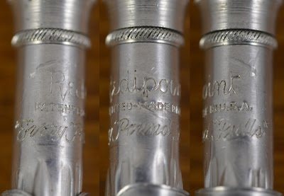


Brown and Bigelow, makers of the Redipoint line of pencils, also made “Every Pound Pulls” pencils for the company.

Tuesday, December 20, 2016

That's Heavy, Man

This article has been edited and included in The Leadhead's Pencil Blog Volume 4; copies are available print on demand through Amazon here, and I offer an ebook version in pdf format at the Legendary Lead Company here.

If you don't want the book but you enjoy this article, please consider supporting the Blog project here.

Robert Foster offered this one online recently, and I’d watched it for weeks.  When I came home after the DC show, I couldn’t take it anymore, and I finally bit:


It’s a gravity pencil . . . point the tip down, and the tip emerges and locks into place for writing; tilt the tip up, and it unlocks and retracts back into the barrel.


More or less.  The mechanism is a bit cranky and it takes a fair amount of shaking and jiggling accompanied with the tilting to make it do its thing.  That’s not bad though, considering the pencil is more than a century old:


“Hicks Pat. May 9, 05.”  Note also the little acorn hallmark in the left panel - right next to the end of the word “sterling.”  Richard H. Ryan applied for a patent for his “gravity-pencil” on February 7, 1905 and it was issued May 9 as number 789,386.  Ryan’s patent was assigned to William S. Hicks’ Sons, of New York, NY, a firm.


This one might have shattered your notions concerning how old the gravity mechanism is . . . most of the time, these show up on 1960s ballpoints.  But the Hicks gravity pencil wasn’t the first - not by a longshot:


This one hails from the American Lead Pencil Company:


At the top it is identified as the “Little Giant”:


And at the nose, a bit of evidence that this one was around more than a decade and a half earlier than the Hicks:


“American L.P. Co. / L & C Hardmuth / Pat. Jan. 31 ‘88.”  The date refers to patent number 377,194, applied for on September 24, 1887 by Costi De Meyer of Budweis, Bohemia, Austria-Hungary:


Unlike the cantankerous Hicks, the American works flawlessly.  Who would have thought?

Monday, December 19, 2016

Imagine the Effort!

This article has been edited and included in The Leadhead's Pencil Blog Volume 4; copies are available print on demand through Amazon here, and I offer an ebook version in pdf format at the Legendary Lead Company here.

If you don't want the book but you enjoy this article, please consider supporting the Blog project here.

I’ve picked up a couple of these Mabie Todd acid-etched pencils recently.  The top one came from Pearce Jarvis at the Ohio Show, and the bottom one – I don’t remember where I got it, but I know I brought it with me for show and tell at the Philly show last January, so it’s been at least a year:


The crowns are marked Fyne Poynt, and the clips bear the patent date for Charles Mabie’s patent number 1,125,144, for the clip:


I wrote about one of these from Rob Bader some time ago, at http://leadheadpencils.blogspot.com/2012/09/these-guys-really-did-this-right.html.  The example in that article advertised American Jobbers Supply, a company which supplied telephone line materials.  The blobs on the barrel in that article represented glass telephone pole insulators:


The example I got from Pearce is covered with similarly elaborate embossing:


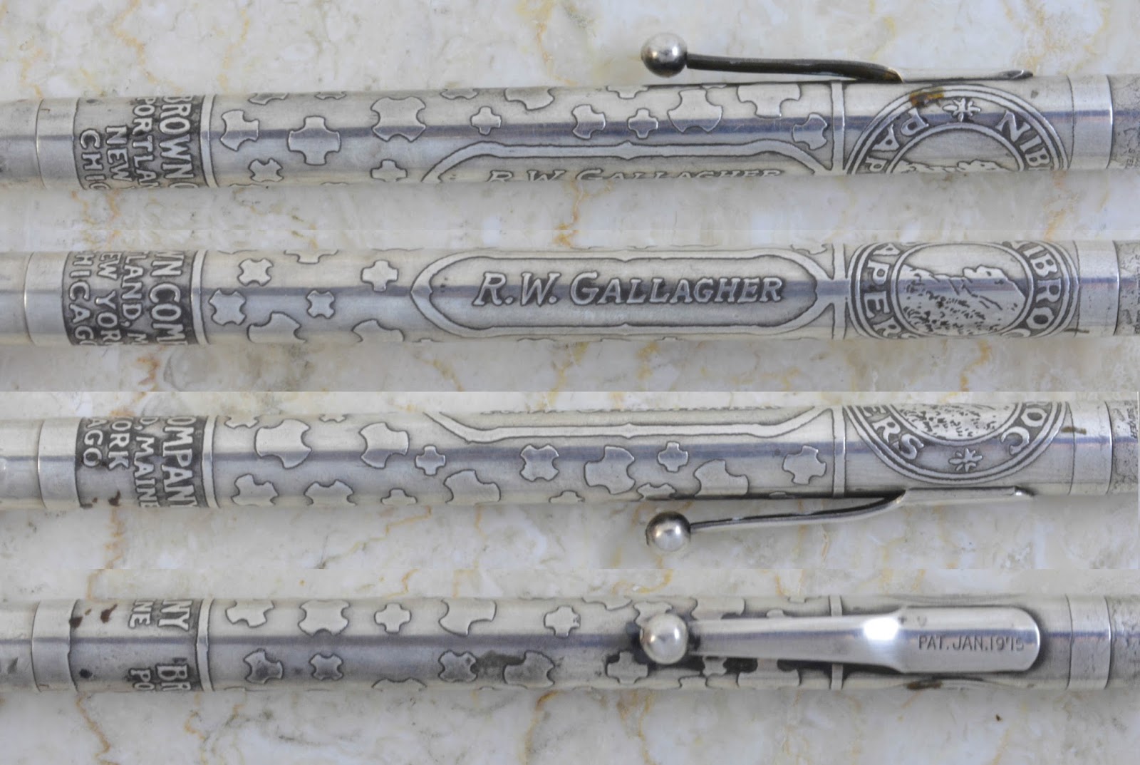
It advertises the Brown Company at the nose, and “Nibroc Papers” at the top end:


the field in between is covered in three and four-spoked blobs.


Here’s the back story: the paper towel was perfected by William E. Corbin, superintendent of The Brown Company, which began producing Nibroc Paper Towels in 1922.  Nibroc – is Corbin spelled backwards.  Corbin was from Charleston, New Hampshire and even served as mayor of Berlin, New Hampshire in the early 1930s, which is why the Nibroc logo includes the “Old Man of the Mountain,” the geographical feature featured on the back of New Hampshire’s state quarter.

As for the Nibroc blobs – that should be enough to figure it out, but I’m still drawing a blank.  When it comes to me (or to one of you), I’ll have to post a follow up.

Let’s get to that other one now:


This was an elaborate souvenir of the Tenth Annual Banquet of the Jewelers’ 24-Karat Club of Pittzburgh, held at the William Penn Hotel on April 5, 1921.   This pencil has some fantastic details:


Including some interesting blobs covering the barrel:


The Tenth Annual Banquet was an elaborate affair, given thorough coverage in the April 13, 1921 issue of The Jewelers’ Circular, beginning on page 85:


The complete text of every speaker’s address is reprinted, and there’s even a group picture taken at the event:


And, in a stroke of luck, the article even makes reference to a certain party favor, and its mysterious blobs:


Although Mabie Todd isn’t mentioned by name, the article states that “Maiden Lane was well represented” by “a whole carload of jewelers.”  “‘Carrots’ were in profusion at the banquet tables and by actual count there was more than 3,000 of them represented in silver form.  It was some ‘vegetable,’ that pencil as a souvenir.”

Yep.  Those little blobs on my 24-Karat Club pencil are . . . carrots.  And yep, there’s 24 of them.

Sunday, December 18, 2016

And the Award for Worst Representation of an Elk Goes To . . .

This article has been edited and included in The Leadhead's Pencil Blog Volume 4; copies are available print on demand through Amazon here, and I offer an ebook version in pdf format at the Legendary Lead Company here.

If you don't want the book but you enjoy this article, please consider supporting the Blog project here.

We were laughing about this one all weekend at the Ohio Pen Show:


This is a “Pal”, and David Nishimura wrote a great article outlining the history of these lower quality pencils over at his blog - worth checking it out at http://vintagepensblog.blogspot.com/2016/01/pal-pencils.html.  I wish I’d written it!

This example is very typical of an early side-clip Pal, complete with the imprint above the clip:


as well as the imprint on the reverse side, which looks like it might have been copied just a little too literally from some lawyers instructions.  “Put “Patented Silver Plated” on the back,” someone must have said, and the client dutifully followed those instructions . . . including even the quotation marks.


But the reason I bought this one was because the good folks at Pal, bless their little pointed heads, attempted to include fraternal emblems mounted on the caps of their pencils . . . and I think they must have hired a second grader to do their artwork:


Were it not for the “BPOE” above it (for Benevolent and Protective Order of Elks), I would have no way of knowing that’s what this furry thing was supposed to be.  It looks like it should be hanging on someone’s refrigerator, with “The Elk goes moo” written in crayon underneath it.

Saturday, December 17, 2016

In Case You Doubted Me

This article has been edited and included in The Leadhead's Pencil Blog Volume 4; copies are available print on demand through Amazon here, and I offer an ebook version in pdf format at the Legendary Lead Company here.

If you don't want the book but you enjoy this article, please consider supporting the Blog project here.

A while back I posted about a great Guild ringtop, in Conklin’s unique “imperial blue” celluloid, which I had indicated was clearly supplied to the Guild Products Corporation by Conklin (see 
http://leadheadpencils.blogspot.com/2015/07/this-might-have-made-things-easier.html):


In case you continue to harbor any lingering doubts that Conklin made pencils for Guild, this one should resolve them:


Friday, December 16, 2016

Three Patricians from the Ohio Pen Show

This article has been edited and included in The Leadhead's Pencil Blog Volume 4; copies are available print on demand through Amazon here, and I offer an ebook version in pdf format at the Legendary Lead Company here.

If you don't want the book but you enjoy this article, please consider supporting the Blog project here.

I picked all three of these up at the Ohio Show last month:


The top one in jade is one of those interesting later “closeout” Patricians, made when the company had apparently used up its stock of normal Patrician clips and switched to some earlier “clip cap” clips - Dale Beebe had this one.  The center bands with cutouts were apparently all used up by this point, too.  I’ve written about these before here (see http://leadheadpencils.blogspot.com/2013/06/the-waterman-96.html), but unlike the other one I had at home, this one lacks a “996" imprint.  I know, it’s just a slight difference . . . but this thing was just so pretty, and even if it was identical I probably would have bought it anyway.


The middle one is a black hard rubber Patrician, with a badly oxidized barrel.  Paul Erano had this one, and I was actually looking for one with this oxidation.  Nowadays, a quick treatment with Mark Hoover’s hard rubber cleaner and this one could be black as new, but I kind of wanted on that I could tell apart from my black celluloid example without doing the old “rub and sniff” routine:


As for that “forest green” one . . . well, I didn’t exactly pick up three.  Rick Krantz brought it to me for repair at the Ohio Show, and when I got started on it, I noticed that this one didn’t have a “normal” Waterman Patrician tip; instead, it had one matching the Number 7 line (and a host of lesser and later Waterman pencils).  I fitted it with a spare nose cone I had with silver trim, and when I got home, I made a more permanent swap with a proper gold filled one:


I left it with Rick that I had a spare forest green Patrician at home that I’d trade him for this one, but now I’m in a quandry.  I assumed the one I had at home was “normal,” but it isn’t:


Note that this has a similar, shorter tip . . . but this one is a little wider, and it doesn’t match anything else in my collection of Watermans:


And so, I resorted to my projects box, where I had another forest green one I thought I could repair and send back to Rick.  Alas:


Crap.  A normal tip.  And I certainly can’t trade him back that great Patrician/94 hybrid he sold me a few years ago in Philly!


Four forest green Patricians, four different variants.  I suppose for now, Rick gets his original pencil back, since it’s the least different one of the four . . . but if I can find an example that’s a duplicate of any one of these in the near future - I’ll pick it up for Rick!

Thursday, December 15, 2016

Three for Three

This article has been edited and included in The Leadhead's Pencil Blog Volume 4; copies are available print on demand through Amazon here, and I offer an ebook version in pdf format at the Legendary Lead Company here.

If you don't want the book but you enjoy this article, please consider supporting the Blog project here.

Most of the time, if I’m after a lot in an online auction, there’s one or maybe two things out of the bunch that I’m really after.  The rest go into large boxes full of extras, that “I really need to start listing things on eBay” pile in one corner of the museum that mysteriously gets bigger.  I think they are reproducing on their own in there.

When this lot came up, I only had eyes for one of them:


That middle one - with the exposed eraser and the chrome-plated trim – matches one I wrote about here a couple years ago (http://leadheadpencils.blogspot.com/2014/10/im-feeling-little-bit-exposed.html) and is harder than heck to find:


These were Sheaffer’s utility pencils, made using the earlier striated Balance celluloids but with exposed erasers, like the company’s “working togs” lines.  In the earlier article I posted, Daniel Kirchheimer identified this by model name as the “Cadet Utility II,” with a 150 imprint denoting a price of $1.50.  With gold-filled trim, this same pencil bore a 250 imprint and matched the better Sovereign, Admiral and Craftsman lines, so in that configuration it was known as the “Sovereign Utility II,” the “Admiral Utility II” or the “Craftsman Utility II” pencil.

Now with a couple years under my belt as editor of the Pennant, I know where Daniel got his information: in the spring 2006 issue of the Pennant, Jim Mamoulides penned an article, “Taxonomy of Late 1940s Sheaffer Pens,” in which he ran down all of the models, including this one and its higher class cousins:


(Image derived from The Penannt, Spring 2006, page 27.)  These were cataloged by Sheaffer in 1946, the last year Sheaffer uesd striated celluloids - in the Summer 2006 article, Jim presented a similar taxonomy based on the 1947 catalog, and he makes no mention of the utility line, leading me to believe my plain black example was also made in 1946.  I’d prefer to show you the actual catalog images here, but while Jim’s excellent articles were based on 1946, 1947 and 1948 catalogs he had found, ten years later, those catalogs still are not in our library . . . sigh . . . I digress.

I had photographed the black Sheaffer Cadet Utility II for this article and was prepared to consign the other two to the “someday to be sold maybe” pile when, as a last thought, I compared them to what was in my collection.  Whaddaya know:


The ball clip Balance without trim (denoting that the pencil matched a non-Lifetime pen) looks nice alongside the black and pearl and grey pearl examples.  And . . .


The little black ringtop finds a nice place in my flattop stash.

Nice – three for three!