Monday, April 26, 2021

The Back Story

This article has been included in The Leadhead's Pencil Blog Volume 7, now available here.

If you don't want the book but you enjoy the article, please consider supporting the Blog project here.

Last August, I was in the garage behind my office when I should have been at the DC Pen Show.  The door was up and I was sitting at a folding table, editing the proofs for The Leadhead’s Pencil Blog, Volume 6 while I watched the world drive by on Cherry Valley Road and listened to locusts.  I love summer afternoons in Ohio.

I took a break to check my email, just to be sure nothing important had come up, and there was an email from Roger Leenerts.  Roger said he had a couple of pencils and he wanted to know if I was interested in them:


He left his phone number, so I gave him a call.  He said he was scheduled to take these to a taping of Antiques Roadshow, but he wasn’t game for an unrehearsed, surprising reveal on television.  So, he started poking around a bit on the internet to see who might know a thing or two about old mechanical pencils.

Guess who he found.

His original thought was to get an opinion of how much they might be worth, but once he stumbled onto the weird little universe I’ve created, he found himself sucked into reading article after article, until he decided I probably valued these things more than he did and certainly more than any host of Antiques Roadshow would.

He said that he inherited the two pencils from a distant relative, and that according to his family lore a pair of twin sisters somewhere back in his family tree had received these matching pencils as graduation gifts when they graduated from high school in the mid-teens.  The relations were distant enough that he did not know their names, and the pencils lack commemorative inscriptions to add further provenance to the story.

I liked the story, but I liked the pencils even better:


Both are marked with a “B” with “G.T.” nested in the top loop and “Co.” in the lower one, the hallmark for the George T. Byers Co.  Better still, those snake clips were imprinted on the back:


“Pat. Jan. 6, 1914 / G.T. Byers Co., N.Y.”  That imprint both excites me and makes my blood boil at the same time.  George T. Byers tried to pull a fast one, since he liked the clips Frank T. Pearce was using over in Providence; he found the supplier that made those snake blanks, ordered a bunch, and then tried to file a design patent so Pearce couldn’t use them anymore.

The story was told in greater detail here in “The Snake that Wasn’t Wrapped Around the Pencil” (Volume 3, page 260).  

But wait . . . there’s more.

The Byers story came up again here to open Volume 4 (page 1) with an Eversharp that had been pimped to include fishscales or snake scales, as well as a similar snake clip:


Same patent date on the clip, but “G.T.Byers” is abbreviated, as it usually is on these clips, to “G.T.B.”


That’s why I couldn’t wait for the twins’ pencils to arrive, to shoot the two Byers pencils alongside my pimped out Eversharp


But wait . . . there’s just a little bit more than that.

Meanwhile, Myk Daigle teased something over on Facebook and fortunately, he was looking to trade it to me for something I had – he had no idea how much I wanted what he was dangling out there for the world to see:


This one is similar to the Byers and the F.T. Pearce leadholders, with a crown that turns one way to release the lead and the other to clamp down around it.   When the mechanism is released, the Salz imprint is revealed:


You’ve seen one like this here - with a slightly more menacing clip:


That Salz dragon clip appeared here in Volume 2, at page 273:


And now the serpentine family picture has filled out nicely:


From top, these are an F.T. Pearce Co., the Byers-modified Eversharp, the two Byers pencils, the two Salz pencils, and a sterling silver stockbroker’s pencil made by A.T. Cross.


Sunday, April 25, 2021

But In My Defense . . .

This article has been included in The Leadhead's Pencil Blog Volume 7, now available here.


If you don't want the book but you enjoy the article, please consider supporting the Blog project here.

Every time I’ve written about the Doran “Deliance,” I’ve complained about how difficult it is to photograph the faint imprints, and how I’ve not been able to learn anything else about the brand:


I found one recently that had a better imprint . . . and it taught me something:


It isn’t the “Deliance.”  It is the Doran “Reliance”:


Meh . . . at least I didn’t print it wrong in a book or anything . . . 


Oh wait.  I did.  Well, at least I said that I was having trouble reading it!


Saturday, April 24, 2021

Square Pegs Are the Best

This article has been included in The Leadhead's Pencil Blog Volume 7, now available here.


If you don't want the book but you enjoy the article, please consider supporting the Blog project here.

Sure, there’s a great deal of satisfaction in “completing” a series.  Picking up that last color you’ve been hunting for years, so you can pose them all together in a neat little row . . . ah . . .  Happy sitcom ending.  Roll credits.

If you like that sort of thing.

I haven’t made any bones about the fact that one of the things I like about collecting is satisfying the OCD part of my psyche.  Sure, I love nice little rows of pencils with white picket fences around them as much as the next guy . . . but I’ve got this masochist little streak in me, too, that gets an even bigger kick over some monster truck knocking down that pretty fence and leaving ruts in my yard.  Figuratively speaking, anyway.

Consider the WASP “Circuit Board” Clipper, a relatively finite subject, wrapped within a subbrand, wrapped within the greater Sheaffer universe.  We know what’s “supposed” to be out there from catalogs and such, and I do have my eyes out for the examples needed to “complete” the series.  

I last ran down the model in 2017 (see Volume 4, page 342).  To recap, here is the “Type I” of the series (moniker courtesy Matt McColm), with a flat metal top.  The earliest advertisement I had found at the time I wrote that last article was from 1938, but in the current issue of The Pennant, Roger Wooten provided an advertisement from October, 1937 (see "Sheaffer's Main Sub-Brands 1928-1946," The Pennant, Spring 2021).  Advertisements in 1939 show them in the same form:


Followed by Type II, with a more rounded metal top (my earlier article included a page from a 1941 Bennett Brothers catalog which shows the Type II alongside Type I models, but they may have been introduced earlier).  The Type III added blue to the lineup, and the metal tops were replaced with black plastic ones (I don’t think anybody knows exactly when that happened):


Oh, and incidentally, I’ve since found an example of the Syracuse Knife Company pocketknives in green.  Since I’m in the neighborhood, thought I’d mention it . . . 


This is easy going forward, right?  Fill in the missing colors, then freeze frame mid-air during a celebratory leap accompanied by a laugh track, and roll credits. Cut, print and tell that OCD gremlin in the back of your mind to take a hike.

Or . . . 


Say “what the f...?” but not in a bad, what-the-heck-are-you-doing-mowing-down-my-fence-with-that-monster-truck way, but in a wait-a-minute-let-me-get-another-beer-and-let’s-see-how-this-plays-out kind of way.

Let’s start with the obvious.  Obviously, this is the exact same clip found on the WASP “circuit board” Clipper pencils, and the cap most closely resembles the more domed, metal Type II, although the edges are sharper:


The barrel, however, is one solid piece of sterling silver, with a nose-drive mechanism press fit into the lower end.  And then, for the coup de grĂ¢ce, a brocaded message:


“The Travelers / Belleair, Fla. / 1954"

Wait . . . what?  1954?

The only other clue is the initials J.M.C. mid-barrel, and I have no idea who that is.


Dang, I don’t even know whether to put this in the same drawer with my WASP Clipper circuit board pencils, but I have no idea where else to put it.   

Friday, April 23, 2021

The Weirdness of Coral

This article has been included in The Leadhead's Pencil Blog Volume 7, now available here.


If you don't want the book but you enjoy the article, please consider supporting the Blog project here.

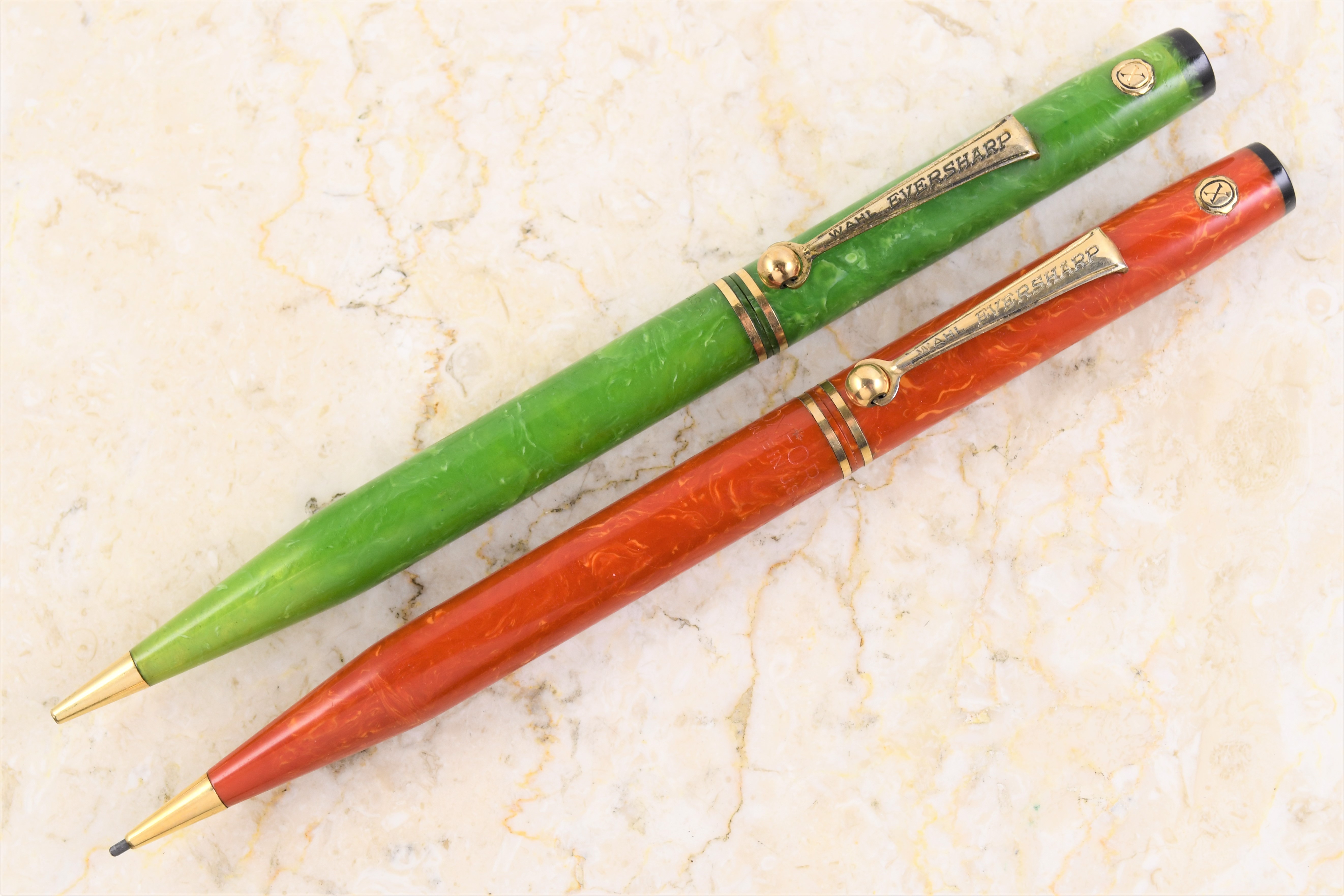
One article in particular from Volume 6 prompted virulent discussion, and the general consensus that emerged from that debate was that my hypothesis was incorrect.  The tempest in our little teapot centered around the use and intent of the “X-Seal” on certain pens and pencils made by the Wahl Company:


My theory in that article (Volume 6, page 110) was that the circle around the X is actually the letter “O,” and that might stand for “Oxford,” Wahl’s budget line.  That suggestion was not well received, as several devotees of the brand offered their own theories.  

The front runner among these theories, offered by Syd Saperstein, was that these X-Seal pens and pencils were assembled from leftover parts in 1939, and those parts which had been drilled for double-check seals that had not yet been installed were filled with a different seal that would not commit Wahl to honor a factory warranty.   He further suggested that if it truly was the letter “O” surrounding an X, it could equally mean XO for “closeout,” rather than OX for “Oxford.”

Everyone agrees there is no documentary evidence to prove what Wahl was thinking when these X-Seals were implemented, and since no one alive today was working the factory floor when it happened, there is no surviving first-hand account of what was intended.

In fact, there’s no evidence that Wahl “meant” anything, or that these X-Seal items were marketed consistently in any unified way – given the probability that they were assembled from leftover parts from discontinued models, any marketing plan might have resembled a garage sale more than a slick campaign.

The argument, therefore, concerned which unsubstantiated theory had the best internal consistency.  My suggestion, “OX for Oxford,” took a beating because known X-Seal examples are marked Eversharp, not Oxford.  That is, the X-Seal examples known at the time I wrote the article . . . 


These no longer slip quietly under the radar when they appear.  I paid handsomely for this one, since the price included both a beautiful pencil and a shot at redemption.  Here it is, alongside the jade example from my previous article:


As is the case with the other example, this one is also built around a flattop Eversharp fitted with an Equipoised mechanism, originally introduced just prior to the rollout of the Doric line in 1931 - probably in 1930.  The top would originally have had a groove into which a gold band would separate the colored plastic from the black end, which was voided by machining down the top end slightly:


Also like the jade example, this one sports the slightly longer and later roller clip, marked “Wahl Eversharp”:


Then things get really interesting.  The jade example is imprinted simply with “Made in USA” on the lower barrel:


This coral example, however, has an imprint I haven’t seen on any other Eversharp – “OXFORD / Made in USA”:


I’m not saying that ALL X-Seals were marketed as Oxfords, but here is the hard, undeniable proof that at least this one was.  It fits as nicely into my theory as that last missing jigsaw puzzle piece that turns up under the couch months after you were trying to piece things together.  Here it is, next to the Oxford-clip coral pencil that caused me to come up with that theory in the first place:


Weirdness seems to coalesce primarily around the coral-colored examples in this series.  Here’s a family photo of all my coral “Tempoint-styled” pencils (or “Signature style, or whatever you prefer to call them):


This includes the “normal” ones - the top three are part of the regular line, although the longer, military-clip examples are harder to find.  The fourth one is an undocumented variant, which marries a 1924-or-so long nose onto what is otherwise the same pencil as the regular, full-length example right below it (what looks like a flared top end is actually one of the original price wafers which was snapped onto the top. 

(For the full story on the long-nose coral pencil, see Volume 3, page 14.  Those price wafers were detailed in a pair of early article posted here, now in Volume 1, pages 93 and 135.)

Next is the Oxford, and you can see how just a few modifications to a leftover from the regular line created a very different-looking pencil.

The bottom two show how the later, Equipoised-mechanism incarnation of this series was modified to create my Oxford “X-seal” pencil.  The flattop turned up at the Chicago show years ago, and its commemorative imprint doesn’t detract from its appearance to me, since it adds a bit more to this story:


The 25th Anniversary of Penn State’s Class of ‘09 would have been in 1934, so Wahl apparently had a supply of completed coral flattop pencils left over long after the line was formally discontinued in 1930. Perhaps the streamlining of the top end and addition of X-seals occurred after this pencil was imprinted and sold in 1934, using unfinished barrels lacking their top band.  That would be consistent with Syd’s theory that the X-seal pencils were hastily assembled from leftover parts in 1939.

Maybe we are all right.  Perhaps Wahl was unwilling to commit to warranting pencils made from parts that were 10 years old, so the “X” was just something different, more artful than just drilling a hole in a double-check seal to make it clear there was no factory warranty.  Perhaps if it is an O rather than just a circle, it was intended at some point to mean XO for closeout, although as of this writing no documentary evidence supports that.

Perhaps, as my pencil strongly suggests, Wahl associated these closeouts with its low-budget Oxford line as a less clumsy, more elegant solution to both of these.  At least we now know Wahl did so once.

I think Wahl might have done all of the above, and maybe I was just a little bit right, too.

Thursday, April 22, 2021

Henber Wrinkles - Part Three

This article has been included in The Leadhead's Pencil Blog Volume 7, now available here.


If you don't want the book but you enjoy the article, please consider supporting the Blog project here.

I’ve saved the most fascinating new wrinkle in the Henber story for last:


When I saw this one, I instantly recognized it as a Henber.  Of course it’s a Henber, right?  Here’s the ringtop Henbers from the article a couple days ago:


As was the case with yesterday’s installment, I was confident there was a mistake in the listing, but I knew this would be really interesting if the listing was actually right.

The listing was actually right:


“Keen-Point.”  Huh.

I pull Occam’s Razor out at every opportunity, mostly to regulate my wild imagination.  Occam’s Razor suggests that the far-flung Henber Company in Minneapolis pulled a cool-sounding name out of thin air, slapped it on a pencil and was quickly reprimanded by those who rightfully claimed the name to knock it off.

Occam, however, needs to pack that switchblade away for a moment.  Perhaps that is not the simplest explanation.

The “Keen-Point” name has (until now) been found in two, well-documented and apparently unrelated incarnations.  The earlier one was O.R. Johnson, who offered metal Keen-Point pencils in 1921 and 1922:


Johnson was marketing his Keen-Points at the same time Henber was active, between 1921 and 1923, so there’s a bright line between two possibilities: either Henber blundered into using the name without Johnson’s permission and Johnson put a stop to it, or Johnson was somehow involved with Henber.

And then there was Charles Keeran, who adopted the Keen-Point name after he was ousted from Autopoint the second time in 1924.  Keeran registered a trademark for “Keen-Point” in a distinctive font:


Keeran claimed in his registration that he first used the mark on November 21, 1928 – but that’s this specific mark.  He might have used the words “Keen-Point” earlier, and Keeran’s activities after he left Autopoint are difficult to piece together.  In Chapter 7 of A Century of Autopoint, I show how his patents filed after 1924 show that he first dusted off his “Keeran Products Corporation” to market “The Keeran Pencil,” in 1925, then affiliated himself with Julius Swanberg and Robert Chelton for a short time around 1926.

But there are holes in the story, and plenty of room in the timeline for Keeran to scoot up to Minneapolis for a bit to pick up the pieces of Henber after the company called it quits in early 1923 – perhaps after Samuel Kanner was finished playing around with it.

History is what floats to the surface when facts are assembled in chronological order.  The three wrinkles presented in these last three articles provide tantalizing new facts – the infuriating part is I don’t know in what order to put them:

1.  The Henber Company offered Henber pencils between late 1921 and February, 1923;

2.  O.R. Johnson Co. offered “Keen-Point” pencils between 1921 and 1922, and at least one pencil marked “Keen-Point” is identical to the Henber;

3.  The Louis F. Dow Co. offered sterling Dow pencils engraved with the same, distinctive chasing on the barrel as the Henber.  One of the examples sports a logo on the box lid dating it to sometime after August, 1923, but that doesn’t mean sterling Dows like this weren’t offered earlier;

4.  Whoever made Samuel Kanner’s “Nupoint” pencils, advertised between 1921 and 1924, also made at least one identical pencil marked “Henber”;

5.  There is a gap between the time O.R. Johnson Co. offered “Keen-Point” pencils in 1921-1922 and when Charles Keeran claimed he first used a stylized “Keen-Point” logo in 1928.  Keeran might have used the name (but not the logo) as early as 1924, when he departed Autopoint.

The artifacts themselves can only tell us so much.  One of these days, I’m hoping some documentary evidence will surface to make some sense out of all this.


Wednesday, April 21, 2021

Henber Wrinkles, Part Two

This article has been included in The Leadhead's Pencil Blog Volume 7, now available here.


If you don't want the book but you enjoy the article, please consider supporting the Blog project here.

When this showed up in an online auction, I was convinced the seller paired pictures of the wrong pencil with the auction title. 


The listing title identified it as a Henber, but the pencil looked to be identical to something else in my collection:


That clip, with it’s exaggerated hump, is something I instantly recognized:


It’s what you often find on Samuel Kanner’s early line of “Nupoint” pencils:


But wait . . . there’s more.  Recall that the Henber has distinctive machining that extends farther down the nose, past where it begins to narrow down to the point.  On the Nupoint, that machining stops before the joint separating the nose drive from the barrel – Henbers, on the other hand, are rear drive. 


Even the engraving on these two pencils is identical, in that V-shaped pattern reminiscent of Superite pencils made by DeWitt-LaFrance:


Yet there it is, just like the seller said: it’s imprinted “Henber.”


This is a fascinating turn of events.  Samuel Kanner’s Nupoint pencils were advertised, just like the Dow, in late 1922; by late 1924, this particular clip was abandoned, and by 1925 Kanner dropped the “Nupoint” name in favor of Presto and switched to a repeating pencil design (the great granddaddy of the Eversharp Skyline, by theft and deception).

Henbers were offered as promotional prizes, while Samuel Kanner, from what I can tell, was a dedicated manufacturer.  If one supplied the other, in this case I would guess that Kanner supplied The Henber Company.  I can’t say, however, that Kanner manufactured all of the Henbers - but I can say with relative certainty that he did this one.

And another one, which has been lounging around the museum for God knows how long, without me noticing what was different about it:


That’s right . . . the Kanner-related Henbers also came in ringtop configuration.