Thursday, October 25, 2018

Foley's Folly

This article has been edited and included in The Leadhead's Pencil Blog Volume 5; copies are available print on demand through Amazon here, and I offer an ebook version in pdf format at the Legendary Lead Company here.

If you don't want the book but you enjoy this article, please consider supporting the Blog project here.

As I was laying out this volume and crossing my fingers, hoping there might be a bit of room at the end for just a few more things, this one was at the top of my “must include” list:


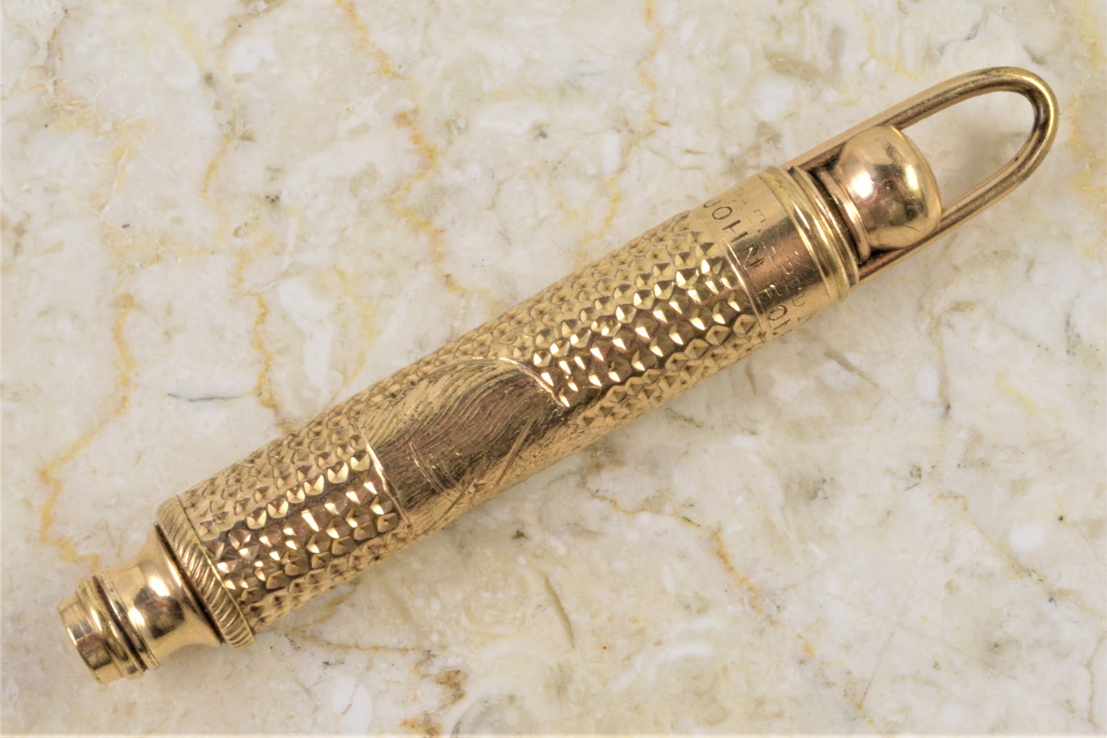
The amazing thing is that I didn’t break the darned thing trying to figure out how it worked, because I thought it was broken.  That wire bail on the top pulls upward, but the pencil wasn’t advancing as I did.  PB blaster and all the usual tools in my arsenal failed to move the mechanism inside . . . until I figured out this isn’t a magic pencil.  The front twists to advance the nozzle, while the wire bail doesn’t do anything - it merely pulls out to act as an extender so the pencil fits better in one’s hand:


There’s a great horse’s head motif on the barrel:


But the real reason I scooped this one up is the manufacturer’s imprint at the top end:


“Pat. Apl’d For / John Foley.”   There’s no pencil patent like this issued or assigned to John Foley listed in American Writing Instrument Patents 1799-1910; perhaps Foley acquired the rights from someone else or, since the only unique feature about this pencil is the wire loop as a simple extender, perhaps that innovation wasn’t unique enough for a patent to be issued.

This is the first time I’ve seen a pencil marked with the John Foley name – the Foleys (first Senior, succeeded in business by his son Junior) were more well known for gold dip pens and the like.  Jim Marshall recently republished an 1875 John Foley catalog, including his comments and thoughts; a page of pencils is included, but as this is the first I’ve seen that was marked with the Foley name, I’m inclined to believe they offered primarily unmarked pencils and combination pen/pencil holders supplied by jobbers. 

Wednesday, October 24, 2018

Gumdrop Pilgrimage

This article has been edited and included in The Leadhead's Pencil Blog Volume 5; copies are available print on demand through Amazon here, and I offer an ebook version in pdf format at the Legendary Lead Company here.

If you don't want the book but you enjoy this article, please consider supporting the Blog project here.

Eric Magnuson makes a pilgrimage to pencil central every so often, since we live within twenty miles of each other and from time to time we have things to swap back and forth.  Whenever I see him, he usually has a new addition to his collection of experimental Parker colors, and his recent sojourn was no exception:


This is to my knowledge the only of one of these oddball colors that is prevalent enough to have picked up a collectors’ nickname: “gumdrop.”   At least, that’s the name that swirls around in conneciton with these, and I don’t know of any official designation for the color by Parker.

Eric acquired all three of the top pieces from Warren Granek after much weeping and gnashing of teeth over the price.  My contribution to this picture is the ringtop at the bottom, which was bequeathed to me by Lee Anderson.   As is the case with most of these experimental plastics, examples in gumdrop are exceedingly fragile and unstable – in fact, part of the lower barrel of my example disintigrated in my hands when Lee first showed it to me (“Don’t worry,” he said - “it was coming your way anyway”).

Note the “deluxe” bands with the slightly wider middle one, and there’s something else a bit unusual about this one: the tip is much shorter – not Vacumatic shorter mind you, but it doesn’t look like a Parker tip:


Eric had one other experimental Parker to show me.  I had seen this one before – Pearce Jarvis and Brian McQueen had partnered to purchase it in a recent auction in Janesville, Wisconsin of a hoard from the estate of a former Parker employee.


Joe and I both took a pass on this one - not that we doubted the legitimacy of it, since it’s fully marked with a Duofold imprint and has direct provenance back to the Parker factory.


The level of commitment required to pick this one up was more than a general pencil collector than I could manage, and even more than a Parker pencil specialist like Joe was able to muster – it took a specialist within a specialty like Eric, who collects Parker pencils in experimental plastics, to bring Brian and Pearce’s pencil into the fold.

Tuesday, October 23, 2018

Identical . . . Or, Almost So

This article has been edited and included in The Leadhead's Pencil Blog Volume 5; copies are available print on demand through Amazon here, and I offer an ebook version in pdf format at the Legendary Lead Company here.

If you don't want the book but you enjoy this article, please consider supporting the Blog project here.

These are Parker Royal Challengers, made in 1936 and 1937, with the more desirable sword clips that cause Parker aficionados to swoon:


Oohworthy and aahworthy they are, for certain, but this article isn’t going to be just a Parker peepshow.  I’m showing these off today because of some things often said about two ends of the spectrum, the sublime and the ridiculous:


Diamond Point in its heyday produced some very well made and attractive pens and pencils, but by the time these were made, the company emphasized style and visual appeal well ahead of technological innovation and performance.  Within about a decade of the time these were made, the company was gone.

This pair obviously copies the Parker Royal Challenger, but pen pundits consistently make a statement that always sticks in my craw a little bit: that Diamond Point used “the same” celluloid Parker used on the Royal Challenger.  “Almost the same,” I interject whenever I’m a party to the conversation . . . which usually results in my ejection from the conversation.

Here’s why I valiantly attempt to qualify that statement:


You might think I’m being anal about this, but look at those feather-like motifs in the celluloid – do you see how much fatter and wider the fingers are on the Diamond Point than on the Parker?


I encourage you to look at every pen and pencil you can find in this Parker and Diamond Point line, and you will see this same difference, without fail, every time.  This isn’t a minor deviation within manufacturing tolerances within a single run of celluloid: these are different production batches.

Does it matter?  I think it does, since it busts collectors’ lore that Parker liquidated remaining stock to Diamond Point.  I believe the evidence points towards Diamond Point ordering a new batch independently of Parker, requesting the stuff Parker had used a few years earlier, which the manufacturer reproduced almost exactly.

Almost.

Note:  after this article ran, I received my Fall 2018 issue of Fountain Pen Journal, in which David Isaacson's article regarding the Parker Royal Challenger appeared, which has me circling around to clarify a couple things.  First, there were two clip styles used on the series; I always thought the sword clip was just an option, but David indicates they were the earliest models in the series made in early and mid-1937. The straight clips (what David calls the "blade clips") were introduced in late 1937 and were used until the end of the Royal Challenger's run.

That's where things get interesting.

I had tracked down newspaper advertisements announcing the introduction of Diamond Point's "De Luxe," made from "the new DuPont miracle material," in 1940:


When I found these advertisements, I thought they further supported my contention that the Diamond Point De Luxe was made from a different batch of celluloid acquired from DuPont, not leftover stock acquired from Parker, since these were introduced so much later than the Parker Royal Challenger.

It may be more complicated than that.  David's article establishes that the Royal Challenger was not discontinued until 1940 and further, he indicates that there was a third type within the series introduced "likely" in late 1938 or early 1939, which continued the "blade clip" and substituted a single wide cap band for the earlier three narrow ones.  

And one of the examples he shows in his article, a gray pen, clearly shows the wider "fingers" on the cap band and narrower ones on the barrel.

So we know Parker also used this "fat-fingered" batch of stuff from DuPont, albeit very briefly and at nearly the same time as Diamond Point came out with its "De Luxe."   Parker did hold a design patent on the sword clip (Design patent 107,708 issued on December 28, 1937), but not on the fingered celluloid, fat or otherwise.  If DuPont was stuck with a batch of celluloid Parker no longer wanted because the company had discontinued the model, DuPont would have been free to sell it to anyone else, and Diamond Point would have been playing close to the line -- but not over it -- by touting "the new DuPont miracle material" on a new line of pens that didn't use Parker's patented sword clip.

I still think that's the more likely explanation than Parker giving blessing to a third-tier company to mimic its product line so closely -- and as David has revealed, so soon after it was discontinued. 

Monday, October 22, 2018

The Class of 1939

This article has been edited and included in The Leadhead's Pencil Blog Volume 5; copies are available print on demand through Amazon here, and I offer an ebook version in pdf format at the Legendary Lead Company here.

If you don't want the book but you enjoy this article, please consider supporting the Blog project here.

Companies are far more interesting when they are desperate.  I think that’s why Parker doesn’t interest me as much as so many other brands – rarely did they flail around in desperation, and with nearly everything they did, regardless of how goofy it was, they made it look like they meant to do it as surely as a cat calmly walks away after falling off the kitchen counter.

But 1939 was different for everyone, Parker included.  America was still in the Depression, and the late Thirties in general represented a time when pen manufacturers great and small alike were pulling out all the stops to introduce gimmicks to attract the largest share possible of a much smaller pool of customers. 

In Parker’s case, the answer was the Parker 51, which had just come out of research and was about to take the pen world by storm.  But there was a problem . . . the company’s flagship Vacumatic line was still in production, and apparently Parker had quite a bit of leftover stock of what would soon become an obsolete commodity.  Perhaps in anticipation of the 51s success, and with an uncharacteristic “waste not, want not” approach, Parker took some unusual steps to use up what was on hand rather than put it in a dumpster.

One example of this was the “Ripley” Vacumatic, about which I’ve written here a few times (see Volume 2, page 212 and Volume 4, page 48).  Nicknamed after the mock “Ripley’s Believe it or Not” cartoons used to promote the new Vacumatic when it was introduced in 1933, they are relatively easy to spot with their early trim configurations and wider-than-usual alternating stripes, but the acid test for whether an early Vac is a Ripley is to hold it up to the light and see if the dark strips glow blue.

At the Chicago Show, I had the opportunity to buy another Ripley and, partly because these came up so rarely, I didn’t mind a significant investment to add another to the fold:


I say “partly” because the bulk of my motivation was that the new example, the lower one in this picture, needs no light to confirm its Ripleyness.  It simply glows blue as if there were already a light inside it!

There was another reason for the purchase, though . . . this one has something you won’t find on a “normal” Ripley:


That 9 with two dots at the end of the imprint is a date code signifying production in 1939, long after the Ripley advertising campaign had ended.  Several Vacumatic aficionados, most notably Brian McQueen, have noted this anomaly, and several examples bearing a 1939 date code have turned up with advertising imprints, another thing you don’t see on the earlier incarnation of the Ripley.  Given the 1933-period correct trim and mechanism, abandoned after Parker outsourced production of its pencil mechanisms to Cross, the only plausible explanation for these is that Parker had stores of complete, assembled Ripley pencils somewhere in its warehouse that the company decided to sell rather than scrap.

Parker also used up leftover rod stock.  This one also came from Chicago, although I can’t remember who from:


This example is odd not only because of the lack of center trim bands (no, there’s no grooves where they have gone missing), but in the placement of the middle joint: the lower barrel is significantly longer than usual, with the break between the cap and lower barrel just a quarter inch or so below the end of the clip.  Also, even though this is a slender pencil that would usually have a black jewel on top, this one has a diminuative striped jewel, one of the smallest I’ve seen:


I consulted with a few Parker guys who confirmed this is a legitimate weird variant, which makes sense given the imprint, which confirms this one is also a graduate of the class of ‘39:


This last one I’ve been wanting to show you for awhile – it belongs to Joe Nemecek, and I photographed it at the Baltimore show when my skills with a camera were far more feeble:


This one lacks a date code, because it was a lower-priced line at the time: the Parker Televisor:


The Televisor was a Parker model made exclusively in and for the Canadian market.  According to Tony Fischer’s website, it was introduced in 1935 and came in two incarnations: the first, which he calls “MKI,” looks a lot like a Parker Challenger, but in 1938, he says the line was redesigned to include a clip with “Parker” on it, like this one.  The line was discontinued in 1940.

Tony doesn’t show any picture with this 1938-and-later clip, but I suspect Joe’s example is a prime example:


Instead of a straight clip, Joe’s example has a “waterfall” shape to it, and note that where the clip is sandwiched between the cap and that top button, the clip bulges out a bit from the plastic.  Was this a repurposed clip, bent out to fit a pencil with a wider girth?  I don’t think so.  By that time, Tony indicates you could have any color so long as it was black, and looks more like a last-ditch effort to add a bit of pizzazz to a dying line.

Sunday, October 21, 2018

North . . . and Norther

This article has been edited and included in The Leadhead's Pencil Blog Volume 5; copies are available print on demand through Amazon here, and I offer an ebook version in pdf format at the Legendary Lead Company here.

If you don't want the book but you enjoy this article, please consider supporting the Blog project here.

Brown and Bigelow, makers of the Redipoint line of pencils (for most of the brand’s run, anyway) had one foot in each of two worlds during the company’s early history.  On the one hand, the firm was an advertising specialty company, and from the outset pencils marked Redipoint from the late teens bore the names of the firms for whom these advertising gimmicks were created. 

However, the company also saw the writing instrument business as an opportunity to expand its operations in a new direction, and the Redipoint – with its simple design and good looks – was also marked as a quality writing instrument in its own right.  William Ingersoll took this way of looking at things to a whole new level during the Redipoint Ingersoll days between 1922 and 1926, when the company produced higher quality writing instruments intended to go head to head with the likes of Eversharp and very few advertising pencils.

The “pencil for pencil’s sake” line of business reached its zenith after Brown & Bigelow reacquired the brand in 1926, just as the industry as a whole was switching from metal pencils over to hard rubber and brightly colored celluloids.  The Redipoint evolved into a commanding flattop pencil:


The chrome plated versions were marked simply “Redipoint,” while those with gold filled trim were assigned a similarly upgraded name: the “Aristocrat”:


You might think that’s why I have both of these otherwise identical pencils in my collection, and you’d be half right.  There’s another reason:


Both are salesman’s samples for Brown and Bigelow, identifying the Aristocrat in black and pearl as model number 69970, and in silver trim as model 69971 – and not only was there a Brown and Bigelow in St. Paul, Minnesota, there was a Brown and Bigelow, Limited in Sault Sainte Marie, Ontario.

Saturday, October 20, 2018

Two Puzzling Details

This article has been edited and included in The Leadhead's Pencil Blog Volume 5; copies are available print on demand through Amazon here, and I offer an ebook version in pdf format at the Legendary Lead Company here.

If you don't want the book but you enjoy this article, please consider supporting the Blog project here.

The Sta-Rite appears in The Catalogue on page 151.  At the time I only had turned up a few of the plastic models, and since I didn’t catch the hyphen in the name on the clip, I identified them as the “Starite.”  The metal examples I’ve stumbled across since the book was written:


Early metal ones have a nice script logo stamped on them:


While most plastic ones have the name in vertical block print, I have found one with that script imprint:


There’s two things that bug me about the Sta-Rite, one of which I’ve mostly figured out and the second . . . well, you’ll see about that.  The first is a tantalizing snippet view from the May 29, 1926 edition of Fourth Estate, which told me almost everything I want to know: the manufacturers of Sta-Rite pens and pencils were located at 158 Pine Street, Providence, Rhode Island . . . but it didn’t tell me who the manufacturer was.  The cut-off advertisement even suggests there’s a trademark filed, but none turned up in the course of researching American Writing Instrument Trademarks.


After far too much flailing around, I was finally able to generate a snippet which provided the preceding few words:  Improved Pencil Company.  Now that’s a company with which I’m familiar!  It was established in 1922, according to this announcement in the Jewelers’ Circular on January 11, 1922:


The company was on my radar for another reason entirely: in 1933, the Improved Pencil Company moved into the former facilities of The Tri-Pen Manufacturing Company, makers of Triad pens and pencils – see Volume 2, page 73. 

Now for the second head-scratcher concerning the Sta-Rite.  Recently, I brought this example home:


If that clip looks familiar, it should:


That’s a Waterman Patrician.


With the same clip, protected by Waterman’s design patents:


We know from the “closeout Patricians” that Waterman used up old Patrician parts until they were exhausted – the company didn’t sell them off to some jobber to stamp with a third-tier brand name!

Friday, October 19, 2018

The Minutian Empire

This article has been edited and included in The Leadhead's Pencil Blog Volume 5; copies are available print on demand through Amazon here, and I offer an ebook version in pdf format at the Legendary Lead Company here.

If you don't want the book but you enjoy this article, please consider supporting the Blog project here.

The art of noticing, I call it – the ability to look at an object and pinpoint those tiny little details that distinguish it in a sea of what appear at first blush to be the same darned thing.  We collectors dwell in minutia because it is those little details that can make the difference between just another two-dollar junker and an unusual variation costing hundreds of dollars.

The first 50 copies (now 51 – long story) of each of these volumes has been reserved for those hardcore, dedicated collectors who have supported this blog for years – good eggs I call “The Order of the Leadheads.”  These first copies are numbered and include a label inside the front cover, and volume 3, released just a couple weeks ago, commemorates what I call the “third glorious campaign into the Minutian Empire.”


Eversharps, more than any other brand in my opinion, offer an infinite pool of these rabbit holes, and over the last few month I’ve picked up quite a few examples, each of which has a tiny little twist that irk and delight me at the same time. 

First is this silver-plated Eversharp, shown next to what I consider to be its more “normal” counterpart:


Octagonal barrels on metal Eversharps were, I believed, earlier models that were discontinued before Eversharp redesigned its metal pencil line in 1924; yet this one has the longer tip, ribbed clip and redesigned guts indicating post-1924 production:


. . . along with the latest incarnation of Eversharp imprints, with the small, superscript “Wahl” preceding the Eversharp name:


Eversharp Checking Pencils have been an ongoing project here at the blog.  In Volume 4 at page 199, I showed an ultra-rare short model with military clip, along with the catalog reference to "Executive" gold filled and silver plated examples in the regular lengths.  Unfortunately, at the time I didn’t have the more normal versions to show you.  In Chicago I finally turned up the gold filled model (I don’t remember who had it), and in Raleigh Brian McQueen was able to supply a very tired looking but nevertheless heartily welcomed silver plate one:


One of these dollar pencils recently came my way, and it had what appeared to be an identical twin:


In fact, both bear advertisements for Eversharp’s Red Top Leads; but with one little difference: the slogans are different.


Eversharp Dollar Pencils have been another ongoing theme here at the blog.  By this point, color variations aren’t anything new to write home about, but this one really knocked my socks off:


On these Equipoised models, what appear to be the latest flattop incarnations abandoned the black nose cone in favor of a one-piece barrel with a longer tip:


Into the 1930s, this next shot shows another pair of coral “tempoint-styled” pencils - however, these are fitted with Equipoised mechanisms rather than the modified version of Charles Keeran’s 1913 design.  Note that the full sized version has a commemorative 1934 imprint, bordering on anachronistic rather than simply later production!


The shorter cap versions with military clips, however, seem to be even scarcer.  They appear at the top of page 61 in The Catalogue, and I reported them as “the most difficult size” to find; although at the time, I completely missed the fact that they had Equipoised mechanisms inside, and they should have been shown alongside the pencils in frame 7e. 


Coronets – more properly (and boringly) known as “All-Metal pencils” by Eversharp – have a few twists and turns of their own.  Bob Novak had to point this one out to me in Chicago, because I missed what was special:


“It doesn’t have the triangles,” Bob said.  I couldn’t remember whether I’d seen that variation, so I decided to splurge.  Bob was right:


I was thinking of the version with a simple row of rectangles at either end, not a simple row of smaller triangles.  Note that the engraving on the barrel is the same as on the “normal” one with large inserts – the inserts have simply been omitted:


The goofy repeater in the center of this next picture came my way at the DC show in August, with no trim bands at all and marked only with an Eversharp imprint on the back side.  It’s shown between an Eversharp Air-Lite, in the same repeating configuration but with a silver plated clip marked “Eversharp,” and an Eversharp Varsity, a twist-action pencil with that same unmarked, gold filled clip:


Into the 1940s, here’s a Skyline that turned up in Chicago:


I refer to these as a Skyline “Standard II,” with the striped upper barrel and thick center band.  I bought it only because it is so pristine and I thought it would be an upgrade, with two stickers, one indicating price and model and the other hawking the company’s leads:


When I brought it home, though, I found out I didn’t have one in this configuration, color and size – and speaking of size, it reminded me to tell you something.  Conventional wisdom teaches us there are three sizes of Skylines: Demi, Standard and Executive.  Conventional wisdom is wrong:


There were four.

Yeah, I know the Executive in that last shot isn’t a match, but as far as I know they weren’t offered in the Standard II configuration.  But speaking of Executives:


I’ve stumbled across something interesting about them.  While I was trying to fix one for a customer, I had reason to take them apart to see how the mechanisms were different from the standard sized pencils.  Imagine my surprise to find this:


One of my examples has a standard-size mechanism, with the quarter-inch difference in size made up with what appears to be a specially made, extra long eraser button!

Finally, into the 1950s Eversharp’s last quality effort was the Symphony line.  Towards the very end of the Symphony line, Eversharp did some weird configurations that must have cost the company far more than it could afford to specially fabricate.  This is one of them, courtesy of Robert (“Speerbob”) Speerbrecher:


The stacked coin band is a nice touch, and the silver trim and narrow Skyline-like top band are a bit different from the standard Symphony fare.  But then again, towards the end, none of these were exactly mainstream: