Saturday, December 26, 2015

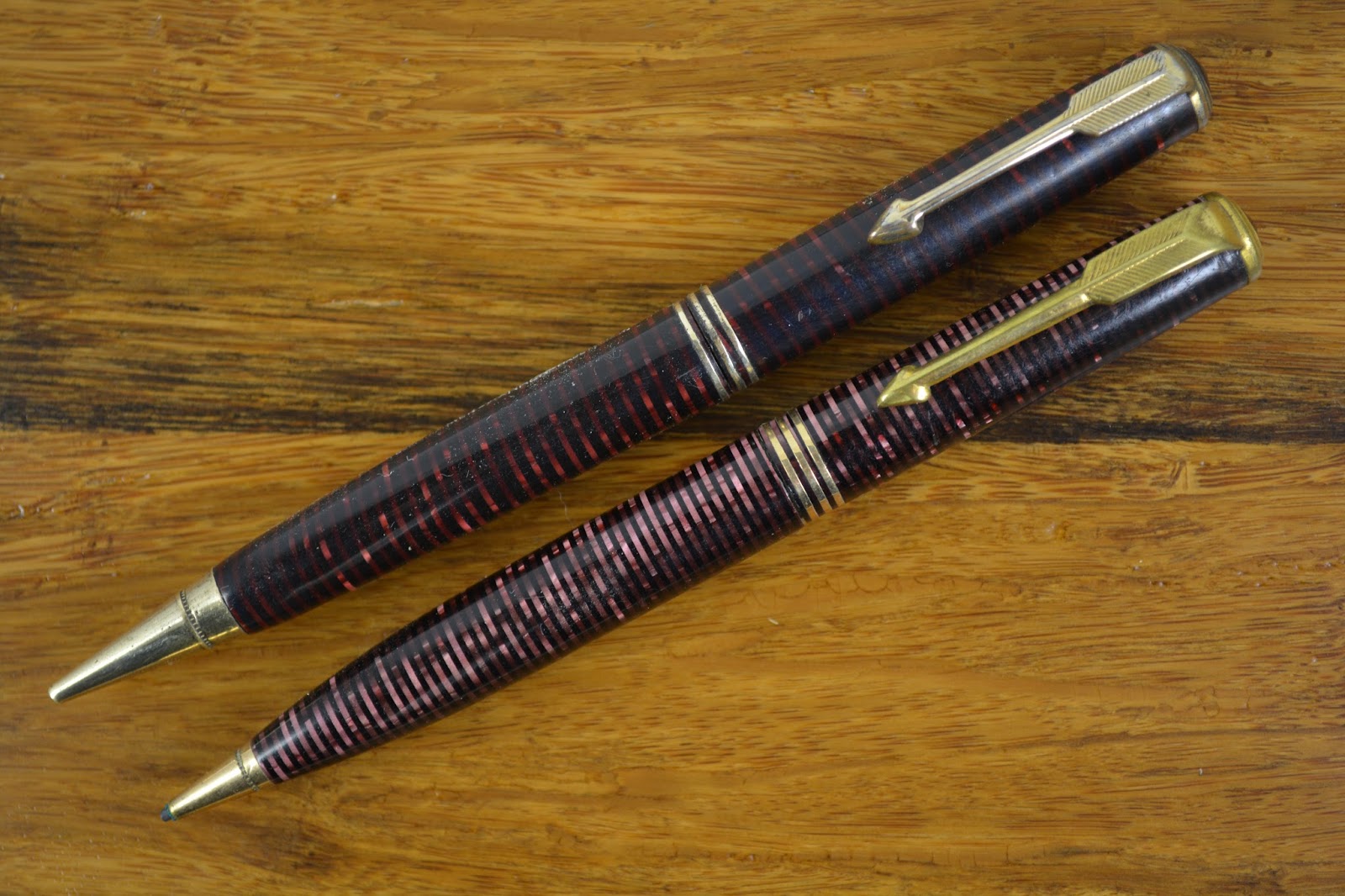
This Counts as Two, Right?

This article has been edited and included in The Leadhead's Pencil Blog Volume 4; copies are available print on demand through Amazon here, and I offer an ebook version in pdf format at the Legendary Lead Company here.

If you don't want the book but you enjoy this article, please consider supporting the Blog project here.

A while back I posted about a nifty four-piece set of Burnham Canasta Pencils:


Even though I still strive mightily to limit myself to American pencils (Burnham, for those who don’t know, is an English make), when a second telltale gold foil box showed up in an online auction, duty required me to have a closer look:


And of course, once I looked, I had to buy.  These two sets just go so nicely together:


The box lid says “Harrod’s” on the new addition – points off, since the Burnham Canasta Set lid is way cooler.  But the card suit imprints on the four pencils?  That more than levels the playing field!

There’s a saying in my house .... more of a warning, actually.  Two’s a coincidence, three’s a collection.  I’m going to count this as two items and cling to the notion that I’ve got a coincidence here.

Friday, December 25, 2015

A Bit of Red and Green . . . and Blue

This article has been edited and included in The Leadhead's Pencil Blog Volume 4; copies are available print on demand through Amazon here, and I offer an ebook version in pdf format at the Legendary Lead Company here.

If you don't want the book but you enjoy this article, please consider supporting the Blog project here.

Back on January 17, 2013, I posted an article about a Sheaffer Balance pencil in a red pearl and black:


The article, “This One Is To Dye For,” (http://leadheadpencils.blogspot.com/2013/01/this-one-is-to-dye-for.html), explained how Sheaffer, in an attempt to offer new colors during the Depression while minimizing product costs, actually dyed existing black and pearl celluloid stock - as an example, I compared it to a green and black Univer set.

It was a shame I didn’t have a red and black Univer for a more apples-to-apples comparison at the time.  I had heard that in addition, these were offered in blue . . . and here they are.


While we are on the subject of weird colors and Sheaffer subbrands – and add a little more red and green for the day – here’s a Craig, which Dan Reppert had at the Michigan show this year:


At first, it looks like something’s gone wrong with the plastic, but on closer examination this is clearly an “end of day” sort of celluloid, with a little bit of green mixed in with the red:


Jade green Craigs I’ve seen.  Red ones, never.  A bit ‘o both in one pencil?  Wow.

Thursday, December 24, 2015

Ritest of the Rite

This article has been edited and included in The Leadhead's Pencil Blog Volume 4; copies are available print on demand through Amazon here, and I offer an ebook version in pdf format at the Legendary Lead Company here.

If you don't want the book but you enjoy this article, please consider supporting the Blog project here.

That same seller that had the 40-pencil lot including that Ripley Vacumatic posted a similar lot a few months ago, which included this one:


I wasn’t entirely sure what this one would be, with those fuzzy pictures.  When it arrived, I found it was a Rite-Rite:


That distinctive plastic really stood out.  The only other ones I’ve seen along these lines have been in an equally distinctive, teal-colored  plastic:


There’s some nice detail work on the lower barrel:


And on the top, a surprise that didn’t show up in the pictures:


That’s not a sticker: that “3 1/4" emblem is built into the plastic, and I haven’t seen that feature on the teal ones.   I thought maybe it might be a more-permanent-than-usual price sticker, so I checked the library at the Pen Collectors of America (www.pencollectorsofamerica.com) to find out at what price point they were offered.  The library has a 1938 Rite-Rite catalog, and this one is listed – at a price of $74.60 per gross:


The “3 1/4" was the model designation, derived from its lead capacity of 3 1/4 inches.   This is only the second color I’ve encountered, but they came in “black and assorted pearl metallic colors,” served . . .


. . . in a “jewelry type display box.”   How cool is that!

Wednesday, December 23, 2015

Regrettable Timing

This article has been edited and included in The Leadhead's Pencil Blog Volume 4; copies are available print on demand through Amazon here, and I offer an ebook version in pdf format at the Legendary Lead Company here.

If you don't want the book but you enjoy this article, please consider supporting the Blog project here.

As I sat down to write this article, which I’ve been meaning to do for a year or more, I always planned to title the article “There is no Santa Claus.”  Even though the analogy is perfect, posting it two days before he’s scheduled to shimmy his way into my gas log fireplace seems, on the one hand, like a travesty.  On the other, I suppose, it’s all the more perfect.

Devotees to particular high quality brands are a peculiar bunch.  I collect Conklins, whether they be the great, innovative products or the junk from the end of the line.  And Eversharps?  I find their spectacular demise into oblivion fascinating, just because it’s hard to imagine a boardroom where the company’s executives were saying “sure, throw that against the wall and see if it sticks” towards the end.

And yet there are those who cling to the notion that their brand of choice was divine – that there’s no way their beloved Conklin, Eversharp or a host of others would stoop to such depths to make a buck out of desperation.

Nowhere is that more true than in the case of the Camel Pen Company, which in the thirties came out with some stunningly beautiful and innovative pens and pencils, built on the concept that a pen fueled by ink tablets would write longer and more reliably than those using conventional inks.  To this day, I still face resistance to the notion that the same guys who made these beautiful pens were associated with the dismal “Secretary Pen Company” and its line of cheesy floaty pencils from the late forties and early fifties.

It doesn’t matter that the history is well documented.  Camel was forced to file for bankruptcy in 1938 and its founder, Joseph Wustman, purchased whatever was left of the company by that time and set up the Secretary Pen Company.  There’s a picture of a Camel “Spaulding” pencil pictured on page 27 of the Catalogue, as living proof that, as things were looking bleak, the company was indeed stooping to levels the Camel faithful would never dream.


Enthusiasts of the brand continue to clink to the notion that just because the company stooped that low, they wouldn’t have gone so far as to make those crappy floaty pencils . . . or would they?


I bought this one because . . . well, because I have a thing for crappy floaty pencils.  Especially when they have a connection to classic cars.


But this one has another connection.  I was expecting a Secretary Pen Company imprint.  I wasn’t expecting, or maybe I should have expected, this:


Tuesday, December 22, 2015

In a Tasteful Manner in Harmonious Colors

This article has been edited and included in The Leadhead's Pencil Blog Volume 4; copies are available print on demand through Amazon here, and I offer an ebook version in pdf format at the Legendary Lead Company here.

If you don't want the book but you enjoy this article, please consider supporting the Blog project here.

Bill Bender met up with me at the Ohio Show, with a few a few goodies in his backpack to share.  This one I had to have:


The top is separated a little bit – I’m not sure whether the barrel has shrank or whether the top retainer has pulled out a little bit.  On the extender is a patent date of January 21, 1879:


What had me intrigued, though, was the inlaid design on the barrel:


Turns out that design explained the patent date.  James C. Aikin applied for a design patent on November 2, 1878 for an ornamental design, “consisting of flowers, insects, leaves and vines, grouped in a tasteful manner in harmonious colors, and arranged in straight lines along the barrel, to produce a good aesthetic effect.”  The patent was issued as design patent 10,984:


The picture is useless.  The description is no better, since he says the design may be made “by painting, or with pearl, gold, silver, plate, stone, glass, turquoise, diamonds, separately or blended, to produce harmonious effects of coloring, &c.” and purports to cover any design “substantially as described.”  Apparently Aikin was trying to sew up the market on anything frilly in the Victorian age.

Wait a minute . . . was it Aikin, or Aikin Lambert?

At the end of the day, it was Aikin, Lambert & Co., but our collectors’ lore is now perpetuating the myth that Aikin, Lambert & Co. was founded in 1864.

It wasn’t.

There’s a nice biographical sketch of James Cornelius Aikin in The National Cyclopaedia of American Biography, published in 1910:


According to this, Aikin got into the pen business in 1862, when he entered into a partnership with Edward D. Valentine.  In 1864, he founded J.C. Aikin & Co., and  Aikin, Lambert & Co. was not incorporated until May, 1889.

Well, that can’t be right, either.  There’s a plethora of advertisements earlier than 1889 for Aikin, Lambert & Co.  Here’s one from 1881, just as an example:


So I did some poking around to see if the real story was out there in contemporary accounts, and it was.  Two accounts published in 1919 contain a few more details, the first of which was included in Henry A. Lambert’s obituary, published in The Jewelers’ Circular on May 21, 1919:


According to this, Lambert first became associated with Aikin as a traveler, when Aikin was a partner in a firm named McConnell, Valentine and Aikin sometime prior to 1861. When McConnell and Valentine withdrew in 1861, this account states that Aikin and Lambert formed a partnership making gold pens as well as jewelry and watches trading under the name “Aikin Lambert & Co.” that “the gold pen business” was incorporated about 25 years before the article was published – putting that date at 1894 – and that the gold pen business was later absorbed by L.E. Waterman.

The other account was published just a few months earlier, on February 5, 1919, also in the Jewelers’ Circular.  This account is a little different:


According to this version, Aikin went into business in 1862 with Valentine as “Valentine and Aikin.”   In March, 1864, J.C. Aikin & Company was formed, “H.A. Lambert being the company.”  In 1867, the pen manufacturer J.B. Shea joined the firm, which was then renamed Aikin, Lambert & Co.

This is the version of the story I was mostly able to verify – all, that is, except the very first part.  The only reference I have been able to find to “McConnell, Valentine & Aikin.  Maybe it was more shortlived than the later accounts state, and maybe it wasn’t in New York City, but the only reference I found to such a partnership is in Henry Lambert’s obituary.  It’s entirely possible that there was a “Valentine and Aikin,” and it seems likely given that all of the later accounts agree on this point; however, if that partnership operated in New York, it might have been formed after  Trow’s Copartnership Directory for 1862-1863, which list New York partnerships, went to press in July of that year.

Remember also that Aikin’s biographical sketch indicates that Aikin enlisted in the 7th Regiment at the outbreak of the American Civil War in 1861, and he didn’t return to New York until 1862.

However, the next edition of Trow’s Directory (by then called “Wilson’s”), released in 1864, matches exactly the Aikin biography and the February, 1919 account published in The Jewelers’ Circular:


There’s J.C. Aikin & Co., a partnership comprised of Aikin and Lambert, at 14 Maiden Lane.  The 1866-1867 directory, which went to press before Shea reportedly joined the firm, says the same thing:


The 1868-1869 directory squares perfectly with these accounts, with J.B. Shea joining the ranks and the partnership renamed “Aikin, Lambert & Co.”


On September 15, 1871, Aikin, Lambert & Co. applied for one of the first American Trademarks on its name, which was issued as number 472 on October 17, 1871:


The date of first use claimed would have been helpful, but in 1871 such things were not reported, and the Patent Office simply provided Congress with an index of all patents and trademarks issued that year.  Volume 1, number 1 of the Official Gazette of the United States Patent Office, which would have included that helpful tidbit of information, wasn’t published until January 3, 1872.

By 1883, D.F. Foley had joined Aikin Lambert & Co., and the firm started another business in Chcago, which they named the “Chicago Gold Pen Manufacturing Company.”  In 1887, they sold their interest to W.H. Burton:


This report, with the added detail that D.F. Foley was with Aikin Lambert, probably confirms that Aikin Lambert & Co. was formally incorporated in 1889, as Aikin’s biography states.  David Nishimura has done some extensive research concerning D.F. Foley & Co., which he documents in an article over at his blog (see http://vintagepensblog.blogspot.com/2012/06/dissolution-of-d-f-foley-co.html); he found a reference that D.F. Foley & Co. was founded in February, 1888.


Under general partnership law, if D.F. Foley left Aikin Lambert & Co. to start his own business in February, 1888, his withdrawal would have technically dissolved the partnership.  That would have triggered the necessity for Aikin Lambert to reorganize, so once again the Aikin account appears to be correct – Aikin, Lambert & Co. would have been incorporated in 1889 or thereabouts, to protect what was by that time a valuable trade name.  Unlike a partnership, corporate shareholders can come and go without affecting the continued existence of the business.

Also in the 1880s, Lewis Edson Waterman went into the pen business, and one of the suppliers of his nibs was Aikin Lambert.  As Waterman’s business took off, Aikin Lambert’s customer increasingly became the tail that wagged the dog, and Waterman gradually assumed control of its supplier.  Again, David Nishimura has documented well this process, and his article (http://vintagepensblog.blogspot.com/2012/12/waterman-and-aikin-lambert.html) picks up nicely where this one ends.

Monday, December 21, 2015

Up Close and Personal

This article has been edited and included in The Leadhead's Pencil Blog Volume 4; copies are available print on demand through Amazon here, and I offer an ebook version in pdf format at the Legendary Lead Company here.

If you don't want the book but you enjoy this article, please consider supporting the Blog project here.

This lot of forty mechanical pencils showed up in an online auction, from the same seller who has sold me several other pigs in a poke – with great success, I might add:


There were several pencils in here that I thought looked very interesting, and I’ll be writing about them in the coming weeks, but my eyes were riveted to just one of them:


That Vacumatic pencil in the upper right corner looked just a little bit more red than a typical burgundy example.  The stripes looked a little wider than I’d expect to see, too, and the rings looked a little crooked.  I was confident from that tip – with the telltale ring around it – that it was a legitimate Parker and not some foreign knockoff.  What I was hoping it would be was a “Ripley Vacumatic,” like the example Joe Nemecek owns and I wrote about here a couple years ago, at http://leadheadpencils.blogspot.com/2013/08/believe-it-or-not.html.

When I wrote that last article, I didn’t do a very good job of it: there were a lot of questions I didn’t answer, many I didn’t ask and unfortunately, at the time it was a direct result of my general lack of interest in the subtle nuances of Vacumatic pencils.  When I showed these fuzzy pictures to my friends online, one of them commented – and rightly so – that I wouldn’t know for certain whether this one was a Ripley until I was “up close and personal” with it.

Spoiler alert: it’s a Ripley.  And now that I’ve spent some time examining these in more detail, and comparing notes with Joe Nemecek, I’m able to articulate what a “Ripley” is and how easy they are to spot in a sea of Vacumatics.  No, they don’t all look alike.

Here she is, after restoration:


I should have taken before pictures, but I was too excited to dig into making this one look nice and work.  I cleaned it up, straightened the clip (which had a decidedly left bend) and fixed the mechanism, which had skipped the track and was jammed in the forward position – see the tutorial I wrote a few weeks ago regarding how to fix a stripped mechanism (http://leadheadpencils.blogspot.com/2015/11/repair-tutorial-fixing-typical-stripped.html).  A paper clip pushed against the rod while I jiggled and retracted the mechanism, and it eased back into the spiral and works perfectly.  Good thing I didn’t have to pull the mechanism out and risk breaking the barrel – especially one made from such a fragile plastic!

Unlike most Parker Vacumatics, this one is not a rear-drive pencil.  It has a nose drive mechanism and unscrews in the center:


Note the very atypical imprint for a Vacumatic:


And the black top jewel – Vacs this big of a later vintage had matching striped celluloid top jewels, but Ripleys had plain black ones (a good thing, too: can you imagine trying to track down a striped Ripley plastic top jewel?):


Ripleys are pretty easy to spot, once you know what you are looking for.  Here it is shown alongside a typical “first year” burgundy example:


There’s five things to notice here, and the first three were what led me to think this might be a Ripley from a really bad picture.  Note how much redder the Ripley’s stripes are, how much wider they are, and how crooked they are.  The other two outward indications are the huge tip at one end and a different clip at the other – look how much shorter the “feather” section is on the clip.

Now I do have to stop for a minute and be a little critical of collectors’ lore on the subject.  We are told that “Ripley” Vacumatics got their nickname from Parker’s 1933-1934 advertising campaign, featuring mock “Ripley’s Believe it or not” cartoons extolling the virtues of the new pens, and picturing pens which look sort of like these.  Yes, it’s true that there was such an ad campaign – but no, the pens that were pictured didn’t look like they were made from the same plastic.


These look more like the typical, later burgundy plastic I’ve compared to my Ripley above.  However, the lore isn’t completely flawed: there is something in these advertisements to tell us what makes a Ripley a Ripley:


Later production Vacumatics used stacks of opaque black plastic and colored celluloid everywhere but on the visulated portion of the barrel, where the colored celluloid was alternated with clear plastic.  The “Ripley” pens and pencils used the same celluloid from end to end - and the “black” stripes would be see-through when held up to the light.   The only definitive way to see if a pen or a pencil is a Ripley is to expose it to bright light and see if you can see through the plastic, which should be a translucent blue.

My pencil, unlike later Vacs, lacked the brass tubes glued inside the barrel, so it was easy to put a small LED light inside for the definitive diagnosis:


There you have it.  That’s the acid test (no, never really use acid) to determine whether a pen or pencil is properly called a “Ripley” Vacumatic.

All of this being said, and bearing in mind that there aren’t very many of these to which I can compare mine, I think the first three clues that tipped me off -- deeper red, stripes that are wider and stripes that are crooked – are enough to tell you that you’re going to see blue when you hold it up to the light.

The light test is just pretty cool.

Sunday, December 20, 2015

What Color Is This?

This article has been edited and included in The Leadhead's Pencil Blog Volume 4; copies are available print on demand through Amazon here, and I offer an ebook version in pdf format at the Legendary Lead Company here.

If you don't want the book but you enjoy this article, please consider supporting the Blog project here.

This Eversharp “half Coronet” came out of that same collection from which that snake-clip Eversharp I wrote about recently came:


Now before you say “oh yeah, I’ve seen one of those, let me show it next to a blue “half Coronet”:


I’ll back up a bit and explain the air quotes around “half Coronet.”  That’s not an official name, nor does it signify that these are only half as good as a real Coronet.  The fact is that the word “Coronet” gets thrown around a lot, and most of the time it’s used wrong.   Although pencils like these have clips that were made from the same molds as those from which Coronets were made, and although they have the same mechanism as a Coronet pencil, Eversharp didn’t use the name Coronet on pencil like these.

Add to that the fact that the pencils were made in a whole variety of colors in which the pens were never made, and pencil guys like me are left to our own devices.  We came up with “half Coronet” to describe pencils styled after the Coronet line, but never officially conferred with that title.

Now to get back to our pencils du jour, the blue ones come along often enough that while you might call them “half Coronets,” you wouldn’t call them “rare.”   Is that other one blue, or does it look gray to you?  A few years ago, at the DC show, I picked up a considerably more weatherbeaten example, wondering whether it was in fact gray, but the plastic was so beat up that I hesitated to put it out there as a possibility that it was a different color rather than an old, abused, faded blue one.

This one, however, is pristine.  If it’s faded blue, then it faded – perfectly and uniformly, all the way around, mind you – over the last eighty years.

The difference, I’ll grant you, is a subtle one . . . but it isn’t so subtle when you put the two right next to each other:


I’m inclined to believe there were truly gray half Coronets.