Monday, November 23, 2015

Vestigial Eversharps

This article has been edited and included in The Leadhead's Pencil Blog Volume 4; copies are available print on demand through Amazon here, and I offer an ebook version in pdf format at the Legendary Lead Company here.

If you don't want the book but you enjoy this article, please consider supporting the Blog project here.

This one showed up in an online auction a few months ago.


There’s a number of things I like about this one.  It’s one of the dollar pencil budget line produced by Eversharp in the 1930s, which are a little tough to find, and this one is in a plastic which approximates the company’s red “bumblebee” plastic.

But that’s not what had me excited to see this one in person and compare it to some of the other models - it’s that little metal dome just above the clip.  We’re so conditioned to expect gold seals in that spot that it’s easy to glide right past that detail, assuming that there’s a double checkmark logo adorning the barrel.  There weren’t gold seals on the budget lines, though, and this is just a metal button.

Why is it there?  I’ll have to back up a bit to explain that one.  After ten years of making pretty much the same metal pencils, Wahl was getting the point in the mid-1920s that it needed to make a change.  Other companies were starting to introduce writing instruments in brightly colored plastics, so Wahl decided to follow suit.

The “dollar pencil” series started with hard rubber and enamel over aluminum barrels, illustrated  in the 1928 catalog, and while they weren’t called “dollar pencils,” every one of them was listed at that price.


Don’t be distracted by the cap variations.  Underneath all of the caps was that same straight top with the knurled middle section - the cap is an accessory.  The ones with the black band and greek key design are shown in the catalog, but it’s possible they were sold without them - nearly all of the rosewood examples marked “Metropolitan Life Insurance Company” don’t have them, for example.

In 1929, Wahl replaced these with brightly colored “Pyralin” (plastic) barrels, with the price for all models, again, at a buck.


The 1929 catalog shows only those models with color-matched points.  I haven’t seen a lapis one with the blue nose piece yet.

I also haven’t seen a 1930 or 1931 Wahl catalog, but those must have been fascinating years.  I would bet that in 1930, Wahl started using the black tips on all of the colors to save money.  I think that’s probably also when the first of the “bumblebee” plastic dollar pencils were introduced, and initially, they were just another color in the same line:


It was also in 1930-1931 when Wahl changed all of its pencils inside, abandoning the familiar 1913 Keeran mechanism (slightly tweaked in 1924) for a rear-drive, Equipoised-type mechanism.  These look almost identical on the outside, even though they are very different pencils: the new mechanism was propel-repel.


The easiest way to spot the difference is an extra metal band at the top:


Yep.  Still a buck:


Production costs, coupled with the  Depression, must have doomed this model quickly.  The 1932 catalog shows a more streamlined version of the dollar line, but these are fitted with a cheaply-produced, nose drive mechanism.


The ones on the right, with a z-clip (shaped like a Z in profile, which fits into a slot in the barrel) are shown in the 1932 catalog, with the gold-filled trim models listed for $1.50 and the chrome trim edition still at $1.00.  The ones on the right, with a clip stapled into the barrel, must have been introduced in 1933 or 1934.  By 1935, the Wahl Oxford line had replaced the series.

So, we have a nice, smooth evolution of Eversharp’s dollar pencil line:


From the top, 1929, 1930, 1930-ish, 1931-ish, 1932, 1933-34 . . ish.  And when you look at this evolution, the meaning of that metal button on my new addition makes perfect sense.  When you line up the lower ends of the barrels of these three red bumblebees . . .


That little button lines up perfectly with the hole where the bolt securing the clip was drilled on its predecessors:


The first streamlined dollar pencils were made from leftover parts, by cutting a slot in pre-drilled barrel and simply filling the hole.

Friday, November 20, 2015

The One that Kept Me Awake at Night

This article has been edited and included in The Leadhead's Pencil Blog Volume 4; copies are available print on demand through Amazon here, and I offer an ebook version in pdf format at the Legendary Lead Company here.

If you don't want the book but you enjoy this article, please consider supporting the Blog project here.

A few months ago, a friend of mine hinted that he might sell his collection of Eversharp pencils to me.  I had seen and photographed his collection before, long before there was any hint that he might part with it, but once there was a suggestion that the collection might be available, there was one piece . . . out of several trays full of nice stuff . . . which kept me awake at night.  I knew that if it were all or nothing, this one would be the one that would put me in the “all” pile.


A snake clip Eversharp?


Sure enough, it’s all Eversharp inside, and based on a scarce clipless model, to boot.  The “scales,” on closer examination, are hand engraved:


I’d never seen or heard of anything like this, and for months the implications of this find had my head swirling.  Conventional wisdom as of this writing is that before Wahl began making Charles Keeran’s Ever Sharp (two words) pencils, they were made by George W. Heath – at least, all the surviving examples bear Heath’s patented (at the time, patent applied for) clip.

Does this snake clip suggest there was another pre-Wahl manufacturer of Ever Sharp pencils?


Patent January 6, 1914 . . . just three months after Keeran applied for his first pencil patent.  The time is certainly right.  The G.T.B. on the clip stands for George T. Byers, about whose shenanigans I wrote about here back on March 16 (“The Snake that Wasn’t Wrapped Around a Pencil,” at http://leadheadpencils.blogspot.com/2015/03/the-snake-that-wasnt-wrapped-around.html).  In a nutshell, Byers liked the snake clips the Frank T. Pearce Company was offering so much, that he ordered some blanks from Pearce’s supplier, applied for a design patent for it, and then tried unsuccessfully to sue Pearce for patent infringement.

If you read the timeline in the article I wrote about Byers, it fits perfectly with the hypothesis that The George T. Byers Co. made some of the first Ever Sharp pencils.  Incorporated May, 1912; patent for snake clip granted January, 1914; complaint against Pearce for infringement filed January, 1915; patent invalidated December, 1915; Byers disbands the George T. Byers Co. and joins John E. Hayes to form Byers and Hayes in June, 1916.

Keeran applied for his patent in October, 1913; begins test marketing the new pencils for the Christmas season, 1913; contracts with the Wahl Adding Machine Company to make his pencils beginning on October 1, 1915.

If this clip was on this pencils when it was made -- and it certainly looks like it was -- it was made between January, 1914 and December, 1915.

There's one other clue.  While the short tip indicates the pencil was made before 1924, which isn’t very helpful, the imprint can more precisely date the pencil.  During the time these pencils were made by the “Eversharp Pencil Company,” both during the time Keeran controlled the company and after Wahl’s directors acquired a controlling interest in 1916, known examples are marked “Ever Sharp / Patented..”  Note: that’s “Eversharp Pencil Company,” with Eversharp as one word, while the pencils were marked “Ever Sharp” - 2 words.

When Wahl began making the pencils on its own account in mid-1917, for a short time the pencils were stamped “Wahl Ever Sharp” - still two words.  A few months later, the space was deleted, and from that point on, pencils were stamped “Wahl Eversharp.”

The imprint on this one is difficult to read.  It was either poorly stamped, or someone made an attempt to obliterate it.  However, on one side there’s just enough of it showing to make a telling observation:


It took about two dozen attempts, to get a picture capturing the faint traces of the word “Eversharp” – one word.  And no "Patented."  If that means this was originally stamped Wahl Eversharp, then someone has created a special piece from a clipless pencil made later than 1918 and added a leftover GTB 1914 patent accommodation clip.  If so, it likely was not Byers himself: even though he wouldn’t have been above grinding someone else’s imprint off a pencil and passing it off on his own, by 1917 he was in a respectable association with Hayes and wasn’t looking back.

But there’s another and much more exciting possibility.  A couple paragraphs up, I carefully stated that known examples of “pre-Wahl” Ever Sharp pencils are stamped “Ever Sharp / Patented” – two words, with the word "Patented."  Although this one has traces of the “Eversharp” (one word), but there is absolutely no trace of the word “Wahl” preceding it on this pencil.  And it says "Sterling," not "Patented."  Is this an imperfect obliteration of a much later Eversharp imprint by whoever pimped this pencil out?  Maybe.

But . . .

Charles Keeran founded the Eversharp Pencil Company – not the “Ever Sharp Pencil Company.”  Why would the company name be one word, but the pencils marked with two?  The answer is that there was already an “Eversharp Pencil” on the market:


It didn’t look the same, but it was called the same, and it was out there first.  By 1918, when Wahl decided to take over the name, the company was defunct.

Is it possible that Keeran, unaware that another company was calling its pencils “Eversharp,” was marketing pencils under the same, one-word name?  To date, the earliest advertisement recently brought to light was the one Bob Bolin has posted on his website, from September, 1915, clearly showing the two-word version.

However, I went back and thumbed through old issues of Charles Keeran’s hometown paper, The Bloomington Pantagraph, and I found a few that were earlier – much , much earlier.  The first ran on July 18, 1914:


There may be a slight space between “Ever” and “Sharp” at the top, but look at what’s dead center in this advertisement: “There is only one genuine EVERSHARP.”

Yes, Virginia.  Keeran may well have caused his first pencils to be stamped “Eversharp,” with one word.  If he did, then this pencil may be the earliest Eversharp in existence.

Tuesday, August 18, 2015

THAT Kind of Show

This article has been edited and included in The Leadhead's Pencil Blog Volume 3; copies are available print on demand through Amazon here, and I offer an ebook version in pdf format at the Legendary Lead Company here.

If you don't want the book but you enjoy this article, please consider supporting the Blog project here.

When Harry Shubin stopped by my table at the DC Show last weekend, he had already warned me in advance that he had a very unusual Parker Vacumatic that he needed some help with.  It was a demi-sized, stubby and chubby burgundy example with two bands - on the very early end of the Vacumatic spectrum, when the only thing that differentiated a Vac from a Duofold was the plastic.

The repair required one of the more sophisticated tools in a pencil repairman’s toolkit – the noble paperclip.  With that and the knowledge that giving a push here and a firm, insistent tug there wouldn’t break the thing, the tabs of the pushrod eased back where they were supposed to be and the problem was solved.

Harry’s pencil is special, and before he left he allowed me to photograph it next to a couple other special Vacumatic pencils that turned up at the show:


These other two, however, came home with me.  The first came from Pearce Jarvis, and I’ve been looking for one for years:


I’ve got a couple Vacumatic band pencils – a pair of prototypes I picked up a couple years ago that I suppose are more special than this (see “What Might Have Been” at http://leadheadpencils.blogspot.com/2014/09/what-might-have-been.html):


I’ll admit to pining for a “regular” production example, and this one is about as big and about as nice as one can hope for.


I enjoy getting a “wow” from people, and pencils like these don’t come along that often . . . so yeah, I probably showed this one to more people than cared to see it.  Even more fun than that was telling people, after they had seen this one, that this wasn’t the nicest Vacumatic pencil I found that weekend.

Yeah.  It was that kind of show. 

With that introduction, I would show off this third one:


In all fairness, I didn’t find this one at the show.  Pete Kirby had emailed me a picture of it months earlier, and it had an appointment to meet me at the show.  I couldn’t pay Pete what he asked quickly enough.

The topic of debate over this piece is whether it was made by Parker at the factory or was a jeweler’s piece.  I think the polls were leaning in favor of factory production by the end of the day, myself included in the number that believe that.  What I can tell you is that the date code indicates third quarter of 1935:


And all the trim is marked 14k – highly unusual for a Vacumatic:


There is a stone set in the arrow of the clip, which ordinarily might suggest a jeweler’s modification . . . although a couple of the folks I talked to had a faint recollection of Parker doing this as a special order item.  A very special order.


But what really stands out about this pencil, above all these other features, is that band.  If it was a jeweler’s work, it was one heluva lot of work.  A close examination reveals a 14k mark right where you’d expect to find it on a factory piece, as well as horizontal lines that indicate the band was either stamped or cast rather than being engraved.  Whoever made this had a pattern fitting this exact barrel circumference, since the pattern is uninterrupted all the way around.


Those horizontal lines almost look like they are intended to discourage counterfeiting to me.  I’m hoping some day to find documentation that this was an original Parker piece – and with it, documentation of the very special occasion for which it was made.

Friday, July 10, 2015

A Few More Flavors

This article has been edited and included in The Leadhead's Pencil Blog Volume 3; copies are available print on demand through Amazon here, and I offer an ebook version in pdf format at the Legendary Lead Company here.

If you don't want the book but you enjoy this article, please consider supporting the Blog project here.

Collecting Parker “depression” pencils is what I would call linear fun.   Structurally, there’s not much variation in the pencils themselves: no bewildering array of sizes, no odd variants of clips . . . at least, none that I’m aware of (consider that a challenge to those of you out there harboring such things, to send me pictures for sharing).  There’s three basic types: some early ones which appear to be made from leftover Duofold parts, with black buttons on top;  the Thrift Time models with the metal button on top; and the larger Premiere models with color matched tops.

No, about the only thing to do when you are hunting Parker depression pencils is to look for different colors.  But, oh, how much fun that one simple task is!  It’s been awhile since I’ve added any to this mini-collection, but at the Chicago Show three additional colors came my way, one from Jon Rosenbaum’s estate, and two from Pete Kirby:


Yes, that red one (the one from Jon) is really that red, calling to mind the “cherry red” Secretary pencils Sheaffer turned out.  And that lapis . . . a very traditional Parker color, so it took a few minutes (and a check of my own pictures library) to realize that you just don’t see that color on a Parker depression pencil.

But the third one takes the cake:


If ever a pencil cried out for a matching colored button on top, it was this one (note the cheap gold plating common to all Parker depression models – in my opinion, an example that doesn’t show this kind of plating wear isn’t original).


“Camouflage,” a couple of guys told me the color is called, although I’m not clear whether that’s a formal name or a collector’s nickname.  If it was an official name, it might not have been Parker’s, because I do have another pencil made from that identical plastic:


Charlie Harles sold me an unmarked pencil at the Ohio Show a few years back.  I don’t question, given the trim, clip and shape, that it is a Moore.

Thursday, July 9, 2015

Keep a Close Eye on the Atlanta Contingent!

This article has been edited and included in The Leadhead's Pencil Blog Volume 3; copies are available print on demand through Amazon here, and I offer an ebook version in pdf format at the Legendary Lead Company here.

If you don't want the book but you enjoy this article, please consider supporting the Blog project here.

I don’t write much about Scriptos here.   It’s not that I have something against the brand – I grew up using the translucent ones all the way through school.  I guess I’ve still got a lingering perception that they aren’t all that old, because I was using them . . . and I need to stop myself right there, because that was pushing forty years ago when I started using them.  Huh.

I do have a stash of them, and sometimes I’ll go out of my way to pick one up when it looks interesting.  Take this one, for example


I like the looks of them, with that clip with the early script (pun intended) logo, and that cool anodized aluminum cap:


I asked Mike Little what these were, and he identified them as the “Model M800”; the neat pencil probably could have done with a little flashierl name  (I always liked the “Wordmaster” line, for example).  This example, however, says of itself that it is a “No. MS-1":


I’ve got a few others of these . . . somewhere . . . and I’ll have to pull them out and start comparing imprints.  In the meantime, this one caught my eye in a recent online auction:


There were a whole bunch of reasons I had to chase this one.  First, it’s a boxed set of a pencil I already liked – how cool is that?  It just oozes with “A Christmas Story” holiday spirit with that  box.  But, closer to home, is what’s painted on the barrel:


I’ve been an Elk for about ten years now, and even though I don’t go down there much any more (it’s more of a gambling parlor than a social club these days), I have a lot of friends down there.  Besides, my father-in-law had been an Elk for some 55 years when he passed, so I suppose for the rest of my life, Janet and I will send in a check once a year so we can take family in there when they come to town for the holidays.  To top it off, I pass through Frederick, Maryland every year on my way to the DC show – a great road trip every year.

All of the above reasons were plenty enough for me to bite on this, but there’s one last detail here that makes this one special, regardless of whether you’re an Elk or know beans about Frederick:


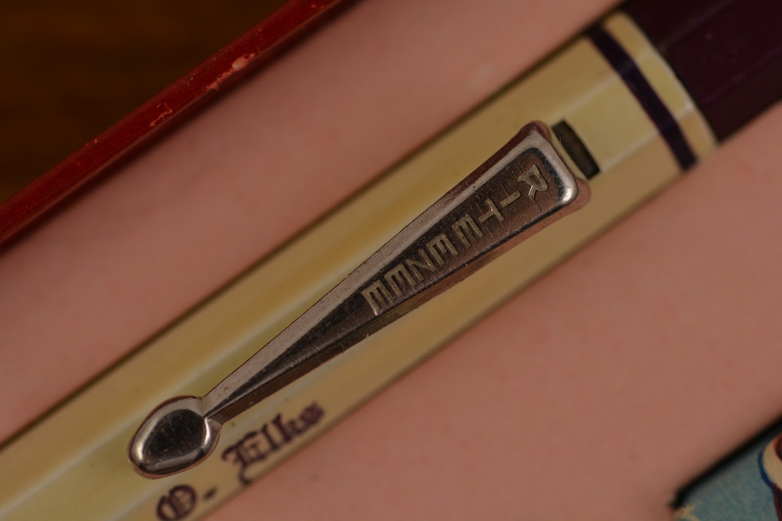
This one isn’t marked Scripto.  “Rite Ezee” . . . now that’s a cool name!

Wednesday, July 8, 2015

My Autopoint Conundrum

This article has been edited and included in The Leadhead's Pencil Blog Volume 3; copies are available print on demand through Amazon here, and I offer an ebook version in pdf format at the Legendary Lead Company here.

If you don't want the book but you enjoy this article, please consider supporting the Blog project here.

On the way home from Chicago, I should have been basking in the afterglow of a great show, seeing great friends and buying great pencils.  Instead, my copilot John Hall was checking my online auction every few minutes for me to see if anyone else was figuring out what this one was:


Yes, it’s an Autopoint, missing its cap.  There were a whole bunch of reasons to go after this one.  First, it’s an early Autopoint in what I consider a pretty rare, flourescent pink color dating to about 1930.  Second, it appeared from the picture to be an oversized model, and I thought it would look great next to the standard sized one I picked up from my friend Michael McNeil a couple years back (I featured Michael’s pencil at http://leadheadpencils.blogspot.com/2012/07/a-couple-mcneil-autopoints.html):


Third, I really liked the imprint:


Harrington and Richardson is best known for their 22-caliber revolvers, which had cylinders accommodating eight rounds rather than six.  They also developed some significant calibers, such as the .32 H&R magnum, a not-your-father’s-wussy-.32 caliber that will knock significant holes through concrete, especially when fitted hollow-point bullets.  That’s what I have loaded in my personal home defense weapon.  Yep.  I like both the pencil and the company it advertises.

And fourth, for the real trick up my sleeve: the cap is the hardest part, and I had just recently picked up a duplicate oversized Autopoint online, currently en route to my house,  for not too much money.  I thought I could get this one for a song and swap the caps.

But when my duplicate arrived, I was simultaneously elated and disappointed.


It didn’t have the green gold filled trim, but instead had Autopoint’s nickel-trimmed “Silvonite” furniture.  According to the 1930 catalog, the oversized “Deluxe” models in this series all had the green gold-filled trim, so I’m not sure whether this was factory or was assembled from parts after the fact.  Regardless of how it came to be, this wasn’t going to satisfy my needs.  So, much as I hated to do it, I did have a duplicate in blue:


And one of them now shares cap custody with the pink one.


I’ve got several black oversized Autopoints, all of which have Silvonite trim.  If I can establish that Autopoint made Deluxe oversized pencils in both levels of trim, I may have to swap parts over . . . just to see how they look . . .

Tuesday, July 7, 2015

S&K and the Birth of Eclipse?

This article has been edited and included in The Leadhead's Pencil Blog Volume 3; copies are available print on demand through Amazon here, and I offer an ebook version in pdf format at the Legendary Lead Company here.

If you don't want the book but you enjoy this article, please consider supporting the Blog project here.

Ladies and gentlemen, I believe we have a winner.

An article I posted a week ago discussed the Rex Manufacturing Company and a lower-tier set marked only on the pencil with “S&K” (the direct link to the article was http://leadheadpencils.blogspot.com/2015/06/nailed-it-pretty-much.html).


I wasn’t happy with either of the possible answers - “Settles and Kritikson” didn’t seem to fit, since all evidence indicates the latter took over for the former, and the two were never in partnership.  Daniel Kirchheimer offered up Skinner and Kennedy, a St. Louis stationer, but neither of us could turn up anything to prove they offered a house brand of writing instruments and, for an early 1920s obscure manufacturer like Rex just getting started, St. Louis seemed pretty far afield.

Michael Little posted a comment at the blog last night, suggesting another possibility for a company located in New York, which even had a connection – albeit an ignominious one – to Eclipse.  In my opinion, his suggestion is the right answer.

Shatkum & Kahn was a partnership formed in 1896 by Benjamin Shatkun and one David Kahn – that’s right, that’s the same David Kahn who later established David Kahn, Inc. and started manufacturing pens and pencils marked Wearever.  Here’s some early letterhead showing the date the partnership was established:


And here’s a 1937 advertisement for Wearever’s which appeared in Life Magazine.  Note the “Est. 1896" reference at the bottom:


I’m not finding any instances where the firm marketed pens or pencils under the trade name “S&K,” but I am finding reasons why, around 1924, the company wasn’t using their full names.  In November, 1921, Office Appliances reported that the newly established Federal Trade Commission had filed charges against the partnership.


The company was imprinting boxes with a $3.00 price tag, never intending that their pens would sell for that much (between 16 and 35 cents was the actual price they were selling for).  The FTC reasoned that the company was attempting to mislead consumers into the belief that they were getting a real deal on pens.

When I researched the reports of the Federal Trade Commission, I found that there were actually two complaints filed.  The first, number 604, alleged that the company was deliberately fitting pens with nibs reading “14k / Gold / Plate” in such a way that the word “Plate” was concealed by the feed, misleading consumers to believe its nibs were actually gold:


Note that the FTC spelled Shatkun’s name wrong, making this reference a little tougher to find (I found it through a 2007 thread on Fountain Pen Network).   On this earlier charge, Shatkun and Kahn were eventually cleared in 1922:


Note that the FTC got Shatkun’s name right in the exoneration, but misspelled Kahn as “Kalin.”

The other complaint against the firm, number 664, is even more interesting.  Three cases were filed simultaneously:


The first was against Marx Finstone (note: with no company association), the second was against Benjamin Shatkun and David Kahn, trading as Shatkun & Kahn, and the third was against Abraham Shatkun, of the United States Novelty Company.  All three cases resulted in identical injunctions against them, as reported in Volume 4 of the Federal Trade Commission’s decisions, beginning on page 163:


The language is harsh: words such as “fictitious, exaggerated or misleading prices” must have been devastating to whatever reputation these firms enjoyed.  By the time my S&K set (imprinted with a 1924 patent date), Shatkun and Kahn would have had every reason to keep their full names off of their products.  By 1928, the firm is replaced by David Kahn, Inc., who registers the trademark "Wearever."

As for Marx Finstone, note that his name is not associated with any firm in the FTC complaint or decision.   The company he founded, Eclipse, was established in 1903, according to conventional wisdom.  However, I find no reference that he marketed products under the Eclipse name prior to the Federal Trade Commission’s injunction against him personally.  Instead, I find that right around the time Finstone’s name was discredited:


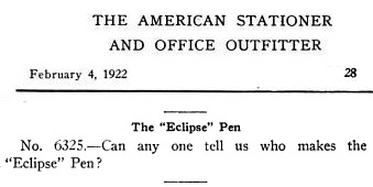
A question appeared in The American Stationer’s Q&A pages:


And no one knew the answer, suggesting that Finstone adopted the name “Eclipse” in the aftermath of the decision.