This article has been included in The Leadhead's Pencil Blog Volume 7, now available here.
If you don't want the book but you enjoy the article, please consider supporting the Blog project here.
Ah, those halcyon days . . . early in our collecting, when we thought if the word “Parker” turned up on something in a flea market cigar box, we’d hit the jackpot. We all have paid our tuition at some point, paying too much for that golden ticket only to learn that, as is the case with all other brands, not all Parkers were created equal.
Many of us learned that lesson paying too much for a Parkette – one of Parker’s budget lines of pens and pencils from the 1930s. I know I did . . . I don’t remember which Parkette pencil it was as I look at the spread today, but I do remember thinking I’d thrown away $20 after I excitedly showed it to a more experienced collector and received a derisive snort rather than a “way to go.”
Times have changed, and Parkettes receive more love these days than they once did. They are still cheaper than more expensive lines, but there’s enough varieties on the theme to keep collectors interested. Over the years Parkettes have checked in at Leadquarters but they haven’t been checking out, unless they are exact duplicates of what I’ve already found. Recently, I’ve been making more of a point to find examples that fill gaps in my little hoard.
Take this grouping, for example:
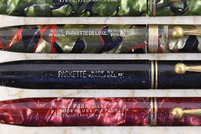
I’ve known for years that sometimes you’ll find these marked “Parkette,” and other times marked “Parco.” I went a little crazy bidding when the black Parco turned up in an online auction, because I thought that completed a nice little set . . . until I pulled all of these together for a family photo and recalled that the grey/red plastic is out there. Now I’m going a little more crazy thinking there’s another color Parco out there to chase.
That green one is kind of fun, with its reverse trim nose cone and a double imprint . . . definitely a measure of Parker’s somewhat lax quality control with this series.
I don’t know what the “Pat. Pend.” means, since the pencils are unremarkable nose-drive affairs. Either a patent never issued, or it was for some general manufacturing process not filed in Category 401.
There’s plenty to explore in the Parkette series, as far as variants go – and when I’ve got more information, I know I’ll circle back around for at least two follow up stories about the ones in this next picture:
My favorites in this group are the top two, with those arrow clips. They are really close to the arrow clips found on later Weidlich pens and pencils, and I’d like to know whether Parker sold leftover clips to Weidlich, or whether there was a mini-turf war over Weidlich’s use of them. There's follow up number one.
My other question is how Parker managed to get away with producing streamlined writing instruments at a time when Sheaffer was so aggressively litigating with companies who dared round off the ends of their pens and pencils. Was there gentleman’s agreement with Parker, or did Sheaffer simply decide Parker was too formidable an adversary to arm wrestle? I’m sure there’s more out there to learn on that subject, too.
From this small sampling, I’m deducing that the “Parkette Deluxe” had a single wide band. That’s the only difference, at least as far as the pencils go:
Unlike that first group, these are generally imprinted with date codes which specify the date the barrels were made, and Parker switched the way they were coded during the run. That top example has a 9, for 1939; the other two are imprinted 26 and 16, for the second quarter of 1936 and the first quarter, respectively.
Continuing down, the next one lacks a date code. The black one has a 17 code and the red one, with an imprint like the ones in that first Parkette/Parco image, is marked 25:
The last two are interesting. The grey/red one has a 16 date code, but it also has two dots, reminiscent of how Parker added dots around date codes on the Vacumatic series, which doesn’t make sense . . . two dots didn’t mean first quarter in Vacumatic-ese. I like the bottom one because it is made from the same burgundy/black celluloid used on the earlier Duofolds. It has a 9 code with three dots, signifying first quarter 1939, during Parker’s parts blowout that year (see the “Class of ‘39" in Volume 5, page 281):
Given all of the variations, and the way Parker mixed and matched different elements on the Parkette series, assembling a truly comprehensive collection of these would be both demanding and infuriating, since online auction pictures rarely capture all of these subtle nuances.
I’ve saved my favorites for last, when “Deluxe” meant more than just a wide band:
I’m always drawn to these neat fluted barrels, and the black ones with nickel-plated trim really pop. I kept both black ones because there’s a subtle difference you can see in this picture: some of these with the metal top ring have flatter ends, and it appears to be deliberate. Date codes on these range between 1937 and 1939.
At some point in this series, Parker made similar Parkette Deluxe pencils with a white plastic ring at the top, rather than matching metal. These came in two sizes and . . . gulp! . . . very rarely, in ringtop configuration:
These don’t have date codes, so I am not sure whether these were made before or after those with metal rings. I am sure, however, that the teal plastic on those bottom three examples is about my favorite color on any pencil, so I was thrilled when Brian McQueen was willing to part with the ringtop.
Since I’m so enamored with that color, and there seems to be an almost infinite range of variations, when another teal Parkette Deluxe happened my way, I was looking for an excuse to keep it here:
It’s the smaller of the two sizes, but when I compared it to the other example, I noticed something:
The top just doesn’t look the same as any of the other Parkette Deluxe pencils . . . it’s definitely more tapered at the top, and it looks to be intentional. Also, the black top piece is decidedly thicker than any of the others I’ve found in this series:
Maybe I’m just wanting to find a subtle difference so that I have an excuse to keep what would otherwise be a duplicate:
But then again, maybe there’s a reason it was made that way, and there’s an entire subseries, within a subseries, within a subbrand to explore.


No comments:
Post a Comment